我想在同一张图上绘制两个时间序列,使用相同的x轴和次要y轴。我已经设法实现了这一点,但是两个图例重叠在一起,无法为x轴和次要y轴提供标签。我尝试将两个图例放置在左上角和右上角,但仍然不起作用。
代码:
代码:
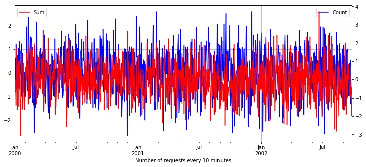
plt.figure(figsize=(12,5))

# Number of request every 10 minutes
log_10minutely_count_Series = log_df['IP'].resample('10min').count()
log_10minutely_count_Series.name="Count"
log_10minutely_count_Series.plot(color='blue', grid=True)
plt.legend(loc='upper left')
plt.xlabel('Number of request ever 10 minute')

# Sum of response size over each 10 minute
log_10minutely_sum_Series = log_df['Bytes'].resample('10min').sum()
log_10minutely_sum_Series.name = 'Sum'
log_10minutely_sum_Series.plot(color='red',grid=True, secondary_y=True)
plt.legend(loc='upper right')
plt.show()
提前感谢。