我正在使用 factorplot(kind="bar")。
如何缩放y轴,例如使用对数尺度?
我尝试过调整图的坐标轴,但总会以某种方式搞乱条形图,因此请先尝试您的解决方案以确保它确实有效。
我正在使用 factorplot(kind="bar")。
如何缩放y轴,例如使用对数尺度?
我尝试过调整图的坐标轴,但总会以某种方式搞乱条形图,因此请先尝试您的解决方案以确保它确实有效。
考虑到你的问题提到了 barplot,我想加入一个针对这种类型绘图的解决方案,因为它与@Jules解决方案中的factorplot不同。
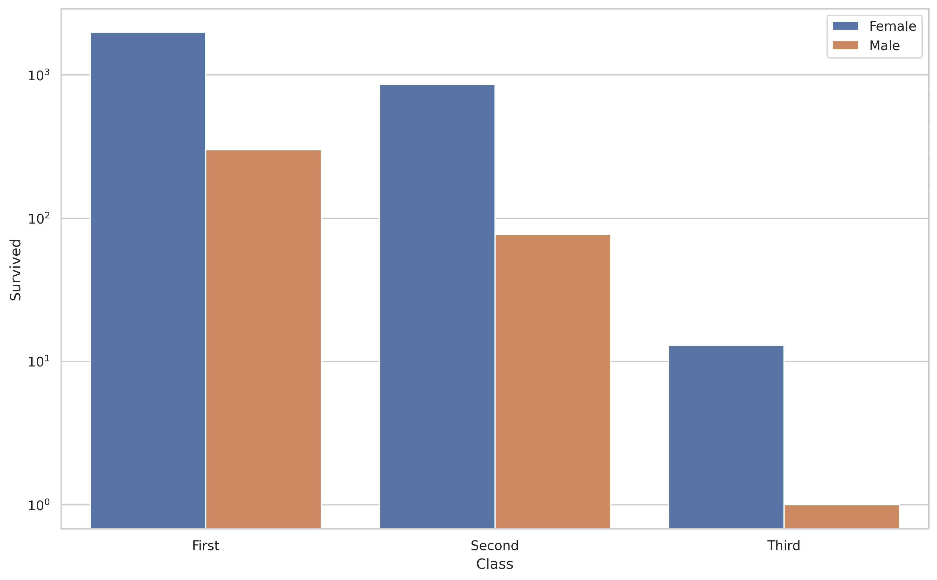
import matplotlib.pyplot as plt
import seaborn as sns
sns.set(style="whitegrid")

xs = ["First", "First", "Second", "Second", "Third", "Third"]
hue = ["Female", "Male"] * 3
ys = [1988, 301, 860, 77, 13, 1]

g = sns.barplot(x=xs, y=ys, hue=hue)
g.set_yscale("log")
_ = g.set(xlabel="Class", ylabel="Survived")
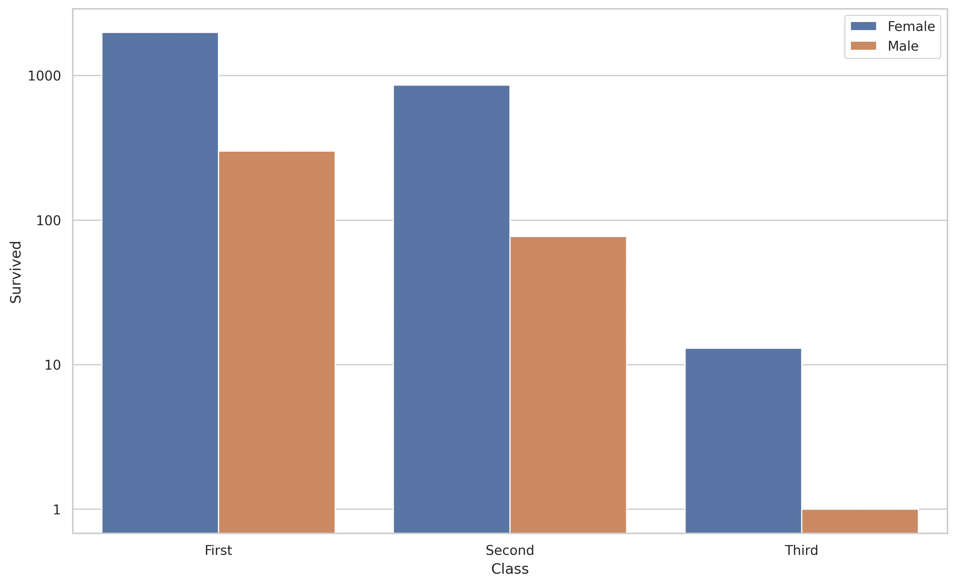
如果你想使用非对数标签为y轴添加标签,可以执行以下操作。
import matplotlib.pyplot as plt
import seaborn as sns
sns.set(style="whitegrid")

xs = ["First", "First", "Second", "Second", "Third", "Third"]
hue = ["Female", "Male"] * 3
ys = [1988, 301, 860, 77, 13, 1]

g = sns.barplot(x=xs, y=ys, hue=hue)
g.set_yscale("log")

# the non-logarithmic labels you want
ticks = [1, 10, 100, 1000]
g.set_yticks(ticks)
g.set_yticklabels(ticks)

_ = g.set(xlabel="Class", ylabel="Survived")
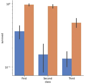
import seaborn as sns
import matplotlib.pyplot as plt

titanic = sns.load_dataset("titanic")

g = sns.catplot(x="class", y="survived", hue="sex",
                   data=titanic, kind="bar",
                   height=5, palette="muted", legend=False, log=True)
plt.show()
factorplot之后,您可以使用Matplotlib命令。
例如:g = sns.factorplot(x="class", y="survived", hue="sex",
data=titanic, kind="bar",
height=5, palette="muted", legend=False)
g.fig.get_axes()[0].set_yscale('log')
plt.show()
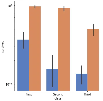
如果您在使用以前的解决方案设置对数刻度时遇到了消失条的问题,请尝试在 seaborn 函数调用中添加 log=True。
已在 python 3.11.2、matplotlib 3.7.1 和 seaborn 0.12.2 中进行测试
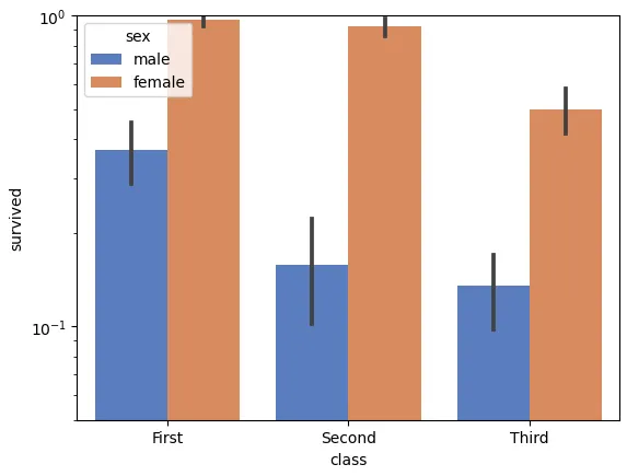
使用 sns.barplot:
import seaborn as sns
import matplotlib.pyplot as plt

titanic = sns.load_dataset("titanic")

g = sns.barplot(x="class", y="survived", hue="sex",
                data=titanic, palette="muted", log=True)
g.set_ylim(0.05, 1)
sns.factorplot 不再是 seaborn 的一部分。请参考此 answer 获取替代方案。
使用 sns.factorplot:
import seaborn as sns
import matplotlib.pyplot as plt
sns.set(style="whitegrid")

titanic = sns.load_dataset("titanic")

g = sns.factorplot(x="class", y="survived", hue="sex", kind='bar',
                   data=titanic, palette="muted", log=True)
g.ax.set_ylim(0.05, 1)
log=True并不能解决消失的条形图问题;我还需要调用g.set(ylim=(0.05, 1))或者像你代码示例中一样使用set_ylim()。 - EasonL