我正在绘制来自各种测试的一些数据。有时在一个测试中,我会有一个异常值(比如0.1),而其他所有值都小三个数量级。
使用matplotlib,我将绘图范围设为[0,max_data_value]
如何仅缩放我的数据并不显示异常值,这将破坏我的绘图x轴?
我是否应该简单地取95个百分位数,并在x轴上有[0, 95_percentile] 的范围?
我正在绘制来自各种测试的一些数据。有时在一个测试中,我会有一个异常值(比如0.1),而其他所有值都小三个数量级。
使用matplotlib,我将绘图范围设为[0,max_data_value]
如何仅缩放我的数据并不显示异常值,这将破坏我的绘图x轴?
我是否应该简单地取95个百分位数,并在x轴上有[0, 95_percentile] 的范围?
不存在一种单一的“最佳”异常值测试方法。理想情况下,您应该结合先验信息(例如,“由于某些原因,此参数不应超过x...”)。
大多数异常值测试使用中位数绝对差(MAD)而不是95th百分位数或其他基于方差的测量。否则,计算出来的方差/标准差将会受到异常值的严重影响。
这里有一个实现其中一种常见异常值测试的函数。
def is_outlier(points, thresh=3.5):
    """
    Returns a boolean array with True if points are outliers and False
    otherwise.

    Parameters:
    -----------
        points : An numobservations by numdimensions array of observations
        thresh : The modified z-score to use as a threshold. Observations with
            a modified z-score (based on the median absolute deviation) greater
            than this value will be classified as outliers.

    Returns:
    --------
        mask : A numobservations-length boolean array.

    References:
    ----------
        Boris Iglewicz and David Hoaglin (1993), "Volume 16: How to Detect and
        Handle Outliers", The ASQC Basic References in Quality Control:
        Statistical Techniques, Edward F. Mykytka, Ph.D., Editor.
    """
    if len(points.shape) == 1:
        points = points[:,None]
    median = np.median(points, axis=0)
    diff = np.sum((points - median)**2, axis=-1)
    diff = np.sqrt(diff)
    med_abs_deviation = np.median(diff)

    modified_z_score = 0.6745 * diff / med_abs_deviation

    return modified_z_score > thresh
作为使用它的一个例子,您可以执行以下操作:
import numpy as np
import matplotlib.pyplot as plt

# The function above... In my case it's in a local utilities module
from sci_utilities import is_outlier

# Generate some data
x = np.random.random(100)

# Append a few "bad" points
x = np.r_[x, -3, -10, 100]

# Keep only the "good" points
# "~" operates as a logical not operator on boolean numpy arrays
filtered = x[~is_outlier(x)]

# Plot the results
fig, (ax1, ax2) = plt.subplots(nrows=2)

ax1.hist(x)
ax1.set_title('Original')

ax2.hist(filtered)
ax2.set_title('Without Outliers')

plt.show()
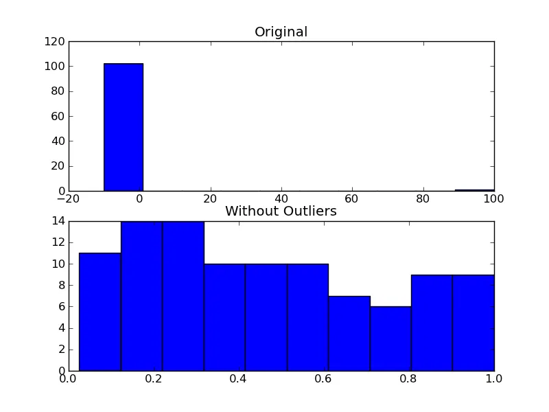
,但not False == True`。 - Will Dean~np.array(False) == True),但对于其他任何东西都不是这种情况。我应该澄清一下。(顺便说一句,按照惯例,如果some_array有多个元素,则not some_array会引发值错误。因此需要在上面的示例中使用~。) - Joe Kington如果您不关心拒绝异常值,正如Joe所提到的那样,而这只是出于美观原因,那么您可以仅设置图表的x轴限制:
plt.xlim(min_x_data_value,max_x_data_value)
在这里,values是您希望显示的限制。
plt.ylim(min,max)可以设置y轴上的限制。
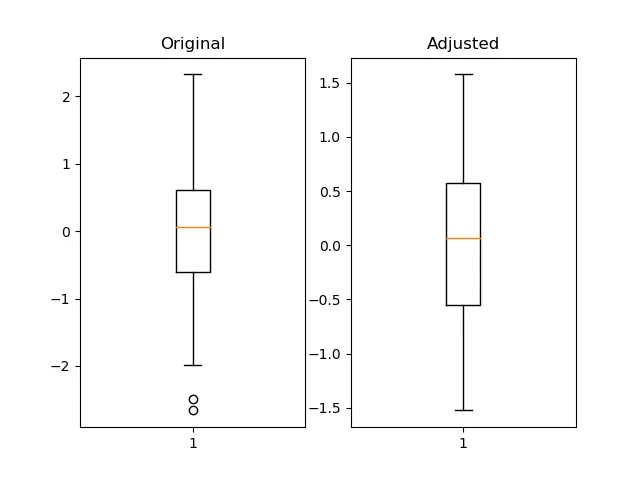
我认为使用pandas的分位数函数很有用且更加灵活。
import pandas as pd
import numpy as np
import matplotlib.pyplot as plt

fig = plt.figure()
ax1 = fig.add_subplot(121)
ax2 = fig.add_subplot(122)

pd_series = pd.Series(np.random.normal(size=300))
pd_series_adjusted = pd_series[pd_series.between(pd_series.quantile(.05), pd_series.quantile(.95))]

ax1.boxplot(pd_series)
ax1.set_title('Original')

ax2.boxplot(pd_series_adjusted)
ax2.set_title('Adjusted')

plt.show()
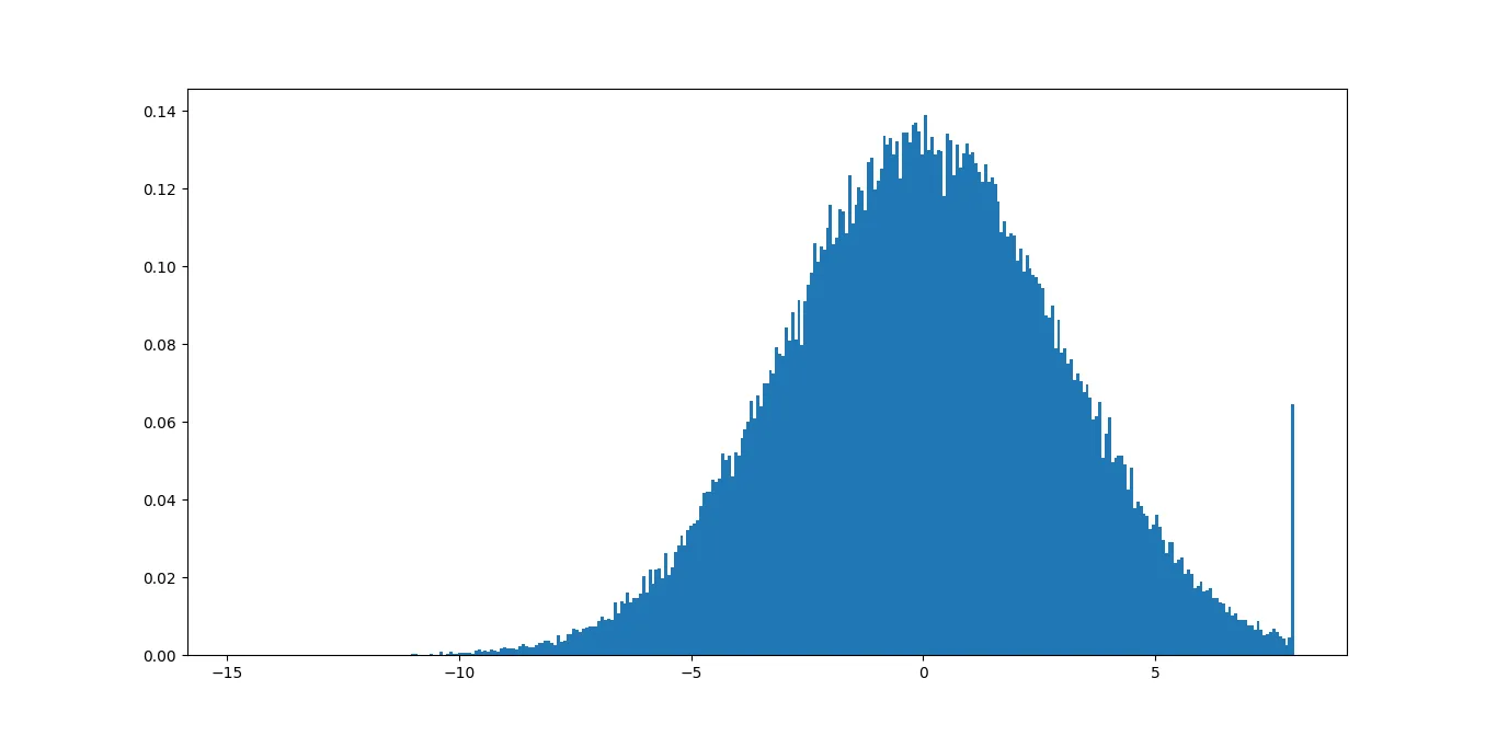
np.clip传递数据。如果您有数据的最大和最小值的合理估计,只需使用它即可。如果您没有合理的估计,剪裁数据的直方图将显示尾巴的大小,如果离群值确实只是离群值,则尾巴应该很小。import numpy as np
import matplotlib.pyplot as plt
data = np.random.normal(3, size=100000)
plt.hist(np.clip(data, -15, 8), bins=333, density=True)
如果你更改剪切函数中的最小值和最大值,直到找到适合你的数据的正确值,就可以比较结果。
import numpy as np
import matplotlib.pyplot as plt
# xdata = some x data points ...
# ydata = some y data points ...
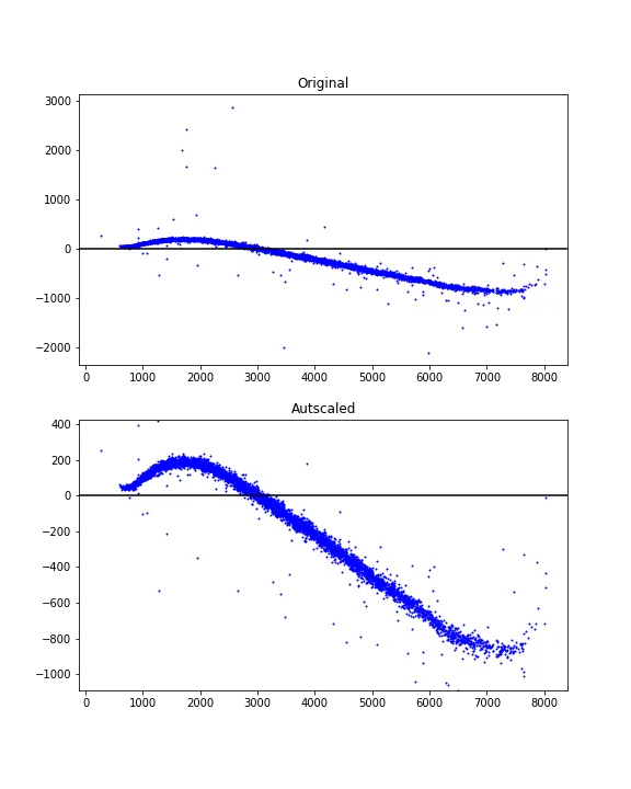
# Finding limits for y-axis
ypbot = np.percentile(ydata, 1)
yptop = np.percentile(ydata, 99)
ypad = 0.2*(yptop - ypbot)
ymin = ypbot - ypad
ymax = yptop + ypad
使用示例:
fig = plt.figure(figsize=(6, 8))

ax1 = fig.add_subplot(211)
ax1.scatter(xdata, ydata, s=1, c='blue')
ax1.set_title('Original')
ax1.axhline(y=0, color='black')

ax2 = fig.add_subplot(212)
ax2.scatter(xdata, ydata, s=1, c='blue')
ax2.axhline(y=0, color='black')
ax2.set_title('Autscaled')
ax2.set_ylim([ymin, ymax])

plt.show()