嗨,我想定义一个函数,该函数基于指定的日期范围返回一个异常值图,并同时绘制原始序列(并在这种情况下考虑可能的比率):
定义异常值:
  anomaly <- function(x)
               {   tt <- 1:length(x)
                   resid <- residuals(loess(x ~ tt))
                   resid.q <- quantile(resid,prob=c(0.25,0.75))
                   iqr <- diff(resid.q)
                   limits <- resid.q + 1.5*iqr*c(-1,1)
                   score <- abs(pmin((resid-limits[1])/iqr,0) + pmax((resid -                   limits[2])/iqr,0))

                   return(score)
            }
   # defining dates
     dates <- as.POSIXct(seq(as.Date("2015-08-20"), as.Date("2015-10-08"), by = "days"))
一些数据:
     a<-runif(50, 5.0, 7.5)
     b<-runif(50, 4, 8)
     c<-runif(50, 1, 2)
     d<-runif(50, 3, 3.5)
     ca<-c/a
     cb<-c/b
     df<-data.frame(dates,a,b,c,d,ca,cb)
介绍异常值
       df[49,4]<-0
       df[50,6]<-0
遍历数据以查找异常
      new<-lapply(df[,2:7],anomaly)
       library(stringi) # binding list with differing rows
     # from list to data frame
       res <- as.data.frame((stri_list2matrix(new)))
     # rename columns
       colnames(res) <- names(new)
     # depends on dates at the beginning
      res<-(cbind(dates,res[,1:6]))
     # melt to plot
       library(reshape)
       library(reshape2)
       new <- melt(res , id.vars = 'dates', variable.name = 'series')
定义指定日期范围(最近4天)的图表:
       library(ggplot2)

       nrdays <- 4
       a.plot<-ggplot(subset(new, new$dates >= as.POSIXct(max(new$dates)- (nrdays*60*60*24))),
         aes(x=dates,y=value,colour=variable,group=variable)) +
         geom_line() +
         facet_grid(variable ~ ., scales = "free_y")+
         ylab("Outliers")+
         xlab("Date")
定义检查数据函数:
          check_data <- function(df) {
          if(tail(df, 1) > 0) { # check only last date

            return(a.plot)

           # and the corresponding original series

        }
      }
        # check and plot data
          check_data(df)
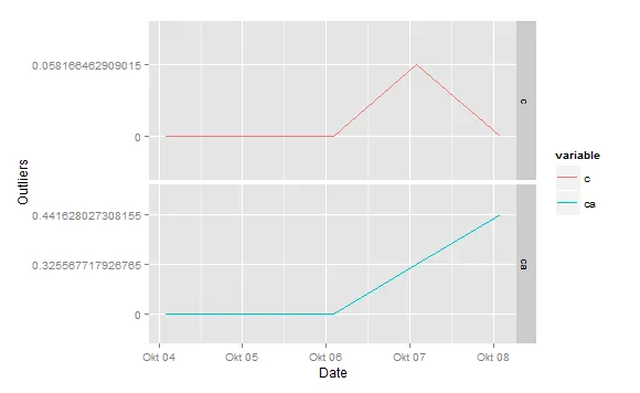
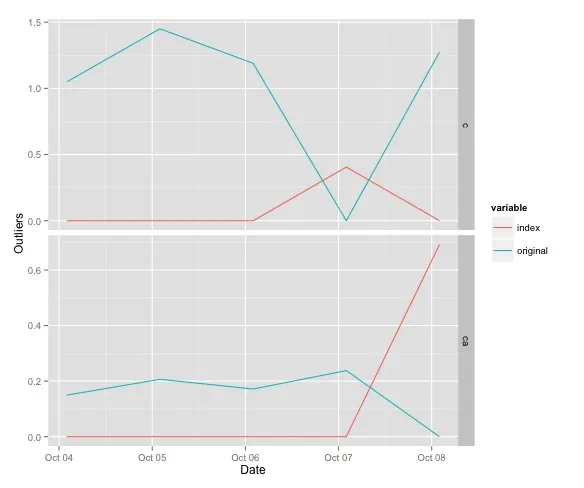
我的问题是我有成百上千个特征,我只想绘制那些发生了异常值的图。正如你在图表中看到的,我能够得出一张包含所有时间序列的图,包括具有离群值的序列,而不仅仅是只有异常值发生的序列。此外,我还想报告原始序列(包括比率),也就是说,如果在比率ca中出现异常值,我还想获得原始序列c和a。...我该如何解决这个问题。因此输出可能如下所示:
including original series:
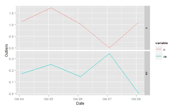
and the outlier as well:
SO规则为新手创建了一个可重现的例子,并尝试尽可能清晰地表达。这引起了5个感兴趣用户的关注,并在5天后发布了悬赏。但有些人仅仅因为没有提出建设性批评或任何有关调整方法的建议就给了负投票。 - user3833190is_anomaly <- function() {..}可能与长的代码块一样有用。尝试只展示一个代码块。此外,您似乎已朝着正确的方向前进,所以大部分听起来像是您只想让其他人为您工作,因此才提供悬赏。不是要冒犯您,只是顺便说一下... - PascalVKooten