我正在尝试使用密度图来识别离群值。我目前使用的是seaborn库来绘制我的数据。我应该如何识别离群值?我一直在考虑使用统计库中的Z分数方法,这是唯一的方式吗?或者在密度图中也可以完成这个任务吗?
如何使用密度图识别异常值
4
- B.Billy
1
你可以分享一些你写过的代码和数据图。我建议你看看 DBSCAN。它是一种可以发现密度异常值的聚类算法。 - Eskapp
1个回答
2
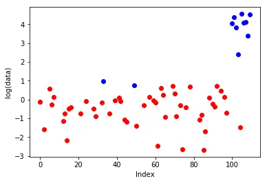
Kernel密度估计是根据给定的数据估计假设的概率密度函数(PDF)。现在,我们有一个问题:哪些数据点应该被视为异常值。异常值是稀有的数据点,即PDF极低的那些点。我们不知道PDF,但知道它的估计值。因此,我们可以使用这个估计来识别异常值。
基本思路是:1)计算所有数据点的Kernel密度估计;2)找到那些估计值低于某个预定义阈值的点。后者将成为异常值。
让我们写一些代码来说明这个过程。原始答案称为"最初的回答"。
基本思路是:1)计算所有数据点的Kernel密度估计;2)找到那些估计值低于某个预定义阈值的点。后者将成为异常值。
让我们写一些代码来说明这个过程。原始答案称为"最初的回答"。
import numpy as np
# import seaborn as sns # you probably can use seaborn to get pdf-estimation values, I would use scikit-learn package for this.
from matplotlib import pyplot as plt
from sklearn.neighbors import KernelDensity

# 100 normally distributed data points and approximately 10 outliers in the end of the array.
data = np.r_[np.random.randn(100), np.random.rand(10)*100][:, np.newaxis]

# you an use kernel='gaussian' instead
kde = KernelDensity(kernel='tophat', bandwidth=0.75).fit(data)

yvals = kde.score_samples(data)  # yvals are logs of pdf-values
yvals[np.isinf(yvals)] = np.nan # some values are -inf, set them to nan

# approx. 10 percent of smallest pdf-values: lets treat them as outliers
outlier_inds = np.where(yvals < np.percentile(yvals, 10))[0]
print(outlier_inds)
non_outlier_inds = np.where(yvals >= np.percentile(yvals, 10))[0]
print(non_outlier_inds)

[ 33  49 100 101 102 103 105 106 107 108 109]
[  0   1   2   3   4   5   6   7   8   9  10  11  12  13  14  15  16  17
  18  19  20  21  22  23  24  25  26  27  28  29  30  31  32  34  35  36
  37  38  39  40  41  42  43  44  45  46  47  48  50  51  52  53  54  55
  56  57  58  59  60  61  62  63  64  65  66  67  68  69  70  71  72  73
  74  75  76  77  78  79  80  81  82  83  84  85  86  87  88  89  90  91
  92  93  94  95  96  97  98  99 104]

# I applied log to data points because we need to visualize small (0,1) and large (up to 100) values on the same plot.
plt.plot(non_outlier_inds, np.log(data[non_outlier_inds]), 'ro',
         outlier_inds, np.log(data[outlier_inds]), 'bo')
plt.gca().set_xlabel('Index')
plt.gca().set_ylabel('log(data)')
plt.show()
- bubble
网页内容由stack overflow 提供, 点击上面的可以查看英文原文,
原文链接
原文链接