我正在尝试使用回归线的第5和第95百分位数来识别数据集中的异常值,因此我使用了Python中的statsmodel、matplotlib和pandas进行分位数回归。根据blokeley的答案,我可以创建一个散点图来显示基于分位数回归的最佳拟合线和第5和第95百分位的线。但是如何识别那些落在这些线以上和以下的点,并将它们保存到pandas dataframe中呢?
我的数据看起来像这样(总共有95个值):
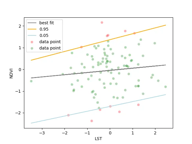
这是我的图表: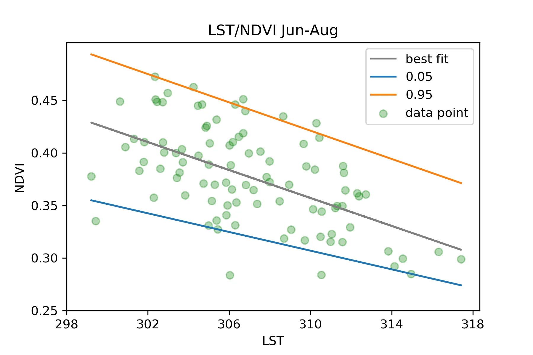 从图中,我可以明显看到一些数据点在95线以上和5线以下,被认为是异常值。但我想要在原始的数据框中识别它们,并且或许绘制它们在图表上或以某种方式突出显示它们作为“异常值”。
我正在寻找一种方法,但没有找到,希望得到帮助。
我的数据看起来像这样(总共有95个值):
    Month   Year    LST     NDVI
0   June    1984    310.550975  0.344335
1   June    1985    310.495331  0.320504
2   June    1986    306.820900  0.369494
3   June    1987    308.945602  0.369946
4   June    1988    308.694022  0.31863
我目前所写的脚本如下:
import pandas as pd
excel = my_excel
df = pd.read_excel(excel)
df.head()

import matplotlib.pyplot as plt
import numpy as np
import pandas as pd
import statsmodels.formula.api as smf

model = smf.quantreg('NDVI ~ LST',df)
quantiles = [0.05,0.95]
fits = [model.fit(q=q) for q in quantiles]
figure,axes = plt.subplots()
x = df['LST']
y = df['NDVI']
axes.scatter(x,df['NDVI'],c='green',alpha=0.3,label='data point')
fit = np.polyfit(x, y, deg=1)
axes.plot(x, fit[0] * x + fit[1], color='grey',label='best fit')
_x = np.linspace(x.min(),x.max())
for index, quantile in enumerate(quantiles):
    _y = fits[index].params['LST'] * _x + fits[index].params['Intercept']
    axes.plot(_x, _y, label=quantile)

title = 'LST/NDVI Jun-Aug'
plt.title(title)
axes.legend()
axes.set_xticks(np.arange(298,320,4))
axes.set_yticks(np.arange(0.25,0.5,.05))
axes.set_xlabel('LST')
axes.set_ylabel('NDVI');
这是我的图表:
从图中,我可以明显看到一些数据点在95线以上和5线以下,被认为是异常值。但我想要在原始的数据框中识别它们,并且或许绘制它们在图表上或以某种方式突出显示它们作为“异常值”。我正在寻找一种方法,但没有找到,希望得到帮助。