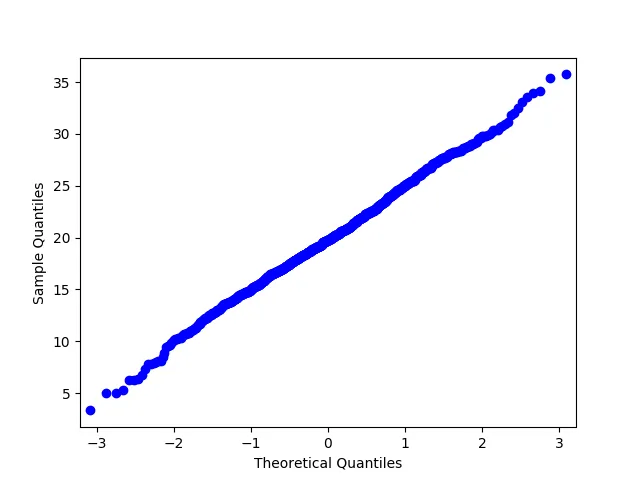
我正在尝试确定具有特定参数的正态分布是否适合于数据集。但是,似乎 qqplot 的效果不如预期。以下是一个小例子:
import numpy as np
import statsmodels.api as sm
import pylab

test = np.random.normal(20,5, 1000)

sm.qqplot(test, loc = 20, scale = 5 ,  line='45')
pylab.show()
从图中可以看出,我期望的点应该在斜率为1的直线上,但实际上给出了以下图形:
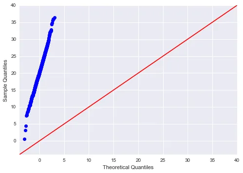
有人能解释一下为什么会这样吗?