使用Matplotlib在多线图中显示误差条

3
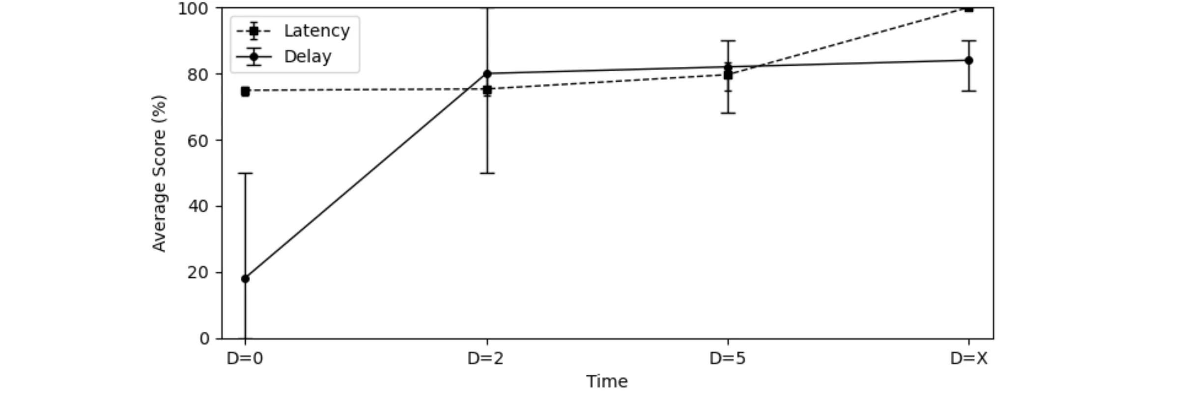
我使用matplotlib创建了一个多线条的图,现在我想在X轴上显示每个参数的最小值和最大值。我的代码如下:
import numpy as np
import pandas as pd
from pandas import DataFrame
import matplotlib.pyplot as plt
from matplotlib import pyplot as plt
import seaborn as sns

df = pd.DataFrame({'Time': ['D=0','D=2','D=5','D=X'],
    'Latency': [74.92, 75.32, 79.64, 100],
    'Delay': [18.2,80,82,84]
   })

  plt.plot( 'Time', 'Latency', data=df, marker='s', color='black', markersize=4,     linewidth=1, linestyle='--')
  plt.plot( 'Time', 'Delay', data=df, marker='o', color='black',  markersize=4, linewidth=1,linestyle='-')

   plt.legend()
   plt.xlabel("Time")
   plt.ylabel("Average Score (%)")
   plt.ylim(0, 100)
   plt.xlim('D=0','D=X')
   plt.savefig('Fig2.png', dpi=300, bbox_inches='tight')
   plt.show()

我想要添加的间隔(min-max)是:

Latency: 
D=0 => {73.3, 76}
D=2 => {73.3, 80}
D=5 => {75, 83.3}
D=X => {100}
Delay:
D=0 => {0, 50}
D=2 => {50, 100}
D=5 => {68, 90}
D=X => {75, 90}

非常感谢您的提前帮助。
3个回答

2

plt.errorbar() 绘制带误差线的线图。它的参数与 plt.plot() 非常相似。为避免误差线被绘图边界截断,xlims 需要略微加宽。

import numpy as np
import pandas as pd
import matplotlib.pyplot as plt

df = pd.DataFrame({'Time': ['D=0', 'D=2', 'D=5', 'D=X'],
                   'Latency': [74.92, 75.32, 79.64, 100],
                   'Delay': [18.2, 80, 82, 84]})
latency_min_max = np.array([(73.3, 76), (73.3, 80), (75, 83.3), (100, 100)]).T
latency_err = np.abs(latency_min_max - df['Latency'].to_numpy())
delay_min_max = np.array([(0, 50), (50, 100), (68, 90), (75, 90)]).T
delay_err = np.abs(delay_min_max - df['Delay'].to_numpy())

plt.errorbar('Time', 'Latency', yerr=latency_err, data=df, marker='s', capsize=2,
             color='black', markersize=4, linewidth=1, linestyle='--')
plt.errorbar('Time', 'Delay', yerr=delay_err, data=df,
             marker='o', capsize=4, color='black', markersize=4, linewidth=1, linestyle='-')
plt.legend()
plt.xlabel("Time")
plt.ylabel("Average Score (%)")
plt.ylim(0, 100)
plt.xlim(-0.2, 3.2)
plt.savefig('Fig2.png', dpi=300, bbox_inches='tight')
plt.show()

示例图

另一种方法是使用plt.fill_between创建误差带:

plt.fill_between(df['Time'], latency_min_max[0, :], latency_min_max[1, :], color='red', alpha=0.2, label='Latency error')
plt.fill_between(df['Time'], delay_min_max[0, :], delay_min_max[1, :], color='blue', alpha=0.2, label='Delay error')

plot with errorbands


非常感谢 @JohanC 的帮助。 - Vincent

2

首先将错误值放入列表中:

latency_lower_err = [73.3, 73.3, 75, 100]
latency_upper_err = [76, 80, 83.3, 100]

然后从这些值中减去数据点,因为matplotlib需要从误差限到相应数据点的距离(以绝对单位表示):

latency_lower_err = (latency_lower_err - df['Latency']).abs() 
latency_upper_err = (latency_upper_err - df['Latency']).abs()

把得到的值放入一个列表中,其中第一个元素是较低的误差,第二个元素是较高的误差:
yerr = [latency_lower_err, latency_upper_err]

然后将调用从plt.plot更改为plt.errorbar,并添加yerr参数:

plt.errorbar('Time', 'Latency', data=df, yerr=yerr, capsize=5, ... )

剩余的参数与您之前用于plt.plot相同。
结果: enter image description hereDelay调整相同的逻辑,以获取该变量的错误。

非常感谢 @jfaccioni 的帮助。 - Vincent

1
你应该使用plt.errorbar而不是plt.plot,然后将数据点与下限/上限之间的差的绝对值分配为下限/上限误差值(numpy具有方便的向量化处理)。为了避免误差棒的帽子重叠并可能令人困惑,建议使用不同的颜色并更新图例。
从演示角度来看,可能更好的方式是在坐标轴周围留出一些空白,这样数据看起来不会被截断-您可以相应地设置plt.xlimplt.ylim。感谢@JohanC首先做到这一点。
import numpy as np
import pandas as pd
from pandas import DataFrame
import matplotlib.pyplot as plt
from matplotlib import pyplot as plt
import seaborn as sns

df = pd.DataFrame({'Time': ['D=0','D=2','D=5','D=X'],
    'Latency': [74.92, 75.32, 79.64, 100],
    'Delay': [18.2,80,82,84]
   })

latency_limits = np.array([[73.3,73.3,75,100],[76,80,83.3,100]])
delay_limits = np.array([[0,50,68,75],[50,100,90,90]])

latency_errors = abs(df.Latency.values - latency_limits)
delay_errors = abs(df.Delay.values - delay_limits)

yerr = np.array([[1,1,1,1],[5,5,5,5]])

fig = plt.figure()
Latency = plt.errorbar(
  x=df.Time, 
  y=df.Latency, 
  yerr=latency_errors, 
  capsize=4,
  marker='s', 
  color='red', 
  markersize=4, 
  linewidth=1, 
  linestyle='--')

Delay = plt.errorbar(
  x=df.Time, 
  y=df.Delay, 
  yerr=delay_errors,
  capsize=4,
  marker='o', 
  color='blue',  
  markersize=4, 
  linewidth=1,
  linestyle='-')

plt.legend((Latency, Delay),("Latency","Delay"))
plt.xlabel("Time")
plt.ylabel("Average Score (%)")
## widen both limits to give some whitespace to the plot
plt.ylim(-5, 105)
plt.xlim(-0.2, 3.2)
# plt.savefig('Fig2.png', dpi=300, bbox_inches='tight')
plt.margins(5,5)
plt.show()

enter image description here


非常感谢 @Derek Oi 的帮助。 - Vincent

网页内容由stack overflow 提供, 点击上面的
可以查看英文原文,
原文链接