我是新手,对于使用Python绘图方面不是很熟悉,但我想知道如何在matplotlib中获取笛卡尔坐标平面? 我指的是以箭头结束的垂直参考线(坐标轴)在原点(0,0)相交,原点位于绘图中心的情况。
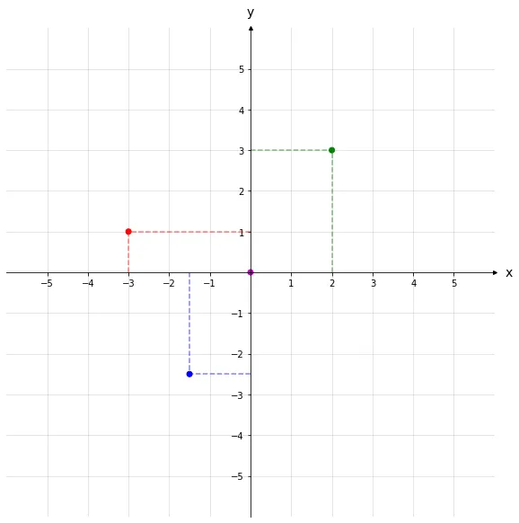
可以将其类比为高中几何学习中使用的平面图,以下是我需要实现的完美示例:

我是新手,对于使用Python绘图方面不是很熟悉,但我想知道如何在matplotlib中获取笛卡尔坐标平面? 我指的是以箭头结束的垂直参考线(坐标轴)在原点(0,0)相交,原点位于绘图中心的情况。
可以将其类比为高中几何学习中使用的平面图,以下是我需要实现的完美示例:
这里是另一种绘制笛卡尔坐标系的方法,基于已经给出的答案。
import numpy as np                 # v 1.19.2
import matplotlib.pyplot as plt    # v 3.3.2

# Enter x and y coordinates of points and colors
xs = [0, 2, -3, -1.5]
ys = [0, 3, 1, -2.5]
colors = ['m', 'g', 'r', 'b']

# Select length of axes and the space between tick labels
xmin, xmax, ymin, ymax = -5, 5, -5, 5
ticks_frequency = 1

# Plot points
fig, ax = plt.subplots(figsize=(10, 10))
ax.scatter(xs, ys, c=colors)

# Draw lines connecting points to axes
for x, y, c in zip(xs, ys, colors):
    ax.plot([x, x], [0, y], c=c, ls='--', lw=1.5, alpha=0.5)
    ax.plot([0, x], [y, y], c=c, ls='--', lw=1.5, alpha=0.5)

# Set identical scales for both axes
ax.set(xlim=(xmin-1, xmax+1), ylim=(ymin-1, ymax+1), aspect='equal')

# Set bottom and left spines as x and y axes of coordinate system
ax.spines['bottom'].set_position('zero')
ax.spines['left'].set_position('zero')

# Remove top and right spines
ax.spines['top'].set_visible(False)
ax.spines['right'].set_visible(False)

# Create 'x' and 'y' labels placed at the end of the axes
ax.set_xlabel('x', size=14, labelpad=-24, x=1.03)
ax.set_ylabel('y', size=14, labelpad=-21, y=1.02, rotation=0)

# Create custom major ticks to determine position of tick labels
x_ticks = np.arange(xmin, xmax+1, ticks_frequency)
y_ticks = np.arange(ymin, ymax+1, ticks_frequency)
ax.set_xticks(x_ticks[x_ticks != 0])
ax.set_yticks(y_ticks[y_ticks != 0])

# Create minor ticks placed at each integer to enable drawing of minor grid
# lines: note that this has no effect in this example with ticks_frequency=1
ax.set_xticks(np.arange(xmin, xmax+1), minor=True)
ax.set_yticks(np.arange(ymin, ymax+1), minor=True)

# Draw major and minor grid lines
ax.grid(which='both', color='grey', linewidth=1, linestyle='-', alpha=0.2)

# Draw arrows
arrow_fmt = dict(markersize=4, color='black', clip_on=False)
ax.plot((1), (0), marker='>', transform=ax.get_yaxis_transform(), **arrow_fmt)
ax.plot((0), (1), marker='^', transform=ax.get_xaxis_transform(), **arrow_fmt)

plt.show()
请注意,我没有添加显示点坐标的注释。根据我的经验,这需要更多的代码来精确定位它们并最小化重叠。要获得注释,最好使用adjustText包或交互式绘图库,例如Plotly。
这是一个老问题,但我认为在今天的matplotlib版本中,关键字是spines。您可以执行以下操作:
ax = plt.gca()
ax.spines['top'].set_color('none')
ax.spines['bottom'].set_position('zero')
ax.spines['left'].set_position('zero')
ax.spines['right'].set_color('none')
该链接提供更多示例。
from pylab import *

x = [0,2,-3,-1.5]
y = [0,3,1,-2.5]
color=['m','g','r','b']

scatter(x,y, s=100 ,marker='o', c=color)

show()
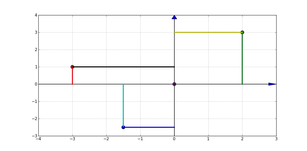
美化输出(使用箭头和虚线):
from pylab import *
import matplotlib.pyplot as plt

x = [0,2,-3,-1.5]
y = [0,3,1,-2.5]
color=['m','g','r','b']

fig = plt.figure()
ax = fig.add_subplot(111)

scatter(x,y, s=100 ,marker='o', c=color)

[ plot( [dot_x,dot_x] ,[0,dot_y], '-', linewidth = 3 ) for dot_x,dot_y in zip(x,y) ]
[ plot( [0,dot_x] ,[dot_y,dot_y], '-', linewidth = 3 ) for dot_x,dot_y in zip(x,y) ]

left,right = ax.get_xlim()
low,high = ax.get_ylim()
arrow( left, 0, right -left, 0, length_includes_head = True, head_width = 0.15 )
arrow( 0, low, 0, high-low, length_includes_head = True, head_width = 0.15 )

grid()

show()
还有一些工作要做,但离结果不远:
import matplotlib.pyplot as plt


def build_cartesian_plane(max_quadrant_range):
    """ The quadrant range controls the range of the quadrants"""
    l = []
    zeros = []
    plt.grid(True, color='b', zorder=0,)
    ax = plt.axes()
    head_width = float(0.05) * max_quadrant_range
    head_length = float(0.1) * max_quadrant_range
    ax.arrow(0, 0, max_quadrant_range, 0, head_width=head_width, head_length=head_length, fc='k', ec='k',zorder=100)
    ax.arrow(0, 0, -max_quadrant_range, 0, head_width=head_width, head_length=head_length, fc='k', ec='k', zorder=100)
    ax.arrow(0, 0, 0, max_quadrant_range, head_width=head_width, head_length=head_length, fc='k', ec='k', zorder=100)
    ax.arrow(0, 0, 0, -max_quadrant_range, head_width=head_width, head_length=head_length, fc='k', ec='k', zorder=100)
    counter_dash_width = max_quadrant_range * 0.02
    dividers = [0,.1,.2,.3,.4, .5, .6, .7, .8, .9, 1]
    for i in dividers:
        plt.plot([-counter_dash_width, counter_dash_width], [i*max_quadrant_range, i*max_quadrant_range], color='k')
        plt.plot([i * max_quadrant_range, i*max_quadrant_range], [-counter_dash_width, counter_dash_width], color='k')
        plt.plot([-counter_dash_width, counter_dash_width], [-i * max_quadrant_range, -i * max_quadrant_range], color='k')
        plt.plot([-i * max_quadrant_range, -i * max_quadrant_range], [-counter_dash_width, counter_dash_width], color='k')
        l.append(i * max_quadrant_range)
        l.append(-i * max_quadrant_range)
        zeros.append(0)
        zeros.append(0)


build_cartesian_plane(10)
plt.show()