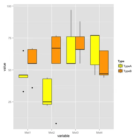
组间箱线图?

17

我有一个数据集(测试),如下所示:

Type    Met1    Met2    Met3    Met4
TypeA   65  43  97  77
TypeA   46  25  76  77
TypeA   44  23  55  46
TypeA   46  44  55  77
TypeA   33  22  55  54
TypeB   66  8   66  47
TypeB   55  76  66  65
TypeB   55  77  88  46
TypeB   36  67  55  44
TypeB   67  55  76  65

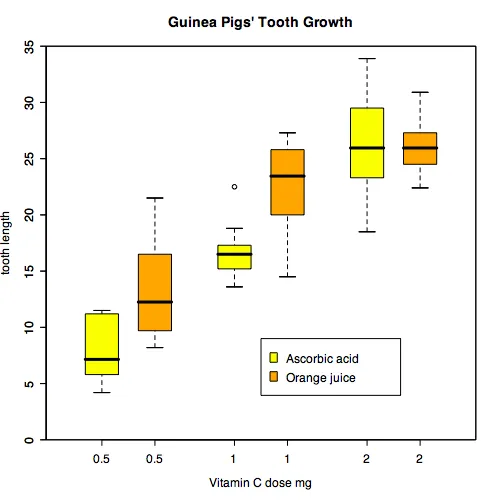
我已经查了很多关于箱线图的链接,但是我还没有成功地得到我想要的类型的箱线图。我希望我的X轴为所有Mets(Met1、Met2、Met3、Met4)的A型(黄色、橙色)。实质上,我想要像以下这样的东西(来自这里):

enter image description here

我正在尝试一些方法,

boxplot(formula = len ~ Type , data = test, subset == "TypeA")
boxplot(formula = len ~ Type , data = test, subset == "TypeA", add=TRUE)
Legend(legend = c( "typeA", "typeB" ), fill = c( "yellow", "orange" ) )

但是我无法用任何方法解决它。有人可以帮助我了解如何以正确的方式在我的测试数据上制作这样的箱线图吗?


3
你需要学会仔细阅读代码,例如,
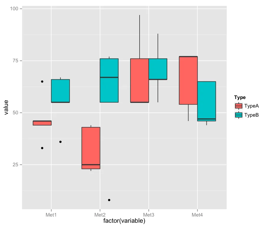
subset == "TypeA"显然不是你所链接示例中展示的内容。 - Roland
4个回答

20

使用 ggplot2 的解决方案。

首先,使用 melt 将数据框 test 转换为长格式:

library(reshape2)
test.m <- melt(test)

绘制数据:

library(ggplot2)
ggplot(test.m, aes(x = variable, y = value, fill = Type)) +
  geom_boxplot() +
  scale_fill_manual(values = c("yellow", "orange"))

输入图像描述


7
正如其他人所说,你需要先将数据融合。
df <- read.table(text="Type    Met1    Met2    Met3    Met4
TypeA   65  43  97  77
TypeA   46  25  76  77
TypeA   44  23  55  46
TypeA   46  44  55  77
TypeA   33  22  55  54
TypeB   66  8   66  47
TypeB   55  76  66  65
TypeB   55  77  88  46
TypeB   36  67  55  44
TypeB   67  55  76  65",header=TRUE)

library(reshape2)
df2 <- melt(df)

boxplot(
  formula = value ~ variable,
  data    = df2,
  boxwex  = 0.25,
  at      = 1:4 - 0.2,
  subset  = Type == "TypeA",
  col     = "yellow",
  main    = "blah",
  xlab    = "x",
  ylab    = "y",
  ylim    = c( 0, ceiling( max( df2$value ) ) + 1 ),
  yaxs    = "i" )


boxplot(
  formula = value ~ variable,
  data    = df2,
  boxwex  = 0.25,
  at      = 1:4 + 0.2,
  subset  = Type == "TypeB",
  col     = "orange",
  add     = TRUE )

3

like this,

test <- structure(list(Type = structure(c(1L, 1L, 1L, 1L, 1L, 2L, 2L, 
    2L, 2L, 2L), .Label = c("TypeA", "TypeB"), class = "factor"), 
    Met1 = c(65L, 46L, 44L, 46L, 33L, 66L, 55L, 55L, 36L, 67L
    ), Met2 = c(43L, 25L, 23L, 44L, 22L, 8L, 76L, 77L, 67L, 55L
    ), Met3 = c(97L, 76L, 55L, 55L, 55L, 66L, 66L, 88L, 55L, 
    76L), Met4 = c(77L, 77L, 46L, 77L, 54L, 47L, 65L, 46L, 44L, 
    65L)), .Names = c("Type", "Met1", "Met2", "Met3", "Met4"), 
    class = "data.frame", row.names = c(NA, -10L))


# install.packages("ggplot2", dependencies = TRUE)
require(ggplot2)
require(reshape2)
df <- melt(test)
p <- ggplot(df, aes(factor(variable), value)) + geom_boxplot(aes(fill = Type))
p

enter image description here

You take a look at the geom_boxplot manual page.


2
您可以使用reshape函数将Met1、..、Met4列中的所有数据制作成长列。它还创建了一列(temp$time),用于标识数据来自哪个列,您可以使用它来分层您的箱形图(temp$Type*temp$time)。
df <- read.table(text=
"Type Met1 Met2 Met3 Met4
TypeA   65  43  97  77
TypeA   46  25  76  77
TypeA   44  23  55  46
TypeA   46  44  55  77
TypeA   33  22  55  54
TypeB   66  8   66  47
TypeB   55  76  66  65
TypeB   55  77  88  46
TypeB   36  67  55  44
TypeB   67  55  76  65",header=TRUE)

temp <- reshape(df, direction='long', varying = 2:5, sep='')

boxplot(temp$Met ~ temp$Type*temp$time, col=c("yellow", "orange"))

网页内容由stack overflow 提供, 点击上面的
可以查看英文原文,
原文链接