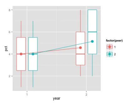
这是否接近您所想要的?每个peer值和每个year都有一个箱线图。我还包括了每个组的平均值。
ggplot(dat, aes(year, pct, group=interaction(year,peer), colour=factor(peer))) +
geom_boxplot(position=position_dodge(width=0.4), width=0.4) +
stat_summary(fun.y=mean, geom="line", position=position_dodge(width=0.4),
aes(group=peer)) +
stat_summary(fun.y=mean, geom="point", position=position_dodge(width=0.4), size=4,
aes(group=peer)) +
scale_x_continuous(breaks=unique(dat$year))
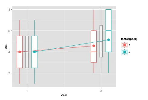
ggplot(dat, aes(year, pct, group=interaction(year,peer), colour=factor(peer))) +
geom_boxplot(aes(group=year), width=0.05, colour="grey60", fill="#FFFFFF90") +
geom_boxplot(position=position_dodge(width=0.4), width=0.2) +
stat_summary(fun.y=mean, geom="line", position=position_dodge(width=0.4),
aes(group=peer)) +
stat_summary(fun.y=mean, geom="point", position=position_dodge(width=0.4), size=4,
aes(group=peer)) +
scale_x_continuous(breaks=unique(dat$year))
更新:根据您的评论,也许可以这样:
基于您的评论,我们可能需要对此进行调整。
dat$id = rep(1:(nrow(dat)/2), each=2)
library(gridExtra)
pdf("plots.pdf", 7, 5)
for (i in unique(dat$id)) {
p1 = ggplot() +
geom_boxplot(data=dat[dat$peer==unique(dat$peer[dat$id==i]),],
aes(year, pct, group=year)) +
geom_point(data=dat[dat$id==i,], aes(year, pct),
pch=8, colour="red", size=5) +
ggtitle("Your Peers")
p2 = ggplot() +
geom_boxplot(data=dat, aes(year, pct, group=year)) +
geom_point(data=dat[dat$id==i,], aes(year, pct),
pch=8, colour="red", size=5) +
ggtitle("All Participants")
grid.arrange(p1, p2, ncol=2, main=paste0("ID = ", i))
}
dev.off()
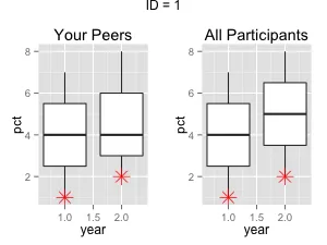
这是第一个图表的样子: