使用Python绘制带有两个y轴的3D图。

7
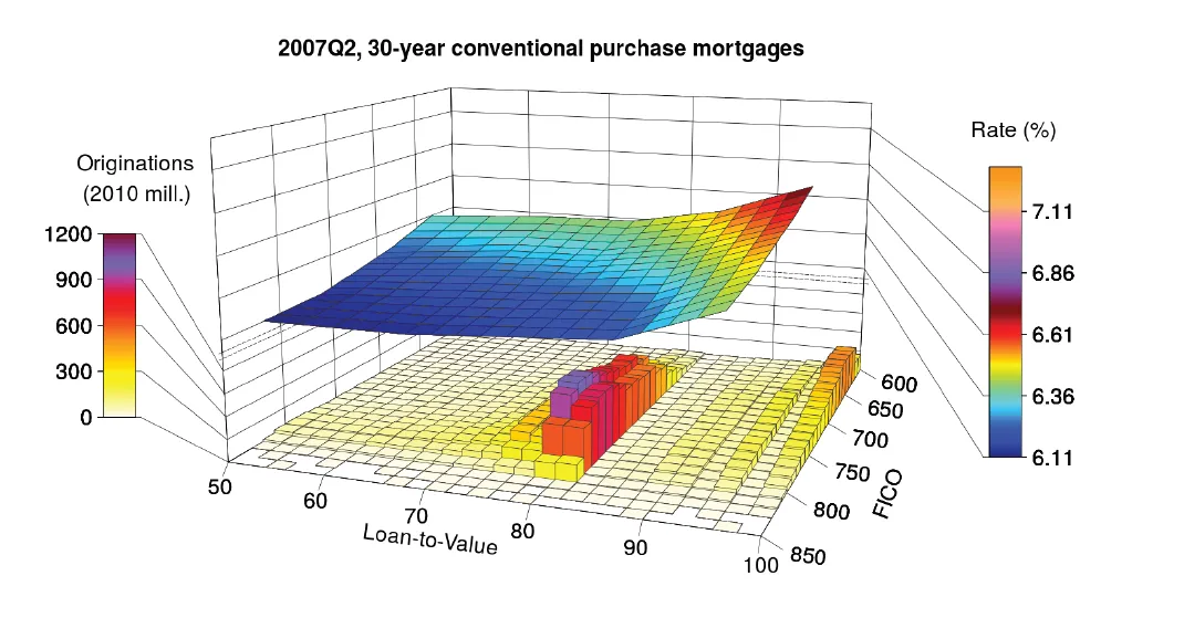
我试图创建一个类似于下面这张图表的绘图,该图表取自这篇论文,本质上是一个带有两个不同y轴的三维绘图。根据这篇博客中的指导,我创建了一个简单的示例。 模块
from mpl_toolkits import mplot3d
import numpy as np
%matplotlib inline
import numpy as np
import matplotlib.pyplot as plt

创建一些数据

def f(x, y):
    return np.sin(np.sqrt(x ** 2 + y ** 2))

x = np.linspace(-6, 6, 30)
y = np.linspace(-6, 6, 30)

X, Y = np.meshgrid(x, y)
Z = f(X, Y)
Z2 = Z*100+100

绘图
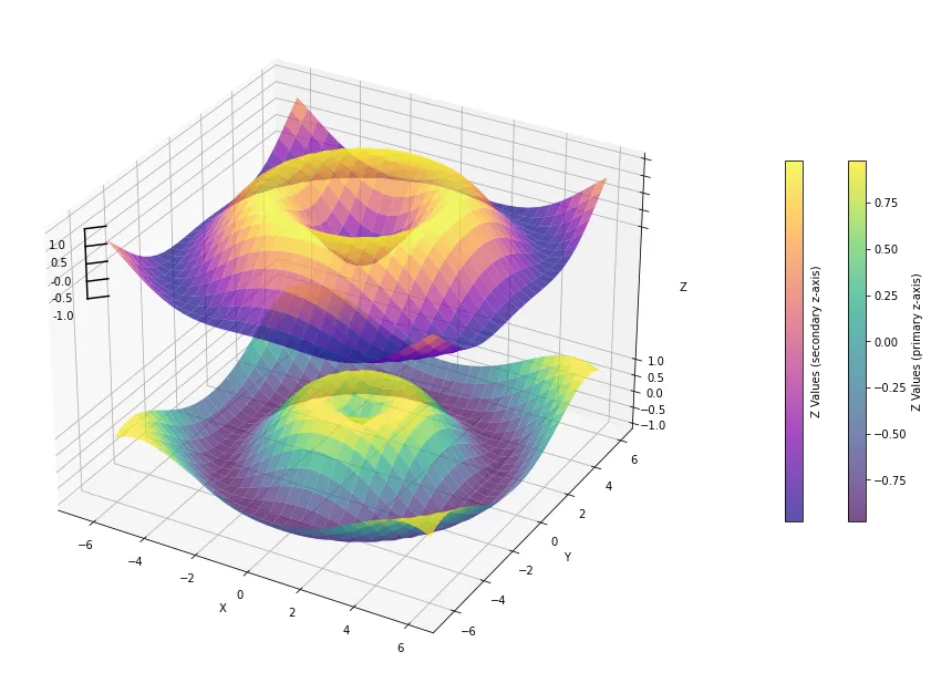
这样可以创建一个漂亮的3D图,但显然只有一个 y 轴。我在网上找不到任何有关如何在 Python 中实现此功能的建议,尽管有一些 Matlab 的建议。
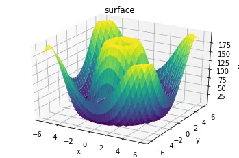
fig = plt.figure()
ax = plt.axes(projection='3d')
ax.plot_surface(X, Y, Z2, rstride=1, cstride=1,
                cmap='viridis', edgecolor='none')
ax.set_title('surface');
ax.set_xlabel('x')
ax.set_ylabel('y')
ax.set_zlabel('z');

代码的输出结果为:

plot

参考图表: this one

1个回答

1
这并不容易。一个可能的解决方法如下:
  • 根据您分享的参考图,我认为您实际上是想要实现第二个 z 轴,而不是 y 轴。
  • 3D 图的 axes 对象仍然是单数且共享的(出于必要性/明显的 matplotlib 3D 图的限制),但数据被绘制得好像在相同的连续值刻度上,然而轴刻度和标签被自定义覆盖以反映不同的值刻度

E.g.,

import numpy as np
import matplotlib.pyplot as plt


def f(x, y):
    return np.sin(np.sqrt(x ** 2 + y ** 2))


def g(x, y):
    return -np.cos(np.sqrt(x ** 2 + y ** 2))


x = np.linspace(-6, 6, 30)
y = np.linspace(-6, 6, 30)
X, Y = np.meshgrid(x, y)
Z = f(X, Y)
Z_new = g(X, Y)
offset = 5
Z_new_offset = Z_new + Z.max() + offset

fig = plt.figure(figsize=(16, 12))
ax = fig.add_subplot(111, projection="3d")

surf1 = ax.plot_surface(
    X, Y, Z, rstride=1, cstride=1, cmap="viridis", edgecolor="none", alpha=0.7
)

surf2 = ax.plot_surface(
    X,
    Y,
    Z_new_offset,
    rstride=1,
    cstride=1,
    cmap="plasma",
    edgecolor="none",
    alpha=0.7,
)

z_ticks_original = np.linspace(Z.min(), Z.max(), 5)

# Add custom tick labels and tick marks for the new plot on the left
z_ticks_new = np.linspace(Z_new_offset.min(), Z_new_offset.max(), 5)
for z_tick in z_ticks_new:
    ax.text(
        X.min() - 0.5,
        Y.min() - 2.5,
        z_tick + 0.25,
        f"{z_tick - (offset+1):.1f}",
        color="k",
        verticalalignment="center",
    )
    ax.plot(
        [X.min() - 0.5, X.min()],
        [Y.min() - 0.5, Y.min()],
        [z_tick, z_tick],
        color="k",
    )

ax.set_zticks(np.block([z_ticks_original, z_ticks_new]))

fig.canvas.draw()
labels = []
for lab, tick in zip(ax.get_zticklabels(), ax.get_zticks()):
    if float(tick) >= 1.0:
        lab.set_text("")
    labels += [lab]
ax.set_zticklabels(labels)

# Draw the left Z-axis line
ax.plot(
    [X.min() - 0.5] * 2,
    [Y.min() - 0.5] * 2,
    [z_ticks_new.min(), z_ticks_new.max()],
    color="k",
)

ax.set_xlabel("X")
ax.set_ylabel("Y")
ax.set_zlabel("Z")

cbar1 = fig.colorbar(
    surf1, ax=ax, pad=-0.075, orientation="vertical", shrink=0.5
)
cbar1.set_label("Z Values (primary z-axis)")
cbar2 = fig.colorbar(
    surf2,
    ax=ax,
    pad=0.12,
    orientation="vertical",
    shrink=0.5,
    ticks=z_ticks_original,
)
cbar2.set_label("Z Values (secondary z-axis)")


plt.show()


生成: {{link1:Matplotlib 3D图显示自定义设计的次共享Z轴刻度}}

网页内容由stack overflow 提供, 点击上面的
可以查看英文原文,
原文链接