使用Python库绘制共享y轴的两个水平条形图

18

我想绘制两个共享y轴的水平条形图。例如,以下问题展示了如何在R中实现:

使用ggplot2创建共享x轴的两个水平条形图(类似于人口金字塔)

如何用Python创建类似的图表?

上述问题中的图表如下所示:

enter image description here

这是上述图表中使用的州名列表(y轴):

["AK", "TX", "CA", "MT", "NM", "AZ", "NV", "CO", "OR", "WY", 
 "MI", "MN", "UT", "ID", "KS", "NE", "SD", "WA", "ND", "OK"]

以下是每个州销售人员数量的列表:

[20,30,40,10,15,35,18,25,22,7,12,22,3,4,5,8,14,28,24,32]
销售数据可以是随机的。
2个回答

38

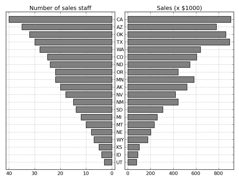
一般来说,如果你要显示的两个变量具有不同的单位或范围,你需要使用两个带有共享Y轴的子图。这类似于@regdoug的回答,但最好显式共享Y轴以确保数据保持对齐(例如在此示例中尝试缩放/平移)。

例如:

import matplotlib.pyplot as plt

y = range(20)
x1 = range(20)
x2 = range(0, 200, 10)

fig, axes = plt.subplots(ncols=2, sharey=True)
axes[0].barh(y, x1, align='center', color='gray')
axes[1].barh(y, x2, align='center', color='gray')
axes[0].invert_xaxis()
plt.show()

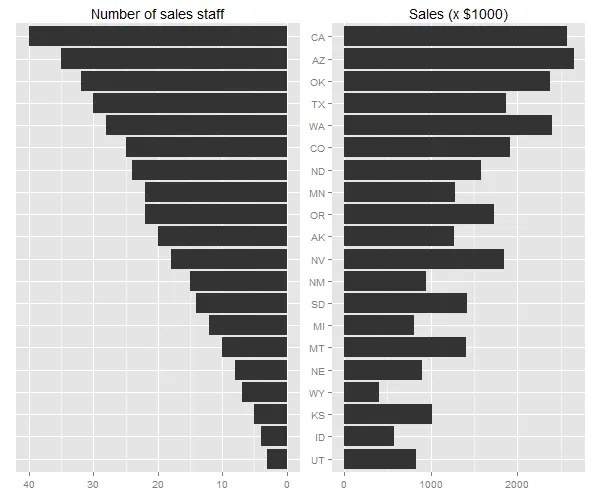
如果您想更精确地复制您所链接的问题中显示的示例(我将省略灰色背景和白色网格,但如果您喜欢,这些很容易添加):

import numpy as np
import matplotlib.pyplot as plt

# Data
states = ["AK", "TX", "CA", "MT", "NM", "AZ", "NV", "CO", "OR", "WY", "MI",
          "MN", "UT", "ID", "KS", "NE", "SD", "WA", "ND", "OK"]
staff = np.array([20, 30, 40, 10, 15, 35, 18, 25, 22, 7, 12, 22, 3, 4, 5, 8,
                  14, 28, 24, 32])
sales = staff * (20 + 10 * np.random.random(staff.size))

# Sort by number of sales staff
idx = staff.argsort()
states, staff, sales = [np.take(x, idx) for x in [states, staff, sales]]

y = np.arange(sales.size)

fig, axes = plt.subplots(ncols=2, sharey=True)
axes[0].barh(y, staff, align='center', color='gray', zorder=10)
axes[0].set(title='Number of sales staff')
axes[1].barh(y, sales, align='center', color='gray', zorder=10)
axes[1].set(title='Sales (x $1000)')

axes[0].invert_xaxis()
axes[0].set(yticks=y, yticklabels=states)
axes[0].yaxis.tick_right()

for ax in axes.flat:
    ax.margins(0.03)
    ax.grid(True)

fig.tight_layout()
fig.subplots_adjust(wspace=0.09)
plt.show()

在此输入图像描述

需要注意的是,我并没有正确对齐y轴刻度标签。虽然可以这样做,但比你想象的要麻烦得多。因此,如果您真的希望y轴刻度标签总是完美地居中于图形的中间位置,最简单的方法是以不同的方式绘制它们。而不是使用axes[0].set(yticks=y, yticklabels=states),您可以采取类似以下的方式:

axes[0].set(yticks=y, yticklabels=[])
for yloc, state in zip(y, states):
    axes[0].annotate(state, (0.5, yloc), xycoords=('figure fraction', 'data'),
                     ha='center', va='center')

如何在类似上面的条形图中更改x轴范围/限制,哪种方法最好? - Chuck
@Chuckaxes[0].axis(xmin=0, xmax=1)axes[1].axis(xmin=0, xmax=1) - digestivee

3

我在matplotlib邮件列表中找到了一些信息,然后修改了其中一个水平条形图示例来制作金字塔图。

下面列出的pyramid_plot函数将水平条形图并排绘制。

def pyramid_plot(ylabels, data_left, xlabel_left, data_right, xlabel_right, fig=None, **kwargs):
    if(fig is None):
        fig = plt.figure()

    y_pos = np.arange(len(ylabels))
    empty_ticks = tuple('' for n in people)

    fig.add_subplot(121)
    plt.barh(y_pos, data_left, **kwargs)
    plt.yticks(y_pos, empty_ticks)
    oldlims = plt.gca().get_xlim()
    plt.axis(xmin=oldlims[1], xmax=oldlims[0])
    plt.xlabel(xlabel_left)

    fig.add_subplot(122)
    plt.barh(y_pos, data_right, **kwargs)
    plt.yticks(y_pos, ylabels)
    plt.xlabel(xlabel_right)

    return fig

pyramid_plot函数的使用方法如下:

import matplotlib.pyplot as plt; plt.rcdefaults()
import numpy as np
import matplotlib.pyplot as plt

# Example data
people = ('Tom', 'Dick', 'Harry', 'Slim', 'Jim')
performance = 3 + 10 * np.random.rand(len(people))
salary = np.linspace(30,60,len(people))

# Plot the data
pyrfig = plt.figure(1)
pyrfig = pyramid_plot(people, salary, 'Salary (thousands)', performance, 'Performance', pyrfig, align='center', alpha=0.4)
pyrfig.suptitle('Pyramid Plot')
pyrfig.set_figwidth(1.5*pyrfig.get_figheight())
plt.show(pyrfig)

References:

http://matplotlib.org/examples/lines_bars_and_markers/barh_demo.html

https://www.mail-archive.com/matplotlib-users@lists.sourceforge.net/msg11606.html


网页内容由stack overflow 提供, 点击上面的
可以查看英文原文,
原文链接