我如何向现有的图表添加一条水平线?
7个回答
868
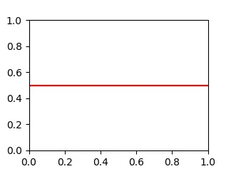
使用axhline(水平轴线)。例如,这将在y = 0.5处绘制一条水平线:
import matplotlib.pyplot as plt
plt.axhline(y=0.5, color='r', linestyle='-')
plt.show()
- BlivetWidget
85
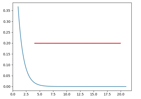
如果你想在坐标轴中绘制一条水平线,你可以尝试使用ax.hlines()方法。你需要指定y位置以及xmin和xmax在数据坐标系内(即x轴上实际数据范围)。以下是一个示例代码片段:
import matplotlib.pyplot as plt
import numpy as np

x = np.linspace(1, 21, 200)
y = np.exp(-x)

fig, ax = plt.subplots()
ax.plot(x, y)
ax.hlines(y=0.2, xmin=4, xmax=20, linewidth=2, color='r')

plt.show()
上面的代码片段将在坐标轴中绘制一条水平线,其
y=0.2。水平线始于 x=4,止于 x=20。生成的图片如下所示:
- jdhao
71
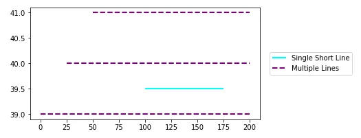
使用 matplotlib.pyplot.hlines:
- 这些方法适用于使用
seaborn和pandas.DataFrame.plot生成的图表,它们都使用matplotlib。 - 通过将
list传递给y参数,可以绘制多条水平线。 y可以作为单个位置传递:y=40y可以作为多个位置传递:y=[39, 40, 41]- 还有
matplotlib.axes.Axes.hlines用于面向对象的API。- 如果您使用类似于
fig,ax = plt.subplots()的东西绘制一个图形,则需要将plt.hlines或plt.axhline替换为相应的ax.hlines或ax.axhline。
- 如果您使用类似于
matplotlib.pyplot.axhline和matplotlib.axes.Axes.axhline只能绘制单个位置(例如y=40)- 有关使用
.vlines绘制垂直线的信息,请参见此answer。
plt.plot
import numpy as np
import matplotlib.pyplot as plt

xs = np.linspace(1, 21, 200)

plt.figure(figsize=(6, 3))
plt.hlines(y=39.5, xmin=100, xmax=175, colors='aqua', linestyles='-', lw=2, label='Single Short Line')
plt.hlines(y=[39, 40, 41], xmin=[0, 25, 50], xmax=[len(xs)], colors='purple', linestyles='--', lw=2, label='Multiple Lines')
plt.legend(bbox_to_anchor=(1.04,0.5), loc="center left", borderaxespad=0)
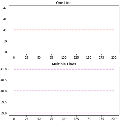
ax.plot
import numpy as np
import matplotlib.pyplot as plt

xs = np.linspace(1, 21, 200)
fig, (ax1, ax2) = plt.subplots(2, 1, figsize=(6, 6))

ax1.hlines(y=40, xmin=0, xmax=len(xs), colors='r', linestyles='--', lw=2)
ax1.set_title('One Line')

ax2.hlines(y=[39, 40, 41], xmin=0, xmax=len(xs), colors='purple', linestyles='--', lw=2)
ax2.set_title('Multiple Lines')

plt.tight_layout()
plt.show()
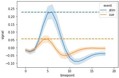
Seaborn轴级绘图
import seaborn as sns

# sample data
fmri = sns.load_dataset("fmri")

# max y values for stim and cue
c_max, s_max = fmri.pivot_table(index='timepoint', columns='event', values='signal', aggfunc='mean').max()

# plot
g = sns.lineplot(data=fmri, x="timepoint", y="signal", hue="event")

# x min and max
xmin, ymax = g.get_xlim()

# vertical lines
g.hlines(y=[c_max, s_max], xmin=xmin, xmax=xmax, colors=['tab:orange', 'tab:blue'], ls='--', lw=2)
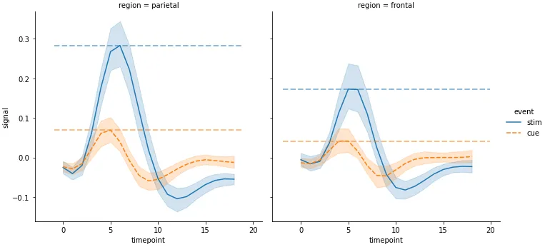
Seaborn图形级别绘图
- 必须通过每个坐标轴进行迭代
import seaborn as sns

# sample data
fmri = sns.load_dataset("fmri")

# used to get the max values (y) for each event in each region
fpt = fmri.pivot_table(index=['region', 'timepoint'], columns='event', values='signal', aggfunc='mean')

# plot
g = sns.relplot(data=fmri, x="timepoint", y="signal", col="region",hue="event", style="event", kind="line")

# iterate through the axes
for ax in g.axes.flat:
    # get x min and max
    xmin, xmax = ax.get_xlim()
    # extract the region from the title for use in selecting the index of fpt
    region = ax.get_title().split(' = ')[1]
    # get x values for max event
    c_max, s_max = fpt.loc[region].max()
    # add horizontal lines
    ax.hlines(y=[c_max, s_max], xmin=xmin, xmax=xmax, colors=['tab:orange', 'tab:blue'], ls='--', lw=2, alpha=0.5)
时间序列轴
xmin和xmax可以接受日期格式,例如'2020-09-10'或datetime(2020, 9, 10)- 使用
from datetime import datetime xmin=datetime(2020, 9, 10), xmax=datetime(2020, 9, 10) + timedelta(days=3)- 给定
date = df.index[9],则xmin=date, xmax=date + pd.Timedelta(days=3),其中索引是DatetimeIndex。
- 使用
- 轴上的日期列必须是
datetime dtype。如果使用pandas,则使用pd.to_datetime。对于数组或列表,请参考将numpy字符串数组转换为datetime或将datetime列表转换为日期python。
import pandas_datareader as web  # conda or pip install this; not part of pandas
import pandas as pd
import matplotlib.pyplot as plt

# get test data; the Date index is already downloaded as datetime dtype
df = web.DataReader('^gspc', data_source='yahoo', start='2020-09-01', end='2020-09-28').iloc[:, :2]

# display(df.head(2))
                   High          Low
Date
2020-09-01  3528.030029  3494.600098
2020-09-02  3588.110107  3535.229980

# plot dataframe
ax = df.plot(figsize=(9, 6), title='S&P 500', ylabel='Price')

# add horizontal line
ax.hlines(y=3450, xmin='2020-09-10', xmax='2020-09-17', color='purple', label='test')

ax.legend()
plt.show()
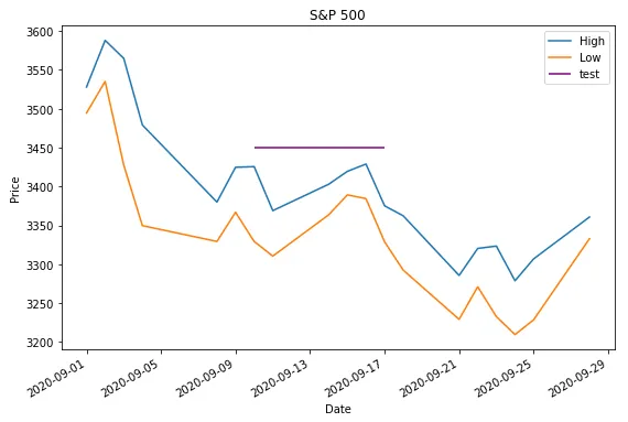
- 如果
web.DataReader无法使用,可以使用示例时间序列数据。
data = {pd.Timestamp('2020-09-01 00:00:00'): {'High': 3528.03, 'Low': 3494.6}, pd.Timestamp('2020-09-02 00:00:00'): {'High': 3588.11, 'Low': 3535.23}, pd.Timestamp('2020-09-03 00:00:00'): {'High': 3564.85, 'Low': 3427.41}, pd.Timestamp('2020-09-04 00:00:00'): {'High': 3479.15, 'Low': 3349.63}, pd.Timestamp('2020-09-08 00:00:00'): {'High': 3379.97, 'Low': 3329.27}, pd.Timestamp('2020-09-09 00:00:00'): {'High': 3424.77, 'Low': 3366.84}, pd.Timestamp('2020-09-10 00:00:00'): {'High': 3425.55, 'Low': 3329.25}, pd.Timestamp('2020-09-11 00:00:00'): {'High': 3368.95, 'Low': 3310.47}, pd.Timestamp('2020-09-14 00:00:00'): {'High': 3402.93, 'Low': 3363.56}, pd.Timestamp('2020-09-15 00:00:00'): {'High': 3419.48, 'Low': 3389.25}, pd.Timestamp('2020-09-16 00:00:00'): {'High': 3428.92, 'Low': 3384.45}, pd.Timestamp('2020-09-17 00:00:00'): {'High': 3375.17, 'Low': 3328.82}, pd.Timestamp('2020-09-18 00:00:00'): {'High': 3362.27, 'Low': 3292.4}, pd.Timestamp('2020-09-21 00:00:00'): {'High': 3285.57, 'Low': 3229.1}, pd.Timestamp('2020-09-22 00:00:00'): {'High': 3320.31, 'Low': 3270.95}, pd.Timestamp('2020-09-23 00:00:00'): {'High': 3323.35, 'Low': 3232.57}, pd.Timestamp('2020-09-24 00:00:00'): {'High': 3278.7, 'Low': 3209.45}, pd.Timestamp('2020-09-25 00:00:00'): {'High': 3306.88, 'Low': 3228.44}, pd.Timestamp('2020-09-28 00:00:00'): {'High': 3360.74, 'Low': 3332.91}}

df = pd.DataFrame.from_dict(data, 'index')
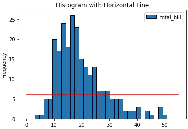
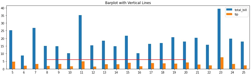
条形图和直方图
- 请注意,条形图的刻度位置是基于零起点索引的,与轴刻度标签无关,因此根据条形索引而不是刻度标签选择
xmin和xmax。ax.get_xticklabels()将显示位置和标签。
import pandas as pd
import seaborn as sns  # for tips data

# load data
tips = sns.load_dataset('tips')

# histogram
ax = tips.plot(kind='hist', y='total_bill', bins=30, ec='k', title='Histogram with Horizontal Line')
_ = ax.hlines(y=6, xmin=0, xmax=55, colors='r')

# barplot
ax = tips.loc[5:25, ['total_bill', 'tip']].plot(kind='bar', figsize=(15, 4), title='Barplot with Vertical Lines', rot=0)
_ = ax.hlines(y=6, xmin=3, xmax=15, colors='r')
- Trenton McKinney
22
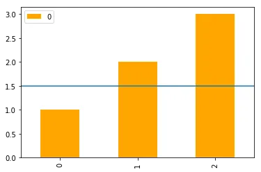
除了这里得票最高的答案之外,还可以在对 pandas 的 DataFrame 调用 plot 之后链式调用 axhline。
import pandas as pd

(pd.DataFrame([1, 2, 3])
   .plot(kind='bar', color='orange')
   .axhline(y=1.5));
- ayorgo
7
对于那些经常忘记命令axhline的人来说,一个简单易用的方法如下:
plt.plot(x, [y]*len(x))
在你的情况下,
xs = x 且 y = 40。
如果 x 的长度很大,那么这将变得低效,你应该真正使用 axhline。- LSchueler
7
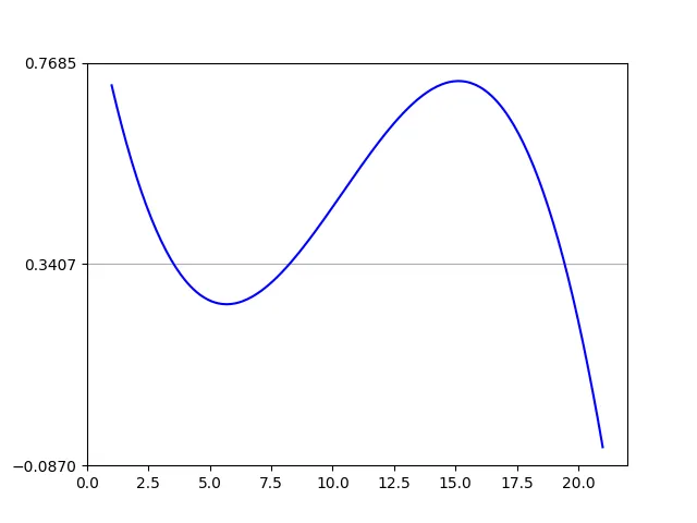
你是正确的,我认为
希望这能解决问题!
[0,len(xs)] 可能使你感到困惑。你需要重复使用原始的 x 轴变量 xs,并将其与另一个相同长度的 numpy 数组一起绘图,该数组包含您的变量。annual = np.arange(1,21,1)
l = np.array(value_list) # a list with 20 values
spl = UnivariateSpline(annual,l)
xs = np.linspace(1,21,200)
plt.plot(xs,spl(xs),'b')
#####horizontal line
horiz_line_data = np.array([40 for i in xrange(len(xs))])
plt.plot(xs, horiz_line_data, 'r--')
###########plt.plot([0,len(xs)],[40,40],'r--',lw=2)
pylab.ylim([0,200])
plt.show()
希望这能解决问题!
- chill_turner
1
32这个方法能够实现,但效率不高,特别是在创建可能非常大的数组时。如果你要使用这种方式,最好在开头和结尾各使用一个数据点。不过,matplotlib已经有了一个专门用于绘制水平线的函数。 - BlivetWidget
3
您可以使用
plt.grid绘制水平线。import numpy as np
from matplotlib import pyplot as plt
from scipy.interpolate import UnivariateSpline
from matplotlib.ticker import LinearLocator
# your data here
annual = np.arange(1,21,1)
l = np.random.random(20)
spl = UnivariateSpline(annual,l)
xs = np.linspace(1,21,200)
# plot your data
plt.plot(xs,spl(xs),'b')
# horizental line?
ax = plt.axes()
# three ticks:
ax.yaxis.set_major_locator(LinearLocator(3))
# plot grids only on y axis on major locations
plt.grid(True, which='major', axis='y')
# show
plt.show()
- Mehdi
网页内容由stack overflow 提供, 点击上面的可以查看英文原文,
原文链接
原文链接