有没有可能在不使用pandas的情况下创建一个日历热图? 如果可以,能否有人提供一个简单的例子?
我有像Aug-16这样的日期和像16这样的计数值,我认为这将是一种快速简便的方法来展示长时间内每天计数之间的强度。
谢谢
有没有可能在不使用pandas的情况下创建一个日历热图? 如果可以,能否有人提供一个简单的例子?
我有像Aug-16这样的日期和像16这样的计数值,我认为这将是一种快速简便的方法来展示长时间内每天计数之间的强度。
谢谢
import datetime as dt
import matplotlib.pyplot as plt
import numpy as np

def main():
    dates, data = generate_data()
    fig, ax = plt.subplots(figsize=(6, 10))
    calendar_heatmap(ax, dates, data)
    plt.show()

def generate_data():
    num = 100
    data = np.random.randint(0, 20, num)
    start = dt.datetime(2015, 3, 13)
    dates = [start + dt.timedelta(days=i) for i in range(num)]
    return dates, data

def calendar_array(dates, data):
    i, j = zip(*[d.isocalendar()[1:] for d in dates])
    i = np.array(i) - min(i)
    j = np.array(j) - 1
    ni = max(i) + 1

    calendar = np.nan * np.zeros((ni, 7))
    calendar[i, j] = data
    return i, j, calendar


def calendar_heatmap(ax, dates, data):
    i, j, calendar = calendar_array(dates, data)
    im = ax.imshow(calendar, interpolation='none', cmap='summer')
    label_days(ax, dates, i, j, calendar)
    label_months(ax, dates, i, j, calendar)
    ax.figure.colorbar(im)

def label_days(ax, dates, i, j, calendar):
    ni, nj = calendar.shape
    day_of_month = np.nan * np.zeros((ni, 7))
    day_of_month[i, j] = [d.day for d in dates]

    for (i, j), day in np.ndenumerate(day_of_month):
        if np.isfinite(day):
            ax.text(j, i, int(day), ha='center', va='center')

    ax.set(xticks=np.arange(7),
           xticklabels=['M', 'T', 'W', 'R', 'F', 'S', 'S'])
    ax.xaxis.tick_top()

def label_months(ax, dates, i, j, calendar):
    month_labels = np.array(['Jan', 'Feb', 'Mar', 'Apr', 'May', 'Jun', 'Jul',
                             'Aug', 'Sep', 'Oct', 'Nov', 'Dec'])
    months = np.array([d.month for d in dates])
    uniq_months = sorted(set(months))
    yticks = [i[months == m].mean() for m in uniq_months]
    labels = [month_labels[m - 1] for m in uniq_months]
    ax.set(yticks=yticks)
    ax.set_yticklabels(labels, rotation=90)

main()
imshow(calendar.T, ...))并在其他地方交换x和y。我稍后会发布一个示例,但可能需要一些时间。 - Joe KingtonPython 3.7.3和matplotlib 3.1.1上运行您的代码在y轴维度上遇到了一些问题(参见:[结果图像](https://ibb.co/GtLDNBj))。我已经没有任何解决方法了。任何帮助将不胜感激...非常感谢! - hetsch免责声明:这是对我自己的软件包的宣传。尽管我晚了几年才能帮助OP,但我希望其他人能发现它的用处。
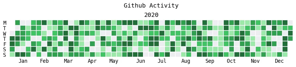
我在相关问题上进行了一些调查研究。当我找不到任何其他满足我所有要求的软件包时,我终于为此编写了一个全新的软件包。
该软件包仍未完善,文档也比较简陋,但我已经在PyPI上发布了它,以供其他人使用。欢迎在我的GitHub上提出意见反馈。
该软件包名为july,可以通过pip安装:
$ pip install july
以下是直接来自README的一些用例:
import numpy as np
import july
from july.utils import date_range

dates = date_range("2020-01-01", "2020-12-31")
data = np.random.randint(0, 14, len(dates))
july.heatmap(dates, data, title='Github Activity', cmap="github")
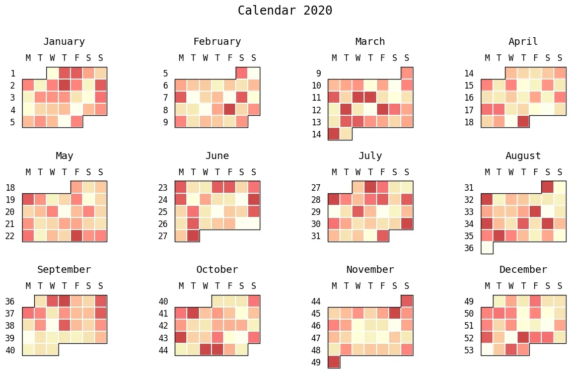
july.heatmap(
    osl_df.date, # Here, osl_df is a pandas data frame.
    osl_df.temp,
    cmap="golden",
    colorbar=True,
    title="Average temperatures: Oslo , Norway"
)

month_grid=True来列出每个月份july.heatmap(dates=dates,
data=data,
cmap="Pastel1",
month_grid=True,
horizontal=True,
value_label=False,
date_label=False,
weekday_label=True,
month_label=True,
year_label=True,
colorbar=False,
fontfamily="monospace",
fontsize=12,
title=None,
titlesize="large",
dpi=100)

# july.month_plot(dates, data, month=5) # This will plot only May.
july.calendar_plot(dates, data)
编辑:我现在看到这个问题要求绘制一个没有使用 pandas 的图表。即便如此,这个问题仍然是“python 日历热力图”在谷歌上的第一页搜索结果,所以我还是会留下来。我建议您仍然使用 pandas。您可能已经将其作为另一个包的依赖项,并且 pandas 具有迄今为止处理日期时间数据的最佳 API(pandas.Timestamp 和 pandas.DatetimeIndex)。
我能找到的唯一 Python 包用于绘制这些图是 calmap,但它已经不再维护,并且与最近版本的 matplotlib 不兼容。因此,我决定自己编写。它生成的图表如下:
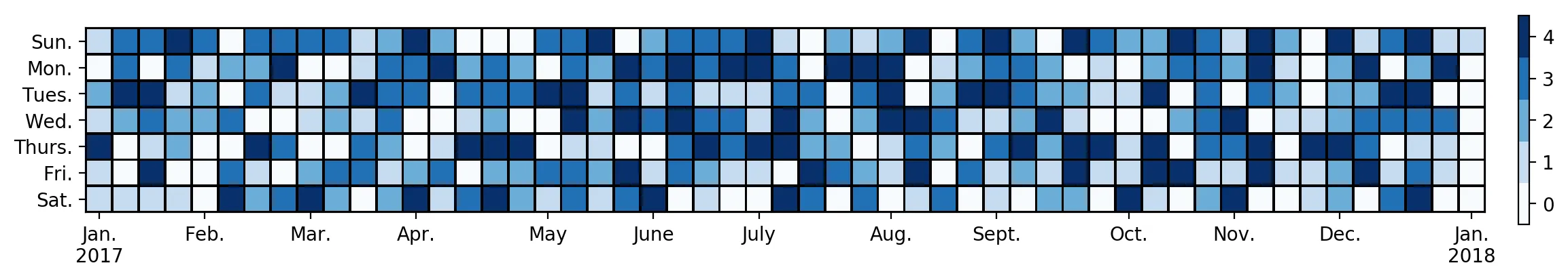 以下是代码。输入是一个具有日期时间索引的系列,该系列提供了热力图的值:
import numpy as np
import pandas as pd
import matplotlib as mpl
import matplotlib.pyplot as plt


DAYS = ['Sun.', 'Mon.', 'Tues.', 'Wed.', 'Thurs.', 'Fri.', 'Sat.']
MONTHS = ['Jan.', 'Feb.', 'Mar.', 'Apr.', 'May', 'June', 'July', 'Aug.', 'Sept.', 'Oct.', 'Nov.', 'Dec.']


def date_heatmap(series, start=None, end=None, mean=False, ax=None, **kwargs):
    '''Plot a calendar heatmap given a datetime series.

    Arguments:
        series (pd.Series):
            A series of numeric values with a datetime index. Values occurring
            on the same day are combined by sum.
        start (Any):
            The first day to be considered in the plot. The value can be
            anything accepted by :func:`pandas.to_datetime`. The default is the
            earliest date in the data.
        end (Any):
            The last day to be considered in the plot. The value can be
            anything accepted by :func:`pandas.to_datetime`. The default is the
            latest date in the data.
        mean (bool):
            Combine values occurring on the same day by mean instead of sum.
        ax (matplotlib.Axes or None):
            The axes on which to draw the heatmap. The default is the current
            axes in the :module:`~matplotlib.pyplot` API.
        **kwargs:
            Forwarded to :meth:`~matplotlib.Axes.pcolormesh` for drawing the
            heatmap.

    Returns:
        matplotlib.collections.Axes:
            The axes on which the heatmap was drawn. This is set as the current
            axes in the `~matplotlib.pyplot` API.
    '''
    # Combine values occurring on the same day.
    dates = series.index.floor('D')
    group = series.groupby(dates)
    series = group.mean() if mean else group.sum()

    # Parse start/end, defaulting to the min/max of the index.
    start = pd.to_datetime(start or series.index.min())
    end = pd.to_datetime(end or series.index.max())

    # We use [start, end) as a half-open interval below.
    end += np.timedelta64(1, 'D')

    # Get the previous/following Sunday to start/end.
    # Pandas and numpy day-of-week conventions are Monday=0 and Sunday=6.
    start_sun = start - np.timedelta64((start.dayofweek + 1) % 7, 'D')
    end_sun = end + np.timedelta64(7 - end.dayofweek - 1, 'D')

    # Create the heatmap and track ticks.
    num_weeks = (end_sun - start_sun).days // 7
    heatmap = np.zeros((7, num_weeks))
    ticks = {}  # week number -> month name
    for week in range(num_weeks):
        for day in range(7):
            date = start_sun + np.timedelta64(7 * week + day, 'D')
            if date.day == 1:
                ticks[week] = MONTHS[date.month - 1]
            if date.dayofyear == 1:
                ticks[week] += f'\n{date.year}'
            if start <= date < end:
                heatmap[day, week] = series.get(date, 0)

    # Get the coordinates, offset by 0.5 to align the ticks.
    y = np.arange(8) - 0.5
    x = np.arange(num_weeks + 1) - 0.5

    # Plot the heatmap. Prefer pcolormesh over imshow so that the figure can be
    # vectorized when saved to a compatible format. We must invert the axis for
    # pcolormesh, but not for imshow, so that it reads top-bottom, left-right.
    ax = ax or plt.gca()
    mesh = ax.pcolormesh(x, y, heatmap, **kwargs)
    ax.invert_yaxis()

    # Set the ticks.
    ax.set_xticks(list(ticks.keys()))
    ax.set_xticklabels(list(ticks.values()))
    ax.set_yticks(np.arange(7))
    ax.set_yticklabels(DAYS)

    # Set the current image and axes in the pyplot API.
    plt.sca(ax)
    plt.sci(mesh)

    return ax


def date_heatmap_demo():
    '''An example for `date_heatmap`.

    Most of the sizes here are chosen arbitrarily to look nice with 1yr of
    data. You may need to fiddle with the numbers to look right on other data.
    '''
    # Get some data, a series of values with datetime index.
    data = np.random.randint(5, size=365)
    data = pd.Series(data)
    data.index = pd.date_range(start='2017-01-01', end='2017-12-31', freq='1D')

    # Create the figure. For the aspect ratio, one year is 7 days by 53 weeks.
    # We widen it further to account for the tick labels and color bar.
    figsize = plt.figaspect(7 / 56)
    fig = plt.figure(figsize=figsize)

    # Plot the heatmap with a color bar.
    ax = date_heatmap(data, edgecolor='black')
    plt.colorbar(ticks=range(5), pad=0.02)

    # Use a discrete color map with 5 colors (the data ranges from 0 to 4).
    # Extending the color limits by 0.5 aligns the ticks in the color bar.
    cmap = mpl.cm.get_cmap('Blues', 5)
    plt.set_cmap(cmap)
    plt.clim(-0.5, 4.5)

    # Force the cells to be square. If this is set, the size of the color bar
    # may look weird compared to the size of the heatmap. That can be corrected
    # by the aspect ratio of the figure or scale of the color bar.
    ax.set_aspect('equal')

    # Save to a file. For embedding in a LaTeX doc, consider the PDF backend.
    # http://sbillaudelle.de/2015/02/23/seamlessly-embedding-matplotlib-output-into-latex.html
    fig.savefig('heatmap.pdf', bbox_inches='tight')

    # The firgure must be explicitly closed if it was not shown.
    plt.close(fig)
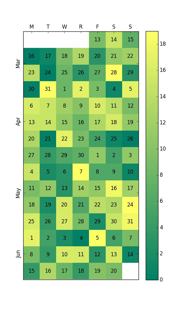
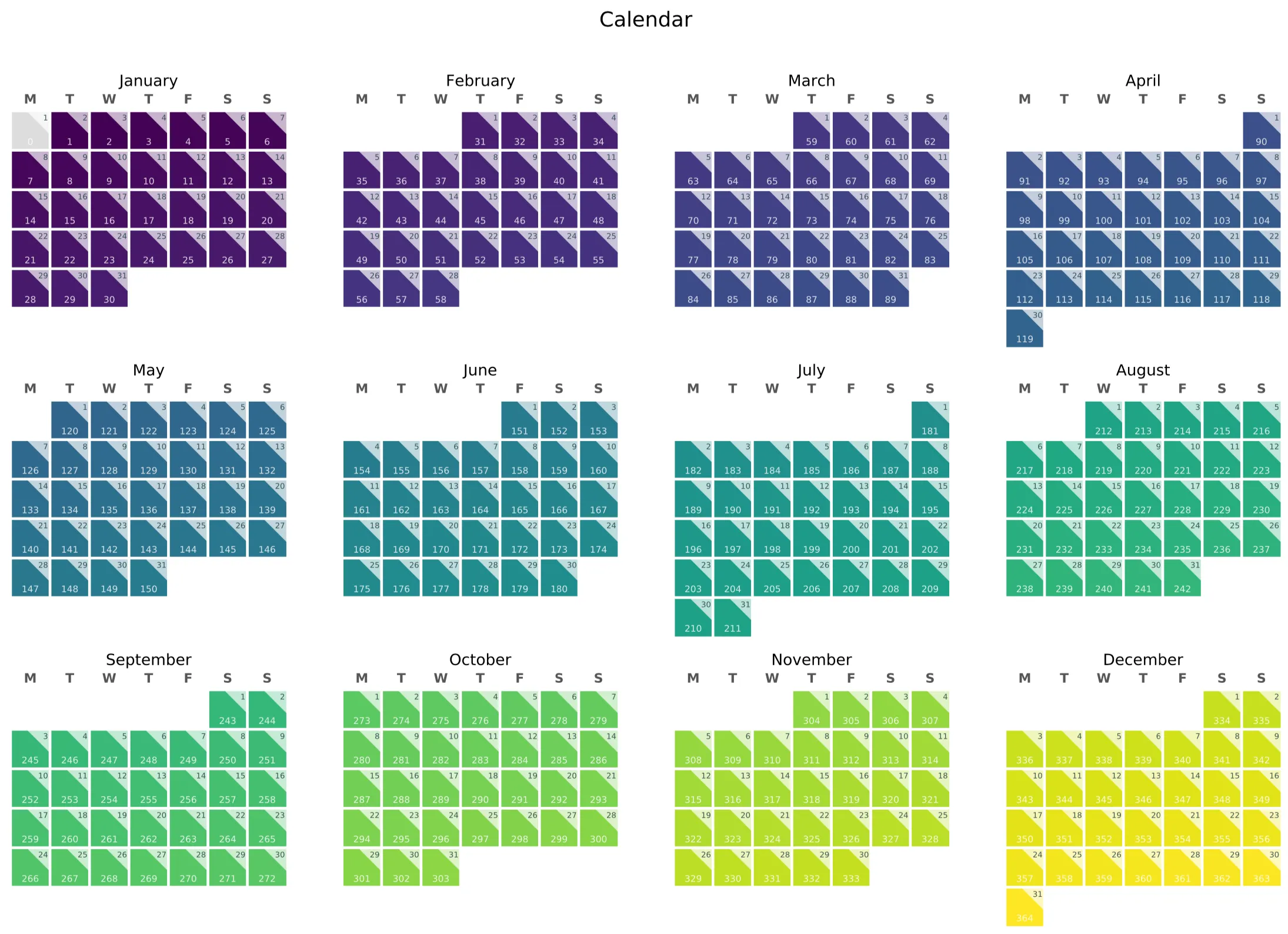
我想创建一个日历热力图,每个月份分别显示。我还需要用日期号(day_of_month)和值标签对每一天进行注释。
我受到了这里发布的答案以及以下网站的启发:
然而,我似乎没有找到完全符合我需求的解决方案,所以我决定在这里发布我的解决方法,或许可以节省其他人想要相同类型绘图的时间。
我的示例使用了一些Pandas来生成一些虚拟数据,因此您可以轻松地插入您自己的数据源。除此之外,我只使用了Matplotlib。
代码输出如下。对于我的需求,我还希望突出显示数据为0的日期(请参见1月1日)。
import numpy as np
import pandas as pd
import matplotlib.pyplot as plt
from matplotlib.patches import Polygon

# Settings
years = [2018] # [2018, 2019, 2020]
weeks = [1, 2, 3, 4, 5, 6]
days = ['M', 'T', 'W', 'T', 'F', 'S', 'S']
month_names = ['January', 'February', 'March', 'April', 'May', 'June', 'July', 'August',
               'September', 'October', 'November', 'December']

def generate_data():
    idx = pd.date_range('2018-01-01', periods=365, freq='D')
    return pd.Series(range(len(idx)), index=idx)


def split_months(df, year):
    """
    Take a df, slice by year, and produce a list of months,
    where each month is a 2D array in the shape of the calendar
    :param df: dataframe or series
    :return: matrix for daily values and numerals
    """
    df = df[df.index.year == year]


    # Empty matrices
    a = np.empty((6, 7))
    a[:] = np.nan

    day_nums = {m:np.copy(a) for m in range(1,13)}  # matrix for day numbers
    day_vals = {m:np.copy(a) for m in range(1,13)}  # matrix for day values

    # Logic to shape datetimes to matrices in calendar layout
    for d in df.iteritems():  # use iterrows if you have a DataFrame

        day = d[0].day
        month = d[0].month
        col = d[0].dayofweek

        if d[0].is_month_start:
            row = 0

        day_nums[month][row, col] = day  # day number (0-31)
        day_vals[month][row, col] = d[1] # day value (the heatmap data)

        if col == 6:
            row += 1

    return day_nums, day_vals


def create_year_calendar(day_nums, day_vals):
    fig, ax = plt.subplots(3, 4, figsize=(14.85, 10.5))

    for i, axs in enumerate(ax.flat):

        axs.imshow(day_vals[i+1], cmap='viridis', vmin=1, vmax=365)  # heatmap
        axs.set_title(month_names[i])

        # Labels
        axs.set_xticks(np.arange(len(days)))
        axs.set_xticklabels(days, fontsize=10, fontweight='bold', color='#555555')
        axs.set_yticklabels([])

        # Tick marks
        axs.tick_params(axis=u'both', which=u'both', length=0)  # remove tick marks
        axs.xaxis.tick_top()

        # Modify tick locations for proper grid placement
        axs.set_xticks(np.arange(-.5, 6, 1), minor=True)
        axs.set_yticks(np.arange(-.5, 5, 1), minor=True)
        axs.grid(which='minor', color='w', linestyle='-', linewidth=2.1)

        # Despine
        for edge in ['left', 'right', 'bottom', 'top']:
            axs.spines[edge].set_color('#FFFFFF')

        # Annotate
        for w in range(len(weeks)):
            for d in range(len(days)):
                day_val = day_vals[i+1][w, d]
                day_num = day_nums[i+1][w, d]

                # Value label
                axs.text(d, w+0.3, f"{day_val:0.0f}",
                         ha="center", va="center",
                         fontsize=7, color="w", alpha=0.8)

                # If value is 0, draw a grey patch
                if day_val == 0:
                    patch_coords = ((d - 0.5, w - 0.5),
                                    (d - 0.5, w + 0.5),
                                    (d + 0.5, w + 0.5),
                                    (d + 0.5, w - 0.5))

                    square = Polygon(patch_coords, fc='#DDDDDD')
                    axs.add_artist(square)

                # If day number is a valid calendar day, add an annotation
                if not np.isnan(day_num):
                    axs.text(d+0.45, w-0.31, f"{day_num:0.0f}",
                             ha="right", va="center",
                             fontsize=6, color="#003333", alpha=0.8)  # day

                # Aesthetic background for calendar day number
                patch_coords = ((d-0.1, w-0.5),
                                (d+0.5, w-0.5),
                                (d+0.5, w+0.1))

                triangle = Polygon(patch_coords, fc='w', alpha=0.7)
                axs.add_artist(triangle)

    # Final adjustments
    fig.suptitle('Calendar', fontsize=16)
    plt.subplots_adjust(left=0.04, right=0.96, top=0.88, bottom=0.04)

    # Save to file
    plt.savefig('calendar_example.pdf')


for year in years:
    df = generate_data()
    day_nums, day_vals = split_months(df, year)
    create_year_calendar(day_nums, day_vals)
可能还有很多优化的空间,但这样做可以满足我的需求。
"""
Created on Tue Sep 4 11:17:25 2018
@author: woldekidank
"""
import numpy as np
from datetime import date
import datetime
import matplotlib.pyplot as plt
import random
D = date(2016,1,1)
Dord = date.toordinal(D)
Dweekday = date.weekday(D)
Dsnday = Dord - Dweekday + 1 #find sunday
square = np.array([[0, 0],[ 0, 1], [1, 1], [1, 0], [0, 0]])#x and y to draw a square
row = 1
count = 0
while row != 0:
for column in range(1,7+1): #one week per row
prof = np.ones([24, 1])
hourly = np.zeros([24, 1])
for i in range(1,24+1):
prof[i-1, 0] = prof[i-1, 0] * random.uniform(0, 1)
hourly[i-1, 0] = i / 24
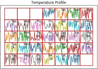
plt.title('Temperature Profile')
plt.plot(square[:, 0] + column - 1, square[:, 1] - row + 1,color='r') #go right each column, go down each row
if date.fromordinal(Dsnday).month == D.month:
if count == 0:
plt.plot(hourly, prof)
else:
plt.plot(hourly + min(square[:, 0] + column - 1), prof + min(square[:, 1] - row + 1))
plt.text(column - 0.5, 1.8 - row, datetime.datetime.strptime(str(date.fromordinal(Dsnday)),'%Y-%m-%d').strftime('%a'))
plt.text(column - 0.5, 1.5 - row, date.fromordinal(Dsnday).day)
Dsnday = Dsnday + 1
count = count + 1
if date.fromordinal(Dsnday).month == D.month:
row = row + 1 #new row
else:
row = 0 #stop the while loop