如何使用Python和Matplotlib绘制像以下这样的图片?
我知道如何绘制2D热图,但是在热图上方和颜色条之间加入条形图让我非常困惑。
如何在图片上添加这两个条形图,并显示x轴或y轴上的数字属于哪个组?
感谢所有回复。
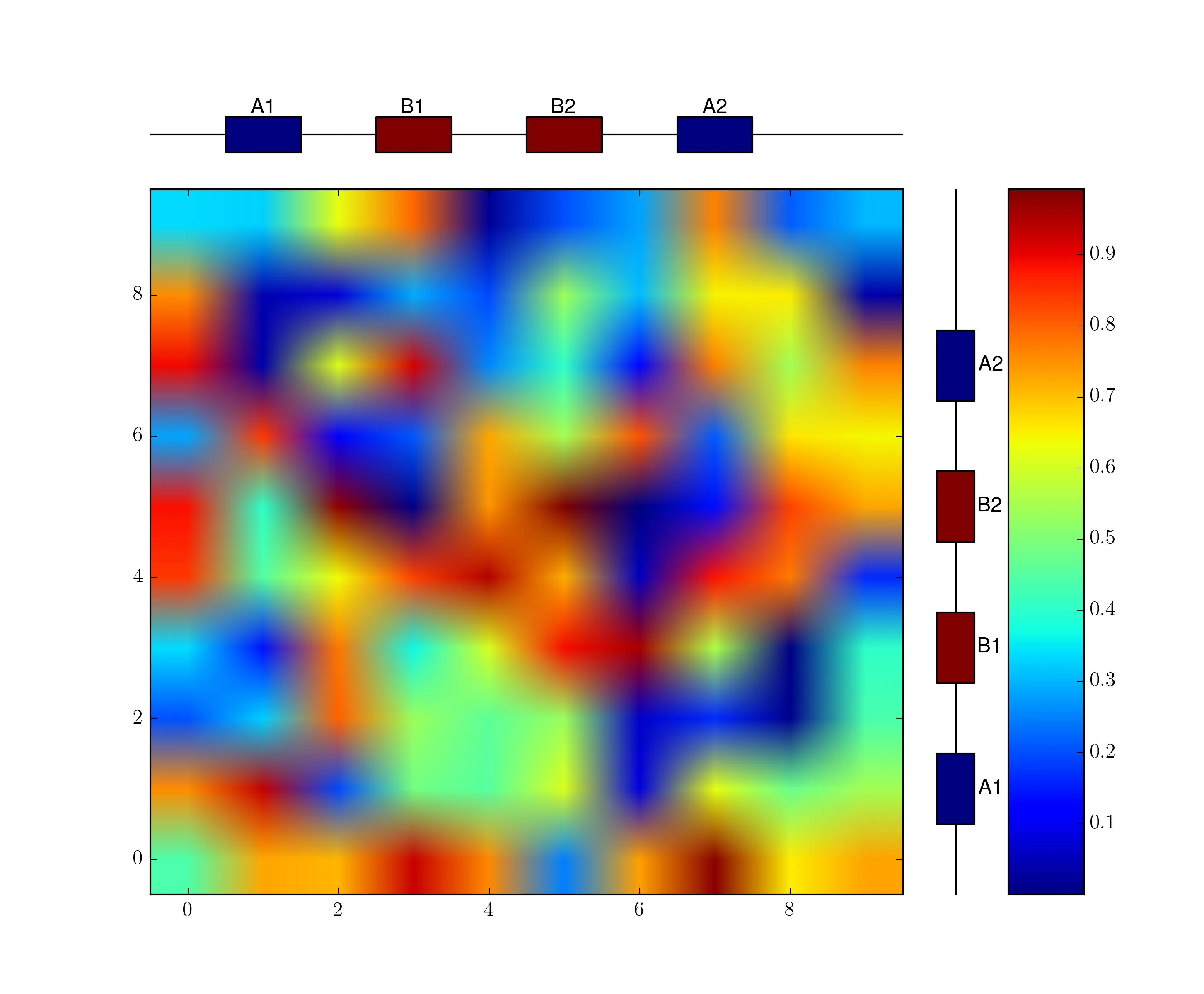
参考图片链接:
感谢所有回复。
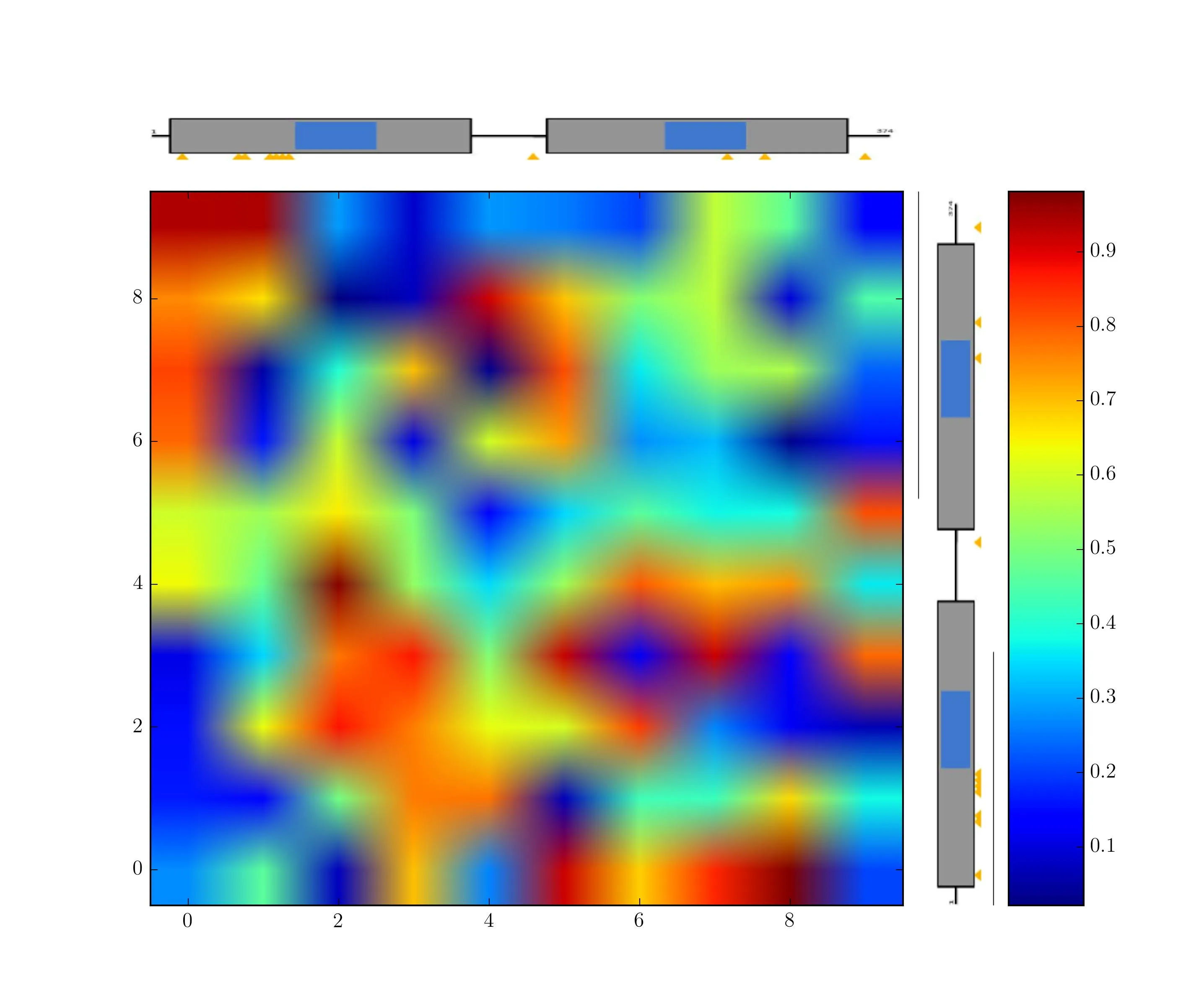
参考图片链接:
一种系统而直接的方法,虽然在开始时有点繁琐,是使用 matplotlib.gridspec.GridSpec。
首先设置网格:
import matplotlib.pyplot as plt
from matplotlib.gridspec import GridSpec

fig = plt.figure()
gs = GridSpec(2, 3, width_ratios=[10, 1, 1], height_ratios=[1, 10])
big_ax = fig.add_subplot(gs[1,0]) # bottom left
top_ax = fig.add_subplot(gs[0,0]) # top left
right_ax = fig.add_subplot(gs[1,1]) # bottom center
cbar_ax = fig.add_subplot(gs[1,2]) # bottom right
 并且将生成一个随机热图。我使用
imshow(aspect='auto'),这样图像对象和热图将占据各自轴的全部空间(否则它们将覆盖gridspec设置的高度/宽度比)。im = plt.imread('/path/to/image.png')
# Plot your heatmap on big_ax and colorbar on cbar_ax
heatmap = big_ax.imshow(np.random.rand(10, 10), aspect='auto', origin='lower')
cbar = fig.colorbar(heatmap, cax=cbar_ax)
# Show your images on top_ax and right_ax
top_ax.imshow(im, aspect='auto')
# need to rotate my image.
# you may not have to if you have two different images
from scipy import ndimage
right_ax.imshow(ndimage.rotate(im, 90), aspect='auto')
# Clean up the image axes (remove ticks, etc.)
right_ax.set_axis_off()
top_ax.set_axis_off()
# remove spacing between axes
fig.subplots_adjust(wspace=0.05, hspace=0.05)
虽然默认的喷气式色图不太华丽,但您可以轻松使用它来重现您的OP所示的图形。
编辑:如果你想生成顶部和右侧的基因组样式图,你可以尝试使用以下代码来创建顶部条形图:
from matplotlib.patches import Rectangle
from matplotlib.collections import PatchCollection

# draw the black line
top_ax.axhline(0, color='k', zorder=-1)

# box x-coords and text labels
boxes = zip(np.arange(0.1, 1, 0.2), np.arange(0.2, 1, 0.2))
box_text = ('A1', 'B1', 'B2', 'A2')
# color indicators for boxes
colors = (0, 1, 1, 0)
# construct Rects
patches = [Rectangle(xy=(x0, -1), width=(x1-x0), height=2) for x0,x1 in boxes]
p = PatchCollection(patches, cmap='jet')
# this maps the colors in [0,1] to the cmap above
p.set_array(np.array(colors))
top_ax.add_collection(p)

# add text
[top_ax.text((x0+x1)/2., 1.2, text, ha='center')
    for (x0,x1), text in zip(boxes, box_text)]

# adjust ylims
top_ax.set_ylim(-2, 2)
如果想要将某些内容放置在正确的轴上,可以使用axvline并交换x坐标和y坐标。
right_ax.axvline(0, color='k', zorder=-1)

patches = [Rectangle(xy=(-1, y0), width=2, height=(y1-y0)) for y0, y1 in boxes]
p = PatchCollection(patches, cmap='jet')
p.set_array(np.array(colors))
right_ax.add_collection(p)

[right_ax.text(1.2, (y0+y1)/2., text, va='center')
    for (y0, y1), text in zip(boxes, box_text)]
right_ax.set_xlim(-2,2)