如何创建一个热力图?

6

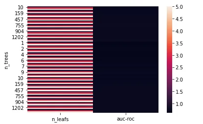
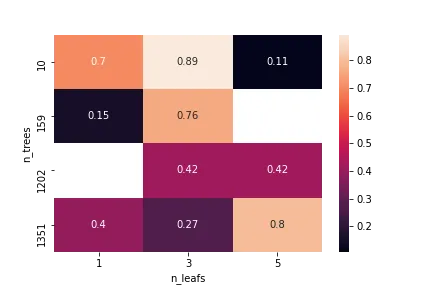
我想创建一个热图,其中Y轴是树的数量,X轴是叶子的数量,在中心位置展示auc-roc。

以下是我的代码:

df = pd.DataFrame(store,columns = ['n_trees' , 'n_leafs', 'auc-roc']) 
df.set_index(['n_trees'], inplace=True)
ax = sns.heatmap(df)
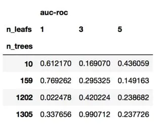
我的DataFrame如下:

         n_leafs   auc-roc
n_trees                   
10             1  0.7
10             3  0.892529
10             5  0.107495
159            1  0.155
159            3  0.7581
...          ...       ...
1202           3  0.420
1202           5  0.422
1351           1  0.398
1351           3  0.273
1351           5  0.795

我得到了这个热图,但不是我想要的。如何删除X轴上的auc-roc并将其转移到中心位置?

输入图像描述

2个回答

2

您需要将数据转换为长格式,使用示例数据集:

import pandas as pd
import seaborn as sns
import numpy as np

np.random.seed(111)
df = pd.DataFrame({'n_trees':np.repeat([10,159,1202,1305],3),
                  'n_leafs':[1,3,5]*4,
                   'auc-roc':np.random.uniform(0,1,12)})

Pivot会让它变成这样:

df.pivot(index="n_trees",columns="n_leafs")

这里插入图片描述

我们可以进行数据透视和绘图:

sns.heatmap(df.pivot(index="n_trees",columns="n_leafs"))

enter image description here


1
通过reset_index重置索引,然后使用pivot转换表格。
df = df.reset_index()
ax = sns.heatmap(df.pivot(*df), annot=True)

enter image description here


网页内容由stack overflow 提供, 点击上面的
可以查看英文原文,
原文链接