在ggplot中绘制连续协变量的预测生存曲线

4
我该如何在Cox比例风险模型中为连续协变量的代表值绘制生存曲线?具体而言,我想使用“survfit.cox”、“survfit”对象在ggplot中完成此操作。
这似乎是一个已经有答案的问题,但我已经通过使用“survfit”和“newdata”等术语(以及许多其他搜索术语)搜索了SO中的所有内容。到目前为止,这个帖子最接近回答我的问题: Plot Kaplan-Meier for Cox regression 根据该帖子中一个答案提供的可重复性示例:
url <- "http://socserv.mcmaster.ca/jfox/Books/Companion/data/Rossi.txt"
df <- read.table(url, header = TRUE)

library(dplyr)
library(ggplot2)
library(survival)
library(magrittr)
library(broom)

# Identifying the 25th and 75th percentiles for prio (continuous covariate)

summary(df$prio)

# Cox proportional hazards model with other covariates
# 'prio' is our explanatory variable of interest

m1 <- coxph(Surv(week, arrest) ~ 
                       fin + age + race + prio,
                     data = df)

# Creating new df to get survival predictions
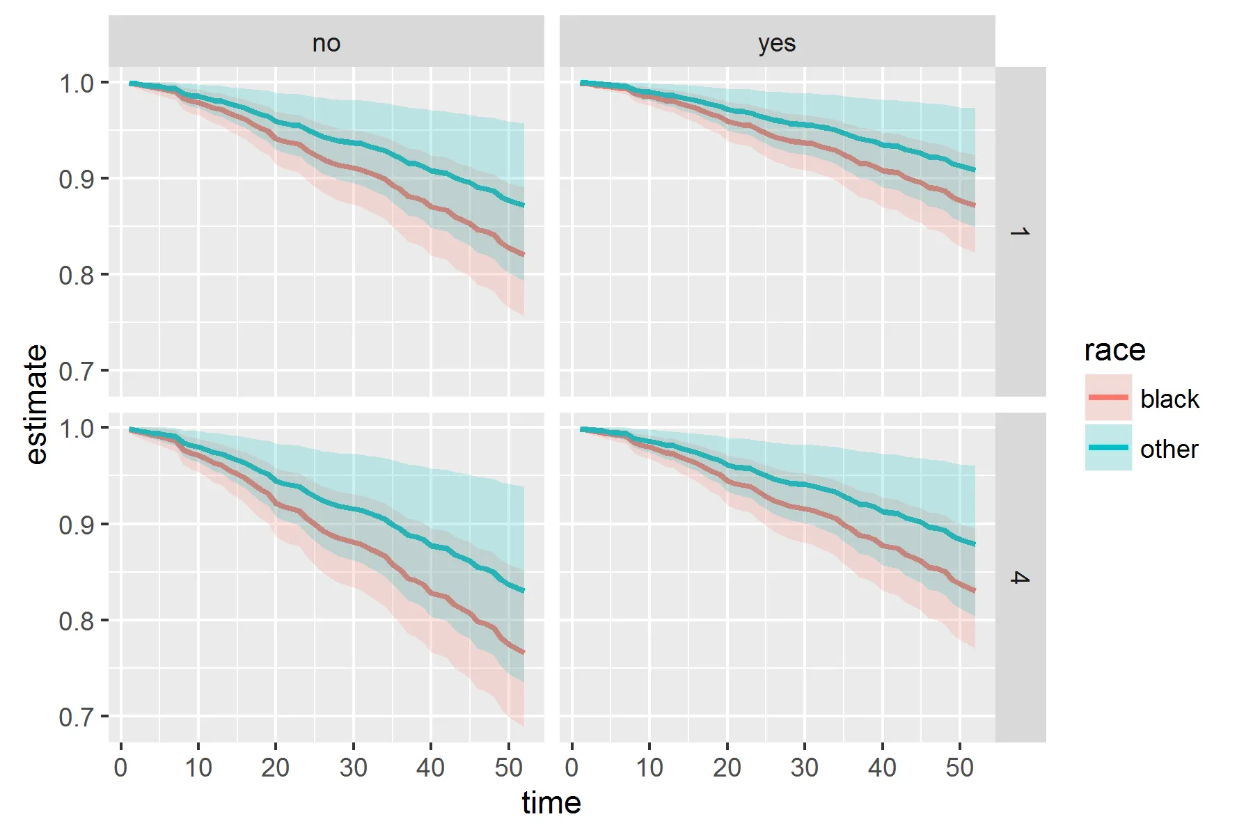
# Want separate curves for the the different 'fin' and 'race'
# groups as well as the 25th and 75th percentile of prio

newdf <- df %$%
  expand.grid(fin = levels(fin), 
                    age = 30, 
                    race = levels(race), 
                    prio = c(1,4))

# Obtain the fitted survival curve, then tidy 
# into a dataframe that can be used in ggplot

survcurv <- survfit(m1, newdata = newdf) %>%
  tidy()

问题是,一旦我有了这个名为survcurv的数据框,我无法确定哪个“estimate”变量属于哪个模式,因为没有保留任何原始变量。例如,“estimate”变量中的哪一个代表了30岁、种族='其他'、prio='4'、fin='no'的拟合曲线?
在所有其他示例中,通常将survfit对象放入通用的plot()函数中,并不添加图例。我想使用ggplot为每个预测曲线添加图例。
在我的数据集中,模型更加复杂,曲线也比我展示的要多得多,因此可以想象,看到40个不同的“estimate.1”..“estimate.40”变量使人难以理解哪个是哪个。

不要在问题中添加你的“答案”。如果你有不同的解决方案,请发布你自己的答案。由社区投票决定哪个答案对未来最好,你可以决定最终接受哪个答案。 - MrFlick
2个回答

4
感谢提供这个措辞清晰、示例良好的问题。我有些惊讶于在此处,tidy 的输出效果相对较差。请参见下面我的尝试,以创建一些可绘制的数据:
library(tidyr)
newdf$group <- as.character(1:nrow(newdf))

survcurv <- survfit(m1, newdata = newdf) %>%
  tidy() %>% 
  gather('key', 'value', -time, -n.risk, -n.event, -n.censor) %>% 
  mutate(group = substr(key, nchar(key), nchar(key)),
         key   = substr(key, 1, nchar(key) - 2)) %>% 
  left_join(newdf, 'group') %>% 
  spread(key, value)

然后创建一个图表(也许你想使用geom_step,但不幸的是没有步骤形状的带状图):

ggplot(survcurv, aes(x = time, y = estimate, ymin = conf.low, ymax = conf.high,
                     col = race, fill = race)) +
  geom_line(size = 1) +
  geom_ribbon(alpha = 0.2, col = NA) +
  facet_grid(prio ~ fin)

enter image description here


这正是我正在寻找的。由于 mutate(group = substr(key, nchar(key), nchar(key)), key = substr(key, 1, nchar(key) - 2)) 如果你有超过10个模式或生存曲线,将无法工作,所以我对你的代码进行了微小的调整,使用了自己的数据集。我会编辑原始帖子来展示我所做的修改。再次感谢! - RNB
@RNB 哦,是的,我看了一下 separate,但是不能快速地实现我想要的功能。 - Axeman
1
是的,我之所以想到这个问题,是因为几天前我不得不调整它,以从Effects包中获得漂亮整洁的输出,所以这个问题在我的脑海中很新鲜。我也很惊讶tidy()函数对于survfit对象并没有更加整洁的处理方式。最近我一直在使用broom包,它通常表现得非常出色。 - RNB
有没有一种方法可以使用连续变量而不是分类变量来完成这个任务?如果您尝试将种族作为值(例如20和25)进行操作,则在绘图时会出现错误“Error in f(...) : Aesthetics can not vary with a ribbon”。 - redferry
@redferry,如果你关于那个有疑问的话,最好是提出一个新问题。 - Axeman

3

尝试像这样定义你的survcurv

survcurv <- 
  lapply(1:nrow(newdf),
         function(x, m1, newdata){
           cbind(newdata[x, ], survfit(m1, newdata[x, ]) %>% tidy)
         },
         m1, 
         newdf) %>%
  bind_rows()

这将包括所有预测变量作为列,并带有预测估计值。

我也接受了你和Axeman的答案。与Axeman的答案不同,我在newdf中不需要进行任何调整就可以使其适用于超过10行的情况。然而,我稍微更喜欢Axeman的答案,因为代码比循环内的函数更易读,并且更符合我的编码风格。但还是谢谢,这个也有效! - RNB

网页内容由stack overflow 提供, 点击上面的
可以查看英文原文,
原文链接