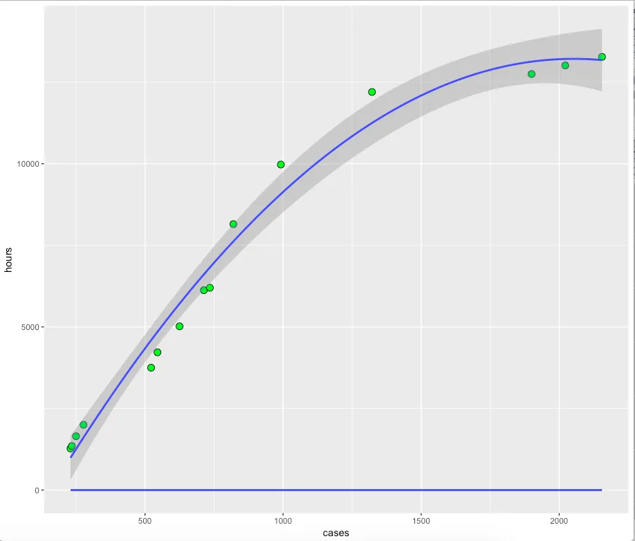
我正在尝试在同一散点图上绘制两条回归线。使用ggplot,看起来我已经接近正确。我有一个拟合,使用二次项,另一个拟合是将小时的倒数作为因变量,将案例的倒数作为预测变量。数据如下:
df <- read.table(textConnection(
  'hours cases
   1275 230
  1350 235
  1650 250
  2000 277
  3750 522
  4222 545
  5018 625
  6125 713
  6200 735
  8150 820
  9975 992
  12200 1322
  12750 1900
  13014 2022
  13275 2155
  '), header = TRUE)
我有以下内容,但看起来逆回归拟合不正确。需要做什么调整才能得到正确的曲线?我知道曲线应该是上凸且递增的。
ggplot(df, aes(x = cases, y = hours)) +
  geom_point(shape=21, size=3.2,fill="green",color="black")+
  geom_smooth(span=.4,method="lm",formula=y~x+I(x^2))+
  geom_smooth(span=.4,method="lm",formula=I(1/y)~I(1/x))
供参考,仅显示预测的y值关于x的散点图,需要注意的是,y轴是1/y的倒数,我们得到:
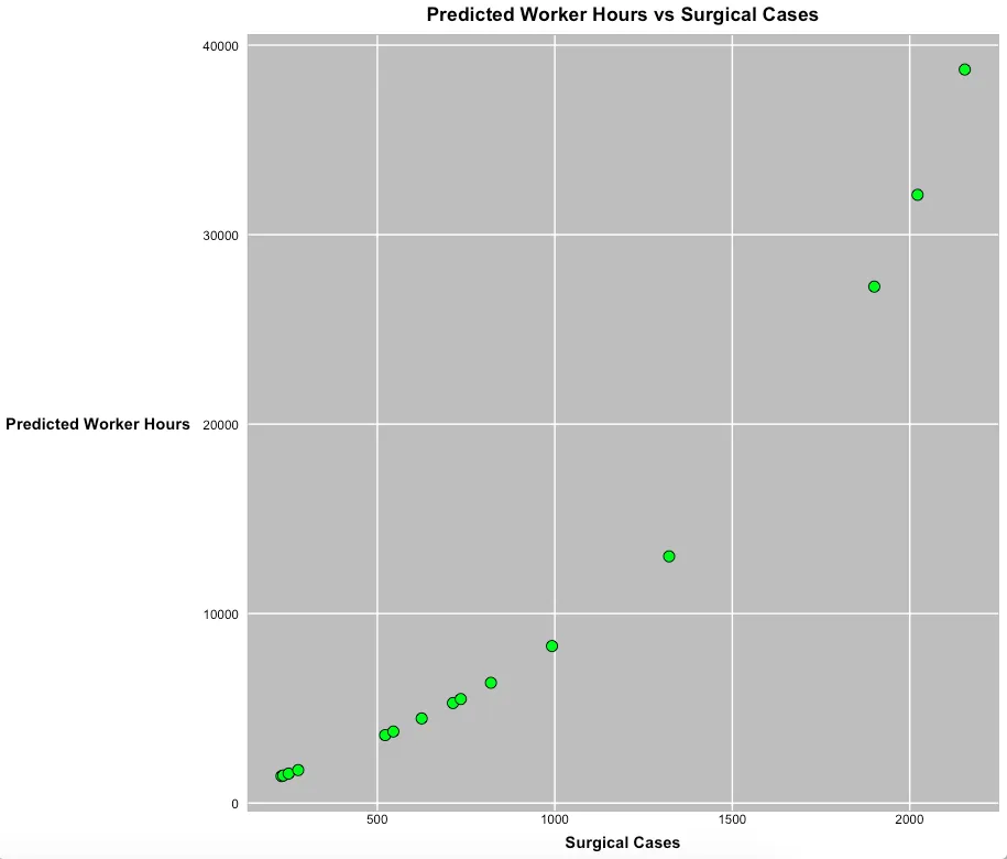
用于生成此代码的代码为:
fit<-lm(I(1/hours)~I(1/cases),data=df)
summary(fit)

hw <- theme(
  plot.title=element_text(hjust=0.5,face='bold'),
  axis.title.y=element_text(angle=0,vjust=.5,face='bold'),
  axis.title.x=element_text(face='bold'),
  plot.subtitle=element_text(hjust=0.5),
  plot.caption=element_text(hjust=-.5),
  strip.text.y = element_blank(),
  strip.background=element_rect(fill=rgb(.9,.95,1),
                                colour=gray(.5), size=.2),
  panel.border=element_rect(fill=FALSE,colour=gray(.70)),
  panel.grid.minor.y = element_blank(),
  panel.grid.minor.x = element_blank(),
  panel.spacing.x = unit(0.10,"cm"),
  panel.spacing.y = unit(0.05,"cm"),

  axis.ticks=element_blank(),
  axis.text=element_text(colour="black"),
  axis.text.y=element_text(margin=margin(0,3,0,3)),
  axis.text.x=element_text(margin=margin(-1,0,3,0)),
  panel.background = element_rect(fill = "gray")
)

ggplot(df,aes(x=cases,y=1/fitted(fit))) +
  geom_point(shape=21, size=3.2,fill="green",color="black")+
  labs(x="Surgical Cases",
       y="Predicted Worker Hours",
       title="Predicted Worker Hours vs Surgical Cases")+hw
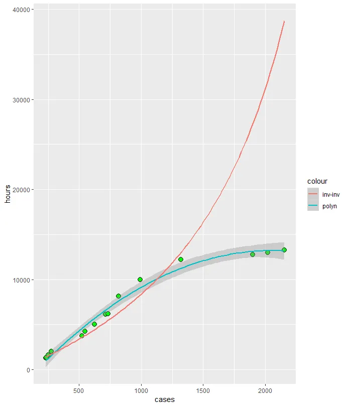
geom_smooth无法转换预测值。 - Roland