在R中绘制逻辑回归的两条曲线

4

我在R中运行逻辑回归(glm)。然后我成功地绘制出了结果。我的代码如下:

 temperature.glm = glm(Response~Temperature, data=mydata,family=binomial)

 plot(mydata$Temperature,mydata$Response, ,xlab="Temperature",ylab="Probability of Response")
 curve(predict(temperature.glm,data.frame(Temperature=x),type="resp"),add=TRUE, col="red")
 points(mydata$Temperature,fitted(temperature.glm),pch=20)
 title(main="Response-Temperature with Fitted GLM Logistic Regression Line") 

我的问题是:

  1. 如何在一个图中绘制两条逻辑回归曲线?
  2. 我从其他统计软件获得了这两个系数。如何创建随机数据,插入这两组系数(Set 1和Set 2),然后生成两条逻辑回归曲线?

模型:

                   SET 1
 (Intercept)     -88.4505
 Temperature       2.9677

                  SET 2
 (Intercept)    -88.585533
 Temperature      2.972168

mydata有2列,大约700行。

Response Temperature 
1 29.33 
1 30.37 
1 29.52 
1 29.66 
1 29.57 
1 30.04 
1 30.58 
1 30.41 
1 29.61 
1 30.51 
1 30.91 
1 30.74 
1 29.91 
1 29.99 
1 29.99 
1 29.99 
1 29.99 
1 29.99 
1 29.99 
1 30.71 
0 29.56 
0 29.56 
0 29.56 
0 29.56 
0 29.56 
0 29.57 
0 29.51

最后,我已经删除了你的签名。如果你想让人们知道你是Eddie,请在你的个人资料中放上你的名字。顺便说一句,欢迎来到SO。 - Richie Cotton
如果你想将它们并排绘制,请在plot调用之前使用par(mfrow=c(1, 2))。否则,Richie的建议是调用两次curve来叠加两条曲线。 - jbaums
嗨,感谢@Richie的回复。非常抱歉,我是SO的新手。我试图附上我的数据,但就是想不出该如何做到。然而...这份数据有两列,大约有700行。响应温度:1 29.33 1 30.37 1 29.52 1 29.66 1 29.57 1 30.04 1 30.58 1 30.41 1 29.61 1 30.51 1 30.91 1 30.74 1 29.91 1 29.99 1 29.99 1 29.99 1 29.99 1 29.99 1 29.99 1 30.71 0 29.56 0 29.56 0 29.56 0 29.56 0 29.56 0 29.57 0 29.51 jbaums 我会查看您的建议。无论如何,非常感谢大家! - Eddie
你的问题底部的“编辑”按钮可以让你添加或修改问题。有足够声望的用户也可以像我一样编辑,添加你的数据并将glm调用中的“Response”大写化。 - IRTFM
我上面的评论有误。它应该是 rbinom(1000, 1, (1/(1+exp(-(-88.4505 + 2.9677*x))))。然而,更简单的方法是 rbinom(1000, 1, plogis(-88.4505 + 2.9677*x)),请查看下面我的答案以获取更详细的解释。 - jbaums
显示剩余3条评论
1个回答

16
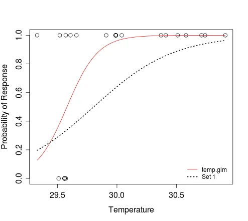
  1. To plot a curve, you just need to define the relationship between response and predictor, and specify the range of the predictor value for which you'd like that curve plotted. e.g.:

    dat <- structure(list(Response = c(1L, 1L, 1L, 1L, 1L, 1L, 1L, 1L, 1L, 
      1L, 1L, 1L, 1L, 1L, 1L, 1L, 1L, 1L, 1L, 1L, 0L, 0L, 0L, 0L, 0L, 
      0L, 0L), Temperature = c(29.33, 30.37, 29.52, 29.66, 29.57, 30.04, 
      30.58, 30.41, 29.61, 30.51, 30.91, 30.74, 29.91, 29.99, 29.99, 
      29.99, 29.99, 29.99, 29.99, 30.71, 29.56, 29.56, 29.56, 29.56, 
      29.56, 29.57, 29.51)), .Names = c("Response", "Temperature"), 
      class = "data.frame", row.names = c(NA, -27L))
    
    temperature.glm <- glm(Response ~ Temperature, data=dat, family=binomial)
    
    plot(dat$Temperature, dat$Response, xlab="Temperature", 
         ylab="Probability of Response")
    curve(predict(temperature.glm, data.frame(Temperature=x), type="resp"), 
          add=TRUE, col="red")
    # To add an additional curve, e.g. that which corresponds to 'Set 1':
    curve(plogis(-88.4505 + 2.9677*x), min(dat$Temperature), 
          max(dat$Temperature), add=TRUE, lwd=2, lty=3)
    legend('bottomright', c('temp.glm', 'Set 1'), lty=c(1, 3), 
           col=2:1, lwd=1:2, bty='n', cex=0.8)
    

    In the second curve call above, we are saying that the logistic function defines the relationship between x and y. The result of plogis(z) is equivalent to that obtained when evaluating 1/(1+exp(-z)). The min(dat$Temperature) and max(dat$Temperature) arguments define the range of x for which y should be evaluated. We don't need to tell the function that x refers to temperature; this is implicit when we specify that the response should be evaluated for that range of predictor values.

    Adding additional curves to a plot

  2. As you can see, the curve function allows you to plot a curve without needing to simulate predictor (e.g. temperature) data. If you still need to do this, e.g. to plot some simulated outcomes of Bernoulli trials that conform to a particular model, then you can try the following:

    n <- 100 # size of random sample
    
    # generate random temperature data (n draws, uniform b/w 27 and 33)
    temp <- runif(n, 27, 33)
    
    # Define a function to perform a Bernoulli trial for each value of temp, 
    #   with probability of success for each trial determined by the logistic
    #   model with intercept = alpha and coef for temperature = beta.
    # The function also plots the outcomes of these Bernoulli trials against the 
    #   random temp data, and overlays the curve that corresponds to the model
    #   used to simulate the response data.
    sim.response <- function(alpha, beta) {
      y <- sapply(temp, function(x) rbinom(1, 1, plogis(alpha + beta*x)))  
      plot(y ~ temp, pch=20, xlab='Temperature', ylab='Response')
      curve(plogis(alpha + beta*x), min(temp), max(temp), add=TRUE, lwd=2)    
      return(y)
    }
    

    Examples:

    # Simulate response data for your model 'Set 1'
    y <- sim.response(-88.4505, 2.9677)
    
    # Simulate response data for your model 'Set 2'
    y <- sim.response(-88.585533, 2.972168)
    
    # Simulate response data for your model temperature.glm
    # Here, coef(temperature.glm)[1] and coef(temperature.glm)[2] refer to
    #   the intercept and slope, respectively
    y <- sim.response(coef(temperature.glm)[1], coef(temperature.glm)[2])
    

    The figure below shows the plot produced by the first example above, i.e. results of a single Bernoulli trial for each value of the random vector of temperature, and the curve that describes the model from which the data were simulated.

    Simulated predictor and response data for model 'Set 1'


这正是我要找的。你救了我! :) - Eddie

网页内容由stack overflow 提供, 点击上面的
可以查看英文原文,
原文链接