我认为它们看起来都一样,但肯定存在一些差异。
它们都以单列输入为基础,而y轴表示所有图形的计数。
我认为它们看起来都一样,但肯定存在一些差异。
它们都以单列输入为基础,而y轴表示所有图形的计数。
这些绘图函数pyplot.hist,seaborn.countplot和seaborn.displot都是用于绘制单个变量频率的辅助工具。根据变量的性质,它们可能更或少适合可视化。
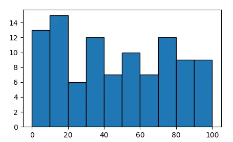
可以对连续变量x进行直方图处理以显示其频率分布。
import matplotlib.pyplot as plt
import numpy as np

x = np.random.rand(100)*100
hist, edges = np.histogram(x, bins=np.arange(0,101,10))
plt.bar(edges[:-1], hist, align="edge", ec="k", width=np.diff(edges))

plt.show()
可以使用 pyplot.hist 或 seaborn.distplot 来实现相同的效果。
plt.hist(x, bins=np.arange(0,101,10), ec="k")
sns.distplot(x, bins=np.arange(0,101,10), kde=False, hist_kws=dict(ec="k"))
distplot1.是对pyplot.hist的封装,但还额外具有其他功能,例如允许显示核密度估计。
对于离散变量,直方图可能适用也可能不适用。如果使用numpy.histogram,则需要将箱体放置在预期的离散观测值之间。
x1 = np.random.randint(1,11,100)

hist, edges = np.histogram(x1, bins=np.arange(1,12)-0.5)
plt.bar(edges[:-1], hist, align="edge", ec="k", width=np.diff(edges))
plt.xticks(np.arange(1,11))
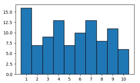
另一种方法是计算x中唯一元素的数量。
u, counts = np.unique(x1, return_counts=True)
plt.bar(u, counts, align="center", ec="k", width=1)
plt.xticks(u)
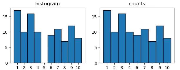
导致与上面相同的情节。 主要区别在于,当不是每个可能的观察都被占用时的情况。 假设 5 不是您的数据的一部分,直方图方法仍将显示它,而它不是唯一元素的一部分。
x2 = np.random.choice([1,2,3,4,6,7,8,9,10], size=100)

plt.subplot(1,2,1)
plt.title("histogram")
hist, edges = np.histogram(x2, bins=np.arange(1,12)-0.5)
plt.bar(edges[:-1], hist, align="edge", ec="k", width=np.diff(edges))
plt.xticks(np.arange(1,11))

plt.subplot(1,2,2)
plt.title("counts")
u, counts = np.unique(x2, return_counts=True)
plt.bar(u.astype(str), counts, align="center", ec="k", width=1)
seaborn.countplot作用于后者。
sns.countplot(x2, color="C0")
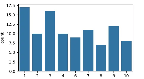
因此,它适用于离散或分类变量。
所有函数pyplot.hist、seaborn.countplot和seaborn.displot都作为matplotlib柱状图的包装器,如果手动绘制这样的柱状图被认为太麻烦,则可以使用它们。
对于连续变量,可以使用pyplot.hist 或seaborn.distplot。对于离散变量,则更方便使用seaborn.countplot。
1. 注意sns.distplot从seaborn 0.11.2版本开始已经过时,对于面向图形的绘制,请使用sns.displot,对于坐标轴级别的绘制,请使用sns.histplot。
pyplot.hist或seaborn.displot进行展示,而对于分类变量则应该使用seaborn.countplot。从seaborn.countplot的文档中可以看到:“使用条形图显示每个分类区间内的观察计数... 可以将计数图视为在分类变量上的直方图,而不是定量变量。”请参见 https://seaborn.pydata.org/generated/seaborn.countplot.html。 - user2340939