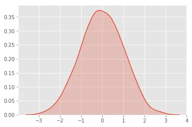
下面是简单的代码:
import numpy as np
import seaborn as sns
dist = np.random.normal(loc=0, scale=1, size=1000)
ax = sns.kdeplot(dist, shade=True);
生成以下图片:
我只想对右边(或某个x值左边)的所有内容进行阴影处理,最简单的方法是什么?我准备使用Seaborn以外的其他东西。
下面是简单的代码:
import numpy as np
import seaborn as sns
dist = np.random.normal(loc=0, scale=1, size=1000)
ax = sns.kdeplot(dist, shade=True);
生成以下图片:
我只想对右边(或某个x值左边)的所有内容进行阴影处理,最简单的方法是什么?我准备使用Seaborn以外的其他东西。
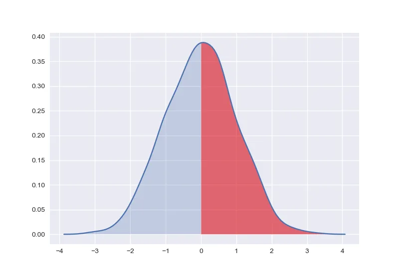
ax = sns.kdeplot(dist, shade=True)之后,ax.get_lines()的最后一行对应于kde密度曲线。ax = sns.kdeplot(dist, shade=True)
line = ax.get_lines()[-1]
line.get_data提取与该曲线对应的数据:x, y = line.get_data()
一旦您拥有数据,例如,您可以通过选择这些点并调用ax.fill_between来为对应于x > 0的区域着色:
mask = x > 0
x, y = x[mask], y[mask]
ax.fill_between(x, y1=y, alpha=0.5, facecolor='red')
import numpy as np
import seaborn as sns
import matplotlib.pyplot as plt
dist = np.random.normal(loc=0, scale=1, size=1000)
ax = sns.kdeplot(dist, shade=True)
line = ax.get_lines()[-1]
x, y = line.get_data()
mask = x > 0
x, y = x[mask], y[mask]
ax.fill_between(x, y1=y, alpha=0.5, facecolor='red')
plt.show()
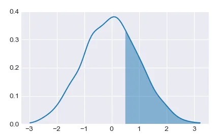
使用seaborn通常可以满足标准图的要求,但当需要一些自定义的需求时,回到matplotlib通常更容易。
因此,可以先计算核密度估计,然后在感兴趣的区域绘制它。
import scipy.stats as stats
import numpy as np
import matplotlib.pyplot as plt
plt.style.use("seaborn-darkgrid")

dist = np.random.normal(loc=0, scale=1, size=1000)
kde = stats.gaussian_kde(dist)
# plot complete kde curve as line
pos = np.linspace(dist.min(), dist.max(), 101)
plt.plot(pos, kde(pos))
# plot shaded kde only right of x=0.5
shade = np.linspace(0.5,dist.max(), 101)
plt.fill_between(shade,kde(shade), alpha=0.5)

plt.ylim(0,None)
plt.show()
get_lines,这里是get_data的文档。 - unutbu