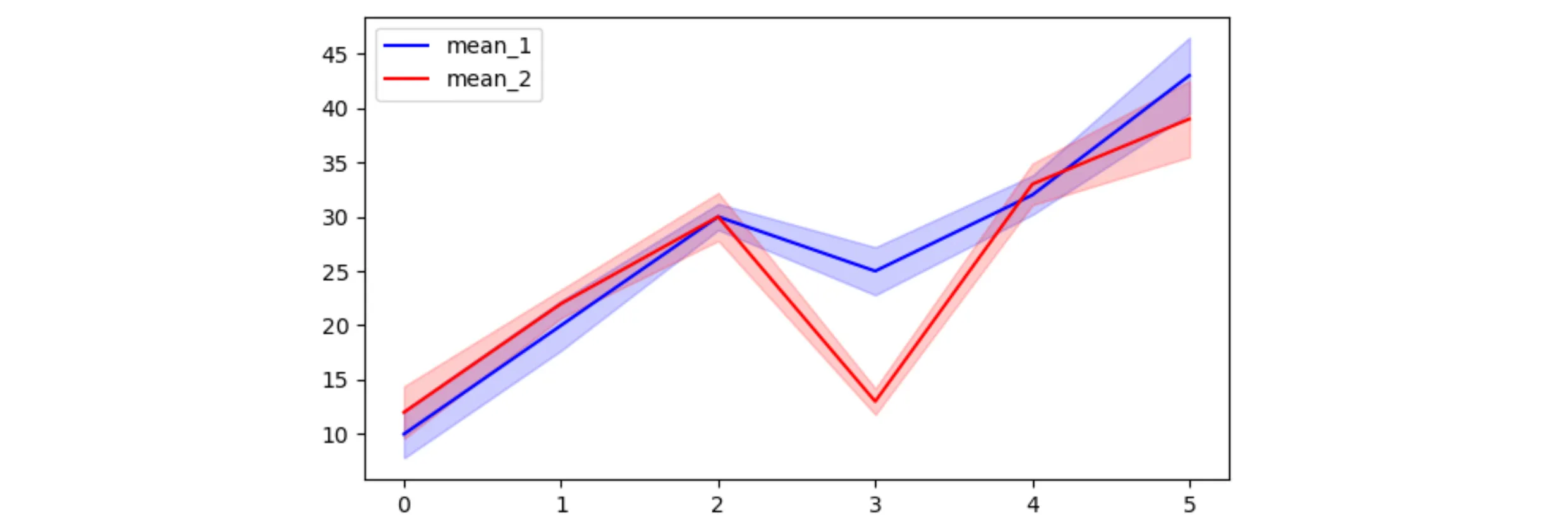
以下是使用给定数据创建此图的最简示例。由于向量化和广播,使用numpy简化了代码。
import matplotlib.pyplot as plt
import numpy as np

mean_1 = np.array([10, 20, 30, 25, 32, 43])
std_1 = np.array([2.2, 2.3, 1.2, 2.2, 1.8, 3.5])

mean_2 = np.array([12, 22, 30, 13, 33, 39])
std_2 = np.array([2.4, 1.3, 2.2, 1.2, 1.9, 3.5])

x = np.arange(len(mean_1))
plt.plot(x, mean_1, 'b-', label='mean_1')
plt.fill_between(x, mean_1 - std_1, mean_1 + std_1, color='b', alpha=0.2)
plt.plot(x, mean_2, 'r-', label='mean_2')
plt.fill_between(x, mean_2 - std_2, mean_2 + std_2, color='r', alpha=0.2)
plt.legend()
plt.show()
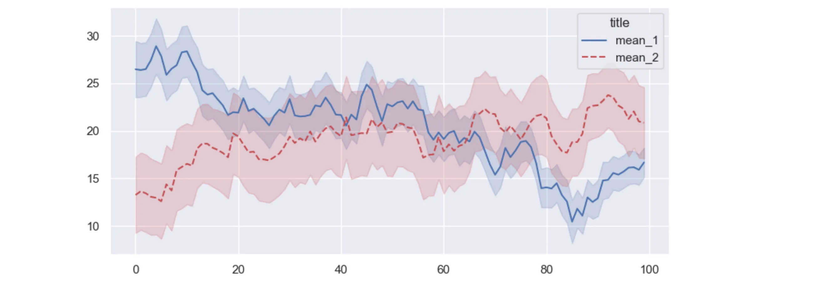
另一个例子:
import matplotlib.pyplot as plt
import numpy as np
import seaborn as sns

sns.set()
N = 100
x = np.arange(N)
mean_1 = 25 + np.random.normal(0.1, 1, N).cumsum()
std_1 = 3 + np.random.normal(0, .08, N).cumsum()

mean_2 = 15 + np.random.normal(0.2, 1, N).cumsum()
std_2 = 4 + np.random.normal(0, .1, N).cumsum()

plt.plot(x, mean_1, 'b-', label='mean_1')
plt.fill_between(x, mean_1 - std_1, mean_1 + std_1, color='b', alpha=0.2)
plt.plot(x, mean_2, 'r--', label='mean_2')
plt.fill_between(x, mean_2 - std_2, mean_2 + std_2, color='r', alpha=0.2)

plt.legend(title='title')
plt.show()
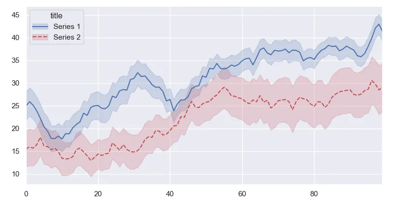
PS:使用matplotlib 3.5或更高版本,线条和填充可以在图例中合并:
line_1, = plt.plot(x, mean_1, 'b-')
fill_1 = plt.fill_between(x, mean_1 - std_1, mean_1 + std_1, color='b', alpha=0.2)
line_2, = plt.plot(x, mean_2, 'r--')
fill_2 = plt.fill_between(x, mean_2 - std_2, mean_2 + std_2, color='r', alpha=0.2)
plt.margins(x=0)

plt.legend([(line_1, fill_1), (line_2, fill_2)], ['Series 1', 'Series 2'], title='title')
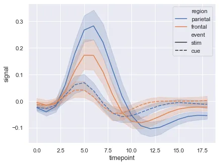
plot和fill_between方法。 - Paul Hplot和fill_between的示例。 - Paul H