使用不均匀长度的数据绘制分布图

3

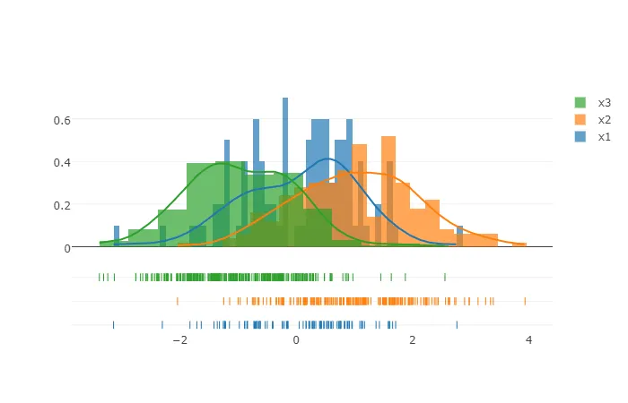
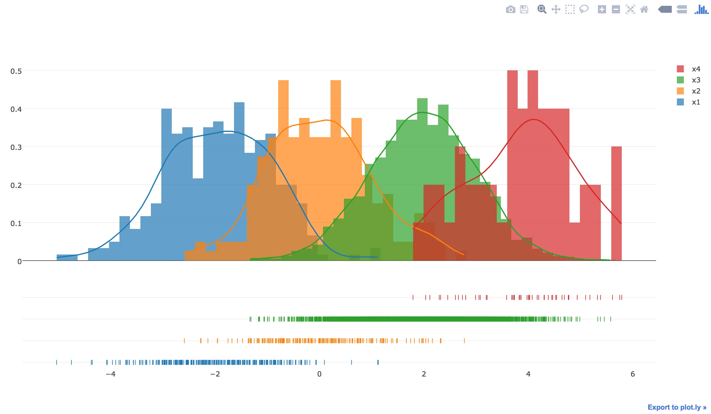
按照Plotly的指导,我想绘制类似以下代码的图表:

import plotly.plotly as py
import plotly.figure_factory as ff

import numpy as np

# Add histogram data
x1 = np.random.randn(200) - 2  
x2 = np.random.randn(200)  
x3 = np.random.randn(200) + 2  
x4 = np.random.randn(200) + 4  


# Group data together
hist_data = [x1, x2, x3, x4]

group_labels = ['Group 1', 'Group 2', 'Group 3', 'Group 4']

# Create distplot with custom bin_size
fig = ff.create_distplot(hist_data, group_labels, bin_size = [.1, .25, .5, 1])

# Plot!
py.iplot(fig, filename = 'Distplot with Multiple Bin Sizes')

然而,我有一个真实的数据集,其样本量不均匀(即组1的计数与组2中的计数不同等)。此外,它是以名称-值对的格式呈现。

以下是一些虚拟数据用于说明:

# Add histogram data
x1 = pd.DataFrame(np.random.randn(100))
x1['name'] = 'x1'

x2 = pd.DataFrame(np.random.randn(200) + 1)
x2['name'] = 'x2'

x3 = pd.DataFrame(np.random.randn(300) - 1)
x3['name'] = 'x3'

df = pd.concat([x1, x2, x3])
df = df.reset_index(drop = True)
df.columns = ['value', 'names'] 

df

如您所见,每个名称(x1,x2,x3)都有不同的计数,并且“names”列是我想要用作颜色的列。
有人知道我如何在plotly中绘制这个图吗?
FYI,在R中,非常简单,我只需调用ggplot,并使用aes(fill = names)。
任何帮助将不胜感激,谢谢!
2个回答

3
你可以尝试对数据框进行切片,然后将其放入Plotly中。
fig = ff.create_distplot([df[df.names == a].value for a in df.names.unique()], df.names.unique(), bin_size=[.1, .25, .5, 1])

enter image description here

import plotly
import pandas as pd
plotly.offline.init_notebook_mode()
x1 = pd.DataFrame(np.random.randn(100))
x1['name']='x1'

x2 = pd.DataFrame(np.random.randn(200)+1)
x2['name']='x2'

x3 = pd.DataFrame(np.random.randn(300)-1)
x3['name']='x3'

df=pd.concat([x1,x2,x3])
df=df.reset_index(drop=True)
df.columns = ['value','names'] 
fig = ff.create_distplot([df[df.names == a].value for a in df.names.unique()], df.names.unique(), bin_size=[.1, .25, .5, 1])
plotly.offline.iplot(fig, filename='Distplot with Multiple Bin Sizes')

感谢您提供一个优雅的解决方案。 - Trexion Kameha

2
plotly的文档中,示例可以直接适用于不均匀样本大小:
#!/usr/bin/env python 

import plotly
import plotly.figure_factory as ff
plotly.offline.init_notebook_mode()
import numpy as np

# data with different sizes
x1 = np.random.randn(300)-2  
x2 = np.random.randn(200)  
x3 = np.random.randn(4000)+2  
x4 = np.random.randn(50)+4  

# Group data together
hist_data = [x1, x2, x3, x4]

# use custom names
group_labels = ['x1', 'x2', 'x3', 'x4']

# Create distplot with custom bin_size
fig = ff.create_distplot(hist_data, group_labels, bin_size=.2)

# change that if you don't want to plot offline
plotly.offline.plot(fig, filename='Distplot with Multiple Datasets')

上述脚本将生成以下结果:

enter image description here


网页内容由stack overflow 提供, 点击上面的
可以查看英文原文,
原文链接