编辑Seaborn散点图和计数图的图例标题和标签。

3
我正在使用 seaborn 的散点图和计数图来处理泰坦尼克号数据集。
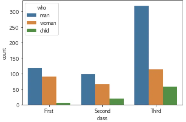
以下是我的代码,用于绘制散点图。我还尝试编辑图例标签。
ax = seaborn.countplot(x='class', hue='who', data=titanic)
legend_handles, _ = ax.get_legend_handles_labels()
plt.show();

output

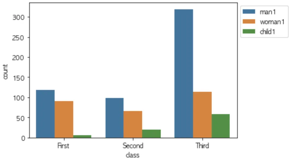
要编辑图例标签,我这样做。在这种情况下,就没有图例标题了。如何将此标题从“who”重命名为“who1”?

ax = seaborn.countplot(x='class', hue='who', data=titanic)
legend_handles, _= ax.get_legend_handles_labels()
ax.legend(legend_handles, ['man1','woman1','child1'], bbox_to_anchor=(1,1))
plt.show()

output2

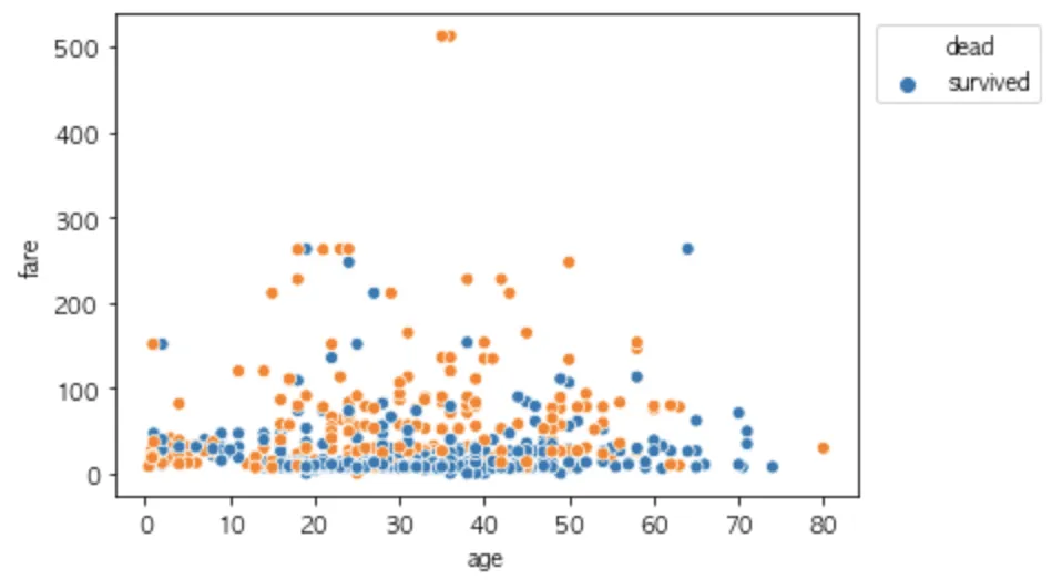
我使用相同的方法编辑散点图上的图例标签,但结果不同。它使用“dead”作为图例标题,并将“survived”用作第一个图例标签。

ax = seaborn.scatterplot(x='age', y='fare', data=titanic, hue = 'survived')
legend_handles, _= ax.get_legend_handles_labels()
ax.legend(legend_handles, ['dead', 'survived'],bbox_to_anchor=(1.26,1))
plt.show()

enter image description here

  1. 有没有参数可以删除和添加图例标题?

  2. 我在两个不同的图表上使用相同的代码,但图例的输出结果却不同。为什么会这样?
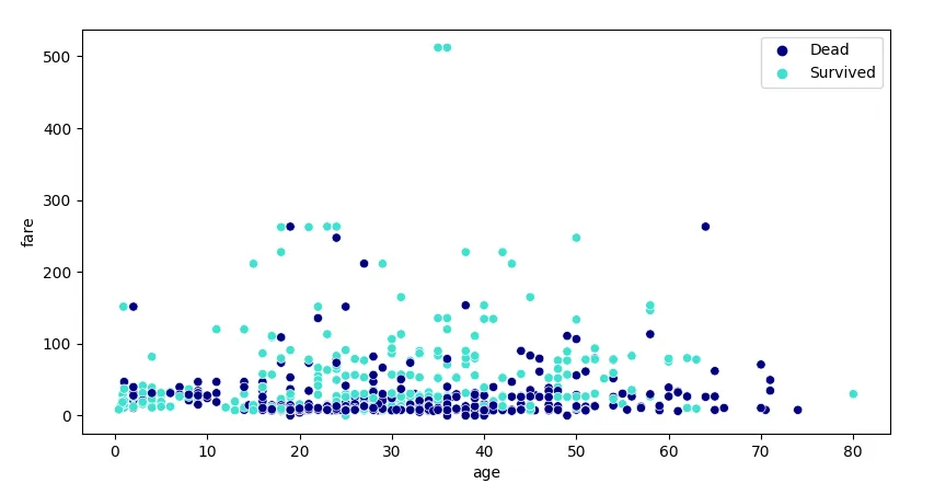

4
图例标题可以通过 ax.get_legend().set_title("标题") 进行设置。在 seaborn 散点图中,看似是标题的实际上只是另一个标签,没有对应的图例项。此时,请参考 https://dev59.com/RFUK5IYBdhLWcg3wmw4S#51579663。 - ImportanceOfBeingErnest
3个回答

10

尝试使用

ax.legend(legend_handles, ['man1','woman1','child1'], 
          bbox_to_anchor=(1,1), 
          title='whatever title you want to use')

3

为什么图例顺序有时候不同?

你可以通过hue_order=['man', 'woman', 'child']来强制设置图例的顺序。默认情况下,当值只是字符串时,顺序是它们在数据框中出现的顺序,或由pd.Categorical所施加的顺序。

如何重命名图例条目?

最保险的方法是重命名列值,例如:

titanic["who"] = titanic["who"].map({'man': 'Man1', 'woman': 'Woman1', 'child': 'Child1'})

如果列的条目包含范围内的数字0,1,...,您可以使用pd.Categorical.from_codes(...)。这也强制执行顺序。

特定色彩对应特定色调值

有许多选项可以指定要使用的颜色(通过palette=)。要为特定的色调值分配特定的颜色,调色板可以是一个字典,例如:
palette = {'Man1': 'cornflowerblue', 'Woman1': 'fuchsia', 'Child1': 'limegreen'}

重命名或删除图例标题

sns.move_legend(ax, title=..., loc='best')可以设置新的标题。将标题设置为空字符串会将其删除(当条目可以自我解释时,这很有用)。

代码示例

import matplotlib.pyplot as plt
import seaborn as sns
import pandas as pd

titanic = sns.load_dataset('titanic')
# titanic['survived'] = titanic['survived'].map({0:'Dead', 1:'Survived'})
titanic['survived'] = pd.Categorical.from_codes(titanic['survived'], ['Dead', 'Survived'])
palette = {'Dead': 'navy', 'Survived': 'turquoise'}

ax = sns.scatterplot(data=titanic, x='age', y='fare', hue='survived', palette=palette)
sns.move_legend(ax, title='', loc='best')  # remove the title

plt.show()

sns.scatterplot with renamed legend entries


2
使用 seaborn v0.11.2 或更高版本,请使用 move_legend() 函数。
来自FAQs页面
使用 seaborn v0.11.2 或更高版本,请使用 move_legend() 函数。
在旧版本中,常见的模式是在绘制后调用 ax.legend(loc=...)。虽然这似乎移动了图例,但实际上它用任何附加到轴上的标记艺术家替换了它。这在不同类型的绘图中并不总是有效。它也不能传播用于格式化多变量图例的图例标题或定位微调。
move_legend() 函数实际上比其名称暗示的更强大,它还可以用于修改绘图后的其他图例参数(字体大小、句柄长度等)。

网页内容由stack overflow 提供, 点击上面的
可以查看英文原文,
原文链接