在直方图的相对分组上叠加箱线图。

3
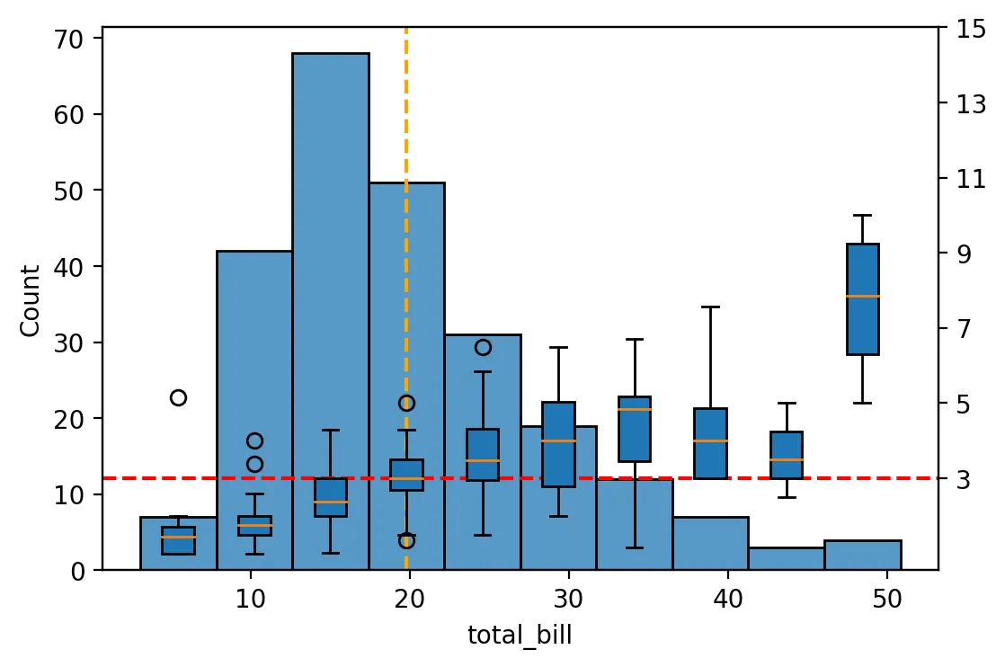
以数据集“tip”为例,我试图表示变量“total_bill”的分布,并将其各个区间与相应关联的变量“tip”的分布联系起来。在这个例子中,这张图旨在回答问题:“顾客支付账单后留下的小费分布如何?”
我已经达到了我想获得的图表(但有一个问题,在最后我会解释一下)。我采取的步骤是:
  1. Dividing 'total_bill' into bins.

    tips['bins_total_bill'] = pd.cut(tips.total_bill, 10)
    tips.head()
    
    total_bill tip smoker day time size bins_total_bill
    16.99 1.01 No Sun Dinner 2 (12.618, 17.392]
    10.34 1.66 No Sun Dinner 3 (7.844, 12.618]
    21.01 3.50 No Sun Dinner 3 (17.392, 22.166]
    23.68 3.31 No Sun Dinner 2 (22.166, 26.94]
    24.59 3.61 No Sun Dinner 4 (22.166, 26.94]
  2. Creation of a pd.Series with:
    Index: pd.interval of total_cost bins
    Values: n° of occurrences

    s = tips['bins_total_bill'].value_counts(sort=False)
    s
    
(3.022, 7.844]       7
(7.844, 12.618]     42
(12.618, 17.392]    68
(17.392, 22.166]    51
(22.166, 26.94]     31
(26.94, 31.714]     19
(31.714, 36.488]    12
(36.488, 41.262]     7
(41.262, 46.036]     3
(46.036, 50.81]      4
Name: bins_total_bill, dtype: int64
  1. Combine barplot and poxplot together

    fig, ax1 = plt.subplots(dpi=200)
    ax2 = ax1.twinx()
    
    sns.barplot(ax=ax1, x = s.index, y = s.values)
    sns.boxplot(ax=ax2, x='bins_total_bill', y='tip', data=tips)
    sns.stripplot(ax=ax2, x='bins_total_bill', y='tip', data=tips, size=5, color="yellow", edgecolor='red', linewidth=0.3)
    
    #Title and axis labels
    ax1.tick_params(axis='x', rotation=90)
    ax1.set_ylabel('Number of bills')
    ax2.set_ylabel('Tips [$]')
    ax1.set_xlabel("Mid value of total_bill bins [$]")
    ax1.set_title("Tips ~ Total_bill distribution")
    
    #Reference lines average(tip) + add yticks + Legend
    avg_tip = np.mean(tips.tip)
    ax2.axhline(y=avg_tip, color='red', linestyle="--", label="avg tip")
    ax2.set_yticks(list(ax2.get_yticks() + avg_tip))
    ax2.legend(loc='best')
    
    #Set labels axis x
    ax1.set_xticklabels(list(map(lambda s: round(s.mid,2), s.index)))
    

    barplot and poxplot together

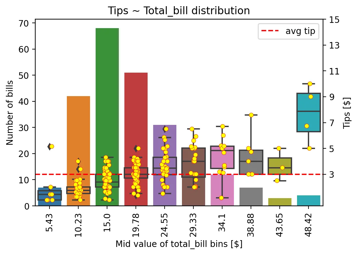
不得不说,这个图表存在问题!由于 x 轴是分类的,例如我不能在 "total_bill" 的平均值处添加一条垂直线。

我该如何修复以获得正确的结果?我也想知道是否有比我采用的方法更正确和更简化的方法。


1
x轴不是线性的,所以即使您将垂直线放在某个位置,它也不会告诉您太多信息(如果它在比例尺上介于15和19.78之间意味着什么)- 也许可以突出显示包含平均值的箱子? - Daniel Wlazło
1
我的意思是,这是可行的 - 你应该考虑相邻x轴刻度的相对位置,然后基于此计算坐标轴上平均值的相对位置,并使用https://matplotlib.org/stable/api/_as_gen/matplotlib.pyplot.axvline.html进行绘制。 但这并不能帮助我们更好地理解数据。 - Daniel Wlazło
1
@DanielWlazło - 我完全同意你的说法!为了理解数据,强调箱子已经足够了。 我提到的问题不在于理解数据,而是熟悉可视化库。非常感谢您的回复! - pofferbacco
1个回答

1
我想到了这种方法,比之前的更简洁(可能还可以更好),并且解决了在x轴上缩放的问题。
  1. I split 'total_bill' into bins and add the column to Df

    tips['bins_total_bill'] = pd.cut(tips.total_bill, 10)
    
  2. Group column 'tip' by previously created bins

    obj_gby_tips = tips.groupby('bins_total_bill')['tip']
    gby_tip = dict(list(obj_gby_tips))
    
  3. Create dictionary with:
    keys: midpoint of each bins interval
    values: gby tips for each interval

    mid_total_bill_bins = list(map(lambda bins: bins.mid, list(gby_tip.keys())))
    gby_tips = gby_tip.values()
    
    tip_gby_total_bill_bins = dict(zip(mid_total_bill_bins, gby_tips))
    
  4. Create chart by passing to each rectangle of the boxplot the centroid of each respective bins

    fig, ax1 = plt.subplots(dpi=200)
    ax2 = ax1.twinx()
    
    bp_values = list(tip_gby_total_bill_bins.values())
    bp_pos = list(tip_gby_total_bill_bins.keys())
    
    l1 = sns.histplot(tips.total_bill, bins=10, ax=ax1)
    l2 = ax2.boxplot(bp_values, positions=bp_pos, manage_ticks=False, patch_artist=True, widths=2)
    
    #Average tips as hline
    avg_tip = np.mean(tips.tip)
    ax2.axhline(y=avg_tip, color='red', linestyle="--", label="avg tip")
    ax2.set_yticks(list(ax2.get_yticks() + avg_tip)) #add value of avg(tip) to y-axis
    
    #Average total_bill as vline
    avg_total_bill=np.mean(tips.total_bill)
    ax1.axvline(x=avg_total_bill, color='orange', linestyle="--", label="avg tot_bill")
    
然后是结果。

小费 ~ 总账单分布图


网页内容由stack overflow 提供, 点击上面的
可以查看英文原文,
原文链接