我想画箱线图,但是我没有原始数据,只有在Pandas DataFrame中的聚合结果。
即使只有聚合结果,仍然可以绘制箱线图吗?
如果不行,那么我能得到最接近的图表是什么,以绘制最小值、最大值、平均数、中位数、标准偏差等。我知道可以使用折线图来绘制它们,但我需要对箱线图进行分组/聚类。
这是我的数据,缺少绘图部分。请帮忙,谢谢。
import matplotlib.pyplot as plt

import numpy as np
import pandas as pd

df = pd.DataFrame({
        'group' : ['Tick Tick Tick', 'Tock Tock Tock', 'Tock Tock Tock', 'Tick Tick Tick']*3, # , ['Tock Tock Tock', 'Tick Tick Tick']*6,
        'person':[x*5 for x in list('ABC')]*4,
        'Median':np.random.randn(12),
        'StdDev':np.random.randn(12)
                   })
df["Average"]=df["Median"]*1.1
df["Minimum"]=df["Median"]*0.5
df["Maximum"]=df["Median"]*1.6
df["90%"]=df["Maximum"]*0.9
df["95%"]=df["Maximum"]*0.95
df["99%"]=df["Maximum"]*0.99

df
更新
我现在距离获得我的结果更近了一步——我刚发现这个功能已经在 matplotlib 1.4 版本中可用,而我正在使用matplotlib 1.5版本,并且我进行了测试并且证明它对我有效。
问题是我不知道为什么它有效,以及如何调整我的上述代码以使用这个新功能。我将重新发布我的工作代码,希望有人能理解并将其串起来。
我拥有的数据是中位数、平均值、最小值、90%、95%、99%、最大值和标准偏差,我希望将它们全部绘制出来。我查看了下面代码的logstats数据结构,在for stats, label in zip(logstats, list('ABCD'))之后,找到它的字段为:
[{'cihi': 4.2781254505311281,
  'cilo': 1.6164348064249057,
  'fliers': array([ 19.69118642,  19.01171604]),
  'iqr': 5.1561885723613567,
  'label': 'A',
  'mean': 4.9486856766955922,
  'med': 2.9472801284780168,
  'q1': 1.7655440553898782,
  'q3': 6.9217326277512345,
  'whishi': 12.576334012545718,
  'whislo': 0.24252084924003742},
 {'cihi': 4.3186289184254107,
  'cilo': 1.9963715983778565,
  ...
因此,根据这个
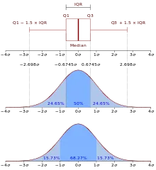
和bxp文档,我将按照以下方式映射我的数据:
- whislo:最小值
- q1:中位数
- med:平均数
- mean:90%
- q3:95%
- whishi:99%
- 以及最大值作为离群值
为了映射它们,我只需要执行SELECT Minimum AS whislo, [90%] AS mean, [95%] as q3, [99%] as whishi... 这是最终结果:
raw_data = {'label': ['Label_01 Init', 'Label_02', 'Label_03', 'Label_04', 'Label_05', 'Label_06', 'Label_07', 'Label_08', 'Label_99'], 'whislo': [0.17999999999999999, 2.0299999999999998, 4.0800000000000001, 2.0899999999999999, 2.3300000000000001, 2.3799999999999999, 1.97, 2.6499999999999999, 0.089999999999999997], 'q3': [0.5, 4.9699999999999998, 11.77, 5.71, 12.460000000000001, 11.859999999999999, 13.84, 16.969999999999999, 0.29999999999999999], 'mean': [0.40000000000000002, 4.1299999999999999, 10.619999999999999, 5.0999999999999996, 10.24, 9.0700000000000003, 11.960000000000001, 15.15, 0.26000000000000001], 'whishi': [1.76, 7.6399999999999997, 20.039999999999999, 6.6699999999999999, 22.460000000000001, 21.66, 16.629999999999999, 19.690000000000001, 1.1799999999999999], 'q1': [0.28000000000000003, 2.96, 7.6100000000000003, 3.46, 5.8099999999999996, 5.4400000000000004, 6.6299999999999999, 8.9900000000000002, 0.16], 'fliers': [5.5, 17.129999999999999, 32.890000000000001, 7.9100000000000001, 32.829999999999998, 70.680000000000007, 24.699999999999999, 32.240000000000002, 3.3500000000000001]}
df = pd.DataFrame(raw_data, columns = ['label', 'whislo', 'q1', 'mean', 'q3', 'whishi', 'fliers'])
现在的挑战是如何在箱线图中呈现我的上述数据框,而且还需要多级分组。如果多级分组太难了,那么让我们先让来自pd数据框的绘图工作正常运行,因为我的pd数据框与所需的np数组具有相同的字段。所以我尝试了以下代码:
fig, ax = plt.subplots()
ax.bxp(df.as_matrix(), showmeans=True, showfliers=True, vert=False)
但是我得到了
...\Anaconda3\lib\site-packages\matplotlib\axes\_axes.py in bxp(self, bxpstats, positions, widths, vert, patch_artist, shownotches, showmeans, showcaps, showbox, showfliers, boxprops, whiskerprops, flierprops, medianprops, capprops, meanprops, meanline, manage_xticks)
   3601         for pos, width, stats in zip(positions, widths, bxpstats):
   3602             # try to find a new label
-> 3603             datalabels.append(stats.get('label', pos))
   3604             # fliers coords
   3605             flier_x = np.ones(len(stats['fliers'])) * pos

AttributeError: 'numpy.ndarray' object has no attribute 'get'
如果我使用
ax.bxp(df.to_records(), ...,那么我将得到AttributeError: 'record' object has no attribute 'get'错误。好的,我终于让它工作了,可以从pd数据框绘制图表,但不能处理多层分组,例如:
df['fliers']=''
fig, ax = plt.subplots()
ax.bxp(df.to_dict('records'), showmeans=True, meanline=True, showfliers=False, vert=False) # shownotches=True,
plt.show()
请注意,我上面的数据缺少
med字段,您可以添加正确的字段或使用df['med']=df['q1']*1.2来使其正常工作。import matplotlib
import matplotlib.pyplot as plt
import numpy as np
import pandas as pd
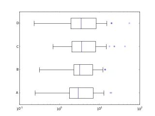
def test_bxp_with_ylabels():
np.random.seed(937)
logstats = matplotlib.cbook.boxplot_stats(
np.random.lognormal(mean=1.25, sigma=1., size=(37,4))
)
print(logstats)
for stats, label in zip(logstats, list('ABCD')):
stats['label'] = label
fig, ax = plt.subplots()
ax.set_xscale('log')
ax.bxp(logstats, vert=False)
test_bxp_with_ylabels()
ax.bxp需要中位数、四分位数和须的值。你有这些吗? - jrjcp和e,并且想要制作一个箱线图,其中p的值为均值,e的值为标准差,以某种方式绘制p ± e,这是你想要的吗? - jrjcpivot_table时所做的那样?) - jrjcpivot_table语句,强调原始数据源。至于数据映射,根据你的新解释,我将只需执行SELECT Minimum AS whislo, [90%] AS q3, [95%] as whishi...。下一个挑战是如何在多个分组级别中呈现它。再次感谢你的帮助。 - xpt