以下是使用numpys的percentile方法以及Rectangle和Line2D进行实际绘图的解决问题的初步尝试:
from matplotlib import pyplot as plt
from matplotlib.patches import Rectangle
from matplotlib.lines import Line2D
import numpy as np
def boxplot_2d(x,y, ax, whis=1.5):
xlimits = [np.percentile(x, q) for q in (25, 50, 75)]
ylimits = [np.percentile(y, q) for q in (25, 50, 75)]
box = Rectangle(
(xlimits[0],ylimits[0]),
(xlimits[2]-xlimits[0]),
(ylimits[2]-ylimits[0]),
ec = 'k',
zorder=0
)
ax.add_patch(box)
vline = Line2D(
[xlimits[1],xlimits[1]],[ylimits[0],ylimits[2]],
color='k',
zorder=1
)
ax.add_line(vline)
hline = Line2D(
[xlimits[0],xlimits[2]],[ylimits[1],ylimits[1]],
color='k',
zorder=1
)
ax.add_line(hline)
ax.plot([xlimits[1]],[ylimits[1]], color='k', marker='o')
iqr = xlimits[2]-xlimits[0]
left = np.min(x[x > xlimits[0]-whis*iqr])
whisker_line = Line2D(
[left, xlimits[0]], [ylimits[1],ylimits[1]],
color = 'k',
zorder = 1
)
ax.add_line(whisker_line)
whisker_bar = Line2D(
[left, left], [ylimits[0],ylimits[2]],
color = 'k',
zorder = 1
)
ax.add_line(whisker_bar)
right = np.max(x[x < xlimits[2]+whis*iqr])
whisker_line = Line2D(
[right, xlimits[2]], [ylimits[1],ylimits[1]],
color = 'k',
zorder = 1
)
ax.add_line(whisker_line)
whisker_bar = Line2D(
[right, right], [ylimits[0],ylimits[2]],
color = 'k',
zorder = 1
)
ax.add_line(whisker_bar)
iqr = ylimits[2]-ylimits[0]
bottom = np.min(y[y > ylimits[0]-whis*iqr])
whisker_line = Line2D(
[xlimits[1],xlimits[1]], [bottom, ylimits[0]],
color = 'k',
zorder = 1
)
ax.add_line(whisker_line)
whisker_bar = Line2D(
[xlimits[0],xlimits[2]], [bottom, bottom],
color = 'k',
zorder = 1
)
ax.add_line(whisker_bar)
top = np.max(y[y < ylimits[2]+whis*iqr])
whisker_line = Line2D(
[xlimits[1],xlimits[1]], [top, ylimits[2]],
color = 'k',
zorder = 1
)
ax.add_line(whisker_line)
whisker_bar = Line2D(
[xlimits[0],xlimits[2]], [top, top],
color = 'k',
zorder = 1
)
ax.add_line(whisker_bar)
mask = (x<left)|(x>right)|(y<bottom)|(y>top)
ax.scatter(
x[mask],y[mask],
facecolors='none', edgecolors='k'
)
fig,(ax1,ax2) = plt.subplots(ncols=2)
x = np.random.rand(1000)**2
y = np.sqrt(np.random.rand(1000))
ax1.scatter(x,y,c='r', s=1)
boxplot_2d(x,y,ax=ax2, whis=1)
plt.show()
这当然可以通过允许关键字参数来使
Rectangle和
Line2D调用更加方便。最终的结果看起来像这样:
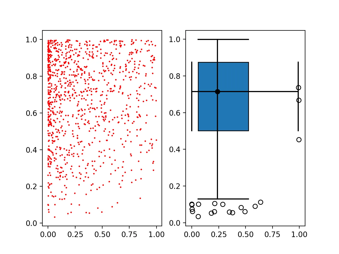
左边显示了实际数据的散点图,右边显示了生成的二维箱形图。希望这有所帮助。
 而非类似于这样的:
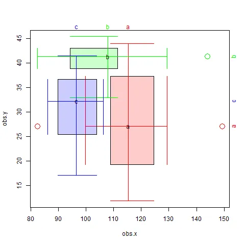
boxplot实现获得期望的结果,你需要编写自己的实现。如果你能够计算出x和y维度的第一四分位数和第三四分位数,那么你就可以使用适当的坐标绘制一个Rectangle(矩形)。Rectangle- Diziet AsahiRectangle的提示。如果成功,我会发布答案。 - Timothée ZARAGORI