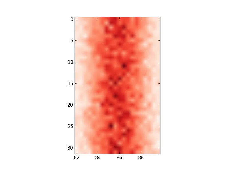
当extent=被设置为某个列表时,图像会沿着x-和y轴分别拉伸以填充框。但有时,最好仍然使用ax.set或plt.xticks/plt.yticks显式地设置刻度标签(在我看来):
fig, ax = plt.subplots(figsize=(6,6))
ax.imshow(hist, cmap='Reds', interpolation='none', extent=[80, 120, 32, 0], aspect=2)
ax.set(xticks=np.arange(80, 122)[::10], xticklabels=np.arange(80, 122)[::10]);
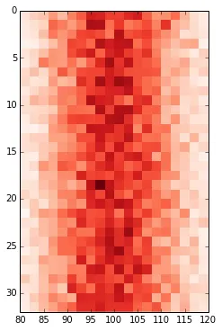
由于extent=设置了图像大小,使用它来设置刻度标签有时不是理想的选择。例如,假设我们想要显示一张相对高但具有较小刻度标签的长图像,如下所示:
那么,
fig, ax = plt.subplots(1, figsize=(6, 6))
ax.imshow(np.arange(120)[None, :], cmap='Reds', extent=[0, 120, 1, 0]);
生成

但是
fig, ax = plt.subplots(1, figsize=(6, 6))
ax.imshow(np.arange(120)[None, :], cmap='Reds', extent=[0, 120, 10, 0]);
ax.set(xticks=np.linspace(0, 120, 7), xticklabels=np.arange(0, 121, 20), yticks=[0, 10], yticklabels=[0, 1]);
生成正确的输出。这是因为extent=被设置为较大的值,但刻度标签被设置为较小的值,以便图像具有所需的标签。
N.B. ax.get_xticks()和ax.get_yticks()是有用的方法,可以了解默认(或其他)刻度位置,而ax.get_xlim()和ax.get_ylim()是有用的方法,可以了解轴限制。
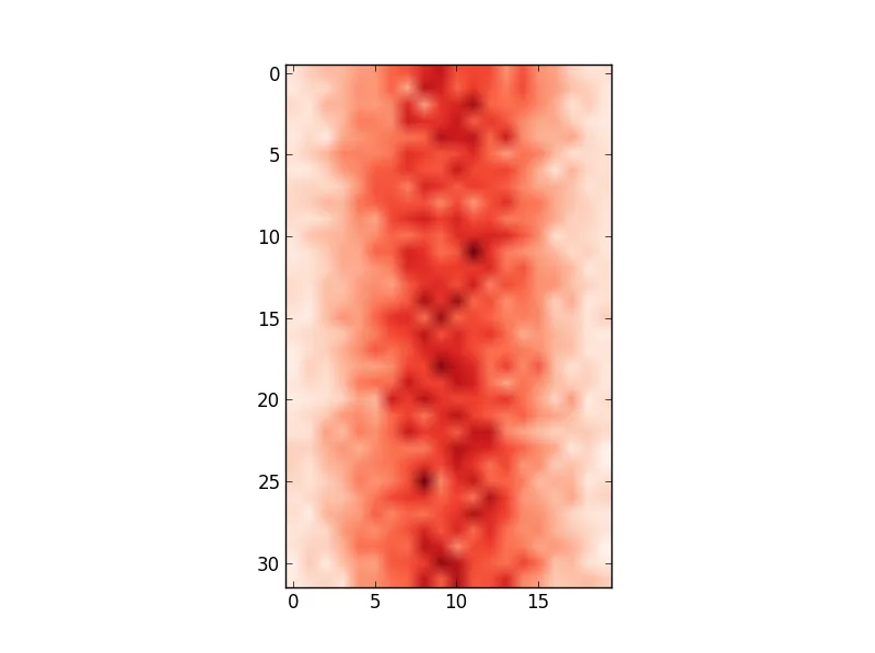
即使在OP使用的方法中,没有任何extent=,ax.get_xlim()仍会返回(-1.0, 19.5)。由于x轴刻度位置范围已经设置为这样,因此可以将x轴刻度标签设置为其他内容;只需将xticks设置为该范围内的某些值,并分配任何值给xticklabels即可。因此,以下内容呈现所需的图像。
fig, ax = plt.subplots(figsize=(6,6))
ax.imshow(hist, cmap='Reds', interpolation='none', aspect=2)
ax.set(xticks=np.arange(-1, 20, 5), xticklabels=np.arange(80, 122, 10));
pcolor,而不是在这个答案中提到的imshow。 - Nirmal