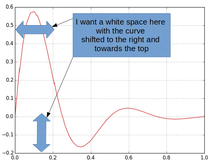
我正在尝试使用matplolib创建一个图形,其中坐标轴和实际绘图之间有一些填充。
以下是我的示例代码:
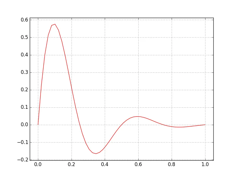
import numpy as np
import matplotlib.pyplot as plt

fig, ax = plt.subplots(1)

x = np.linspace(0, 1)
y = np.sin(4 * np.pi * x) * np.exp(-5 * x)

plt.plot(x, y, 'r')
plt.grid(True)


plt.show()
以下是我想要得到的内容:
ax.autoscale(True)。 - SpinUp __ A Davis