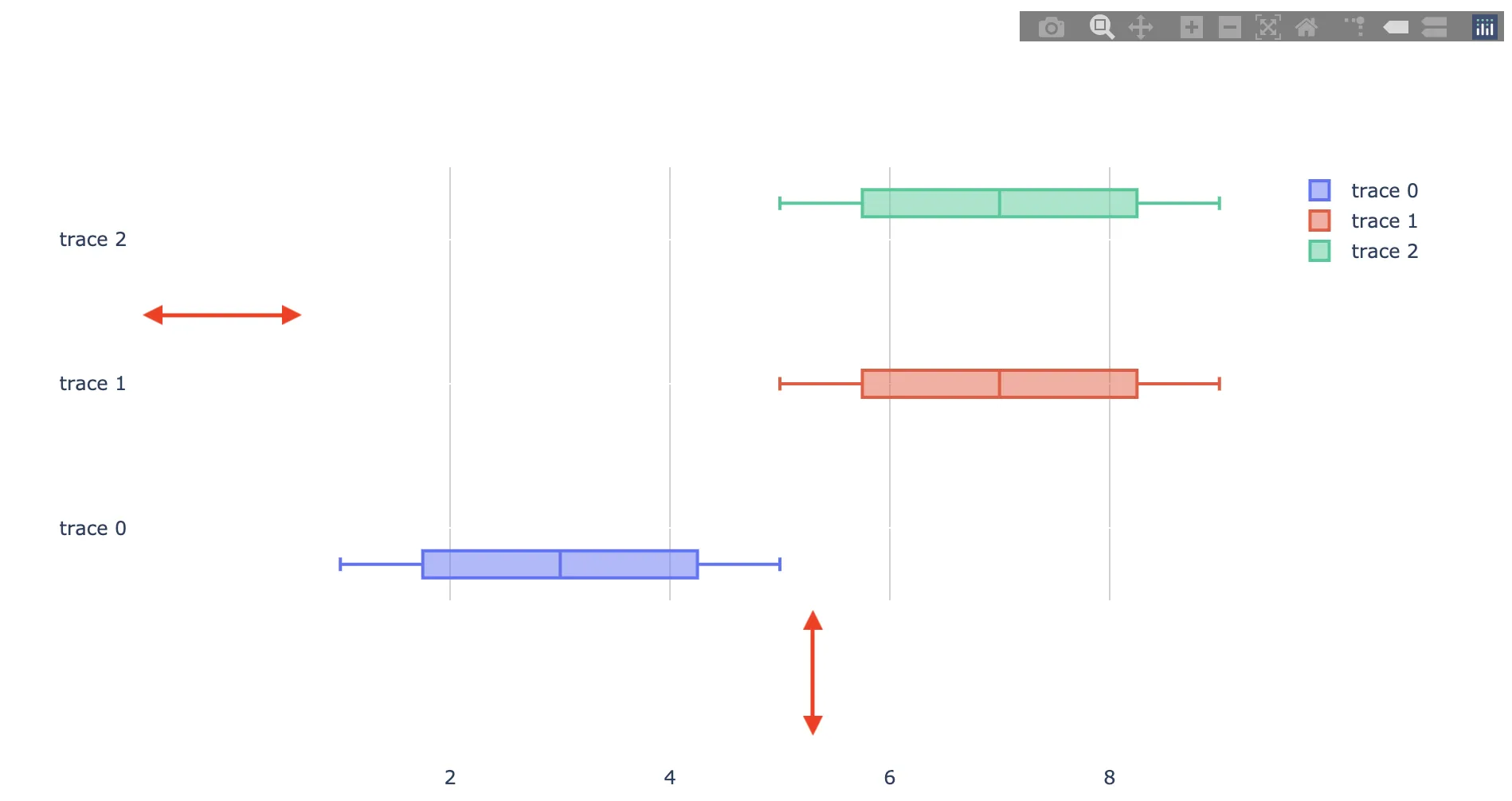
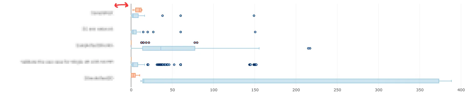
我该如何在Plotly中调整轴标签和绘图区域之间的间距?特别是我想减小轴标签和绘图区域之间的间距。我附上了一个带有示例的屏幕截图。
以下是可重现的代码片段:
import dash
import dash_core_components as dcc
import dash_html_components as html
import plotly.graph_objs as go
import plotly.express as px
import pandas as pd
import numpy as np

external_stylesheets = ['https://codepen.io/chriddyp/pen/bWLwgP.css']

app = dash.Dash(__name__, external_stylesheets=external_stylesheets)


df = pd.read_csv("data.txt", sep='\t', parse_dates=["StartTimeRun", "EndTimeRun"])
df = df[df['Status'] != 'NOT_RUN']
df = df[df['Status2'] != 'NOT_RUN']

# assume you have a "long-form" data frame
# see https://plotly.com/python/px-arguments/ for more options
df_PASS = df.loc[df['Status'] == "PASS"]
df_FAIL = df.loc[df['Status'] == "FAIL"]
trace1 = go.Box(x=df_PASS["Duration(seconds)"], y=df_PASS["Keyword"], name="PASS", orientation='h', marker=dict(color='rgb(158,202,225)', line=dict(color='rgb(8,48,107)', width=1.5)))
trace2 = go.Box(x=df_FAIL["Duration(seconds)"], y=df_FAIL["Keyword"], name="FAIL", orientation='h', marker=dict(color='#fd9668', line=dict(color='rgb(8,48,107)', width=1.5)))
fig = {
    'data': [trace1, trace2],
    'layout':
    go.Layout(
        boxmode='group',  margin=dict(l=200, r=150)
    )
}

app.layout = html.Div(children=[
    html.H1(children='Hello Dash'),

    html.Div(children='''
        Dash: A web application framework for Python.
    '''),

    dcc.Graph(
        id='example-graph',
        figure=fig
    )
])

if __name__ == '__main__':
    app.run_server(debug=True)
以下是数据框(data.txt)的内容:
SuiteName   Test    Status  Keyword Status2 Duration(seconds)   StartTimeRun    EndTimeRun  Type    FileName
0SmokeTestDD    Validate the use case for Single UE PASS    BuiltIn.Run Keywords    FAIL    12.619  20200809 06:45:18.515   20200809 06:45:31.134   setup   output-20200809-064513.xml
0SmokeTestDD    Validate the use case for Single UE PASS    Validate the work flow  PASS    34.56   20200809 06:45:31.135   20200809 06:49:25.695   kw  output-20200809-064513.xml
0SmokeTestDD    Validate the use case for Single UE PASS    BuiltIn.Run Keywords    PASS    15.344  20200809 06:49:25.695   20200809 06:49:41.039   teardown    output-20200809-064513.xml
Validate the use case for Single UE Validate the work flow  PASS    Login To    FAIL    8.502   20200809 06:45:31.135   20200809 06:45:39.637   kw  output-20200809-064513.xml
Validate the use case for Single UE Validate the work flow  PASS    Select Technology   PASS    1.243   20200809 06:45:39.637   20200809 06:45:55.880   kw  output-20200809-064513.xml
Validate the use case for Single UE Validate the work flow  PASS    Select Menu PASS    7.147   20200809 06:45:55.880   20200809 06:46:03.027   kw  output-20200809-064513.xml
Validate the use case for Single UE Validate the work flow  PASS    BuiltIn.Log FAIL    0.001   20200809 06:46:03.027   20200809 06:46:03.028   kw  output-20200809-064513.xml
Validate the use case for Single UE Validate the work flow  PASS    BuiltIn.Sleep   PASS    5.0 20200809 06:46:03.028   20200809 06:46:08.028   kw  output-20200809-064513.xml
希望这段代码能帮助你找到答案。