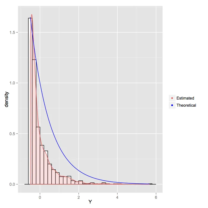
将任意函数添加到ggplot直方图

3

背景: 我有一些数据,希望:

  1. 绘制它们的直方图
  2. 添加核密度
  3. 添加“理论密度”
  4. 添加图例以区分2和3。

考虑:

X <- rnorm(1000,0,1)
Y <- (X^2-1)/2
ggplot(as.data.frame(Y), aes(x=Y)) + 
    geom_histogram(aes(y=..density..),      
                   binwidth=.2,
                   colour="black", fill="white") +
    geom_density(alpha=.2, fill="#FF6666") 

这样做可以实现1和2,但我该如何实现3和4?我已经编写了我想绘制的函数:
myfunc <- function(x) {
    2*exp(-x-0.5)/(sqrt(2*x+1)*sqrt(2*pi))
}

欢迎提出任何其他的评论/批评(我正在学习)


1
对于(3),请参见stat_function,尽管图例可能需要在ggplot之外计算两条线并手动添加geom_path层,这取决于您对图例外观的要求。 - joran
1个回答

4

由于您的自定义函数在该域上表现不佳,我用另一个简单的示例替代它以进行说明。

#Dummy data set for the legend
dat <- data.frame(x = rep(NA_integer_,2),
                  y = rep(NA_integer_,2),
                  grp = c('Theoretical','Estimated'))
ggplot(as.data.frame(Y), aes(x=Y)) + 
    geom_histogram(aes(y=..density..),      
                   binwidth=.2,
                   colour="black", fill="white") +
    geom_density(alpha=.2, fill="#FF6666",color = '#FF6666') + 
    stat_function(fun = function(x) exp(-x),colour = "blue") + 
    geom_point(data = dat,aes(x = x,y = y,color = grp)) + 
    scale_color_manual(name = "",values = c('#FF6666','blue'))

enter image description here

我稍微调整了颜色,但您可以根据需要进行微调。可能有一种更清晰的方法来制作图例,但“具有NA和分组变量的数据框架”是我处理这种情况的标准方法。


网页内容由stack overflow 提供, 点击上面的
可以查看英文原文,
原文链接