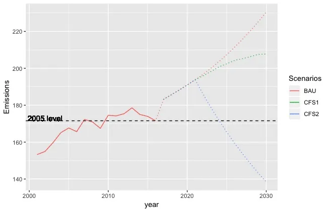
以下图表显示了不同情景下的排放水平。
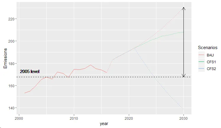
如何在2030年的图表上添加双头箭头(或括号),以显示2030年的排放水平与2005年(黑色水平线)的排放水平之间的差异。
  ggplot() +
  geom_line(data=emissions.total, aes(x=year, y =Emissions, colour=Scenarios), linetype="dotted",show_guide = TRUE) +
  geom_line(data=emissions.total, aes(x=year, replace(Emissions, year>2016, NA), colour=Scenarios),show_guide = TRUE) +
  geom_hline(yintercept=emissions.total$Emissions[which(year==2005)], linetype="dashed", color = "black") +
  geom_text(data=emissions.total, aes(x=2002, y=173, label="2005 level"),size=4, color="black")
 Here is the dataset:
       emissions.total <- structure(list(year = c(2001, 2002, 2003, 2004, 2005, 2006, 2007,
        2008, 2009, 2010, 2011, 2012, 2013, 2014, 2015, 2016, 2017, 2018,
        2019, 2020, 2021, 2022, 2023, 2024, 2025, 2026, 2027, 2028, 2029,
        2030, 2001, 2002, 2003, 2004, 2005, 2006, 2007, 2008, 2009, 2010,
        2011, 2012, 2013, 2014, 2015, 2016, 2017, 2018, 2019, 2020, 2021,
        2022, 2023, 2024, 2025, 2026, 2027, 2028, 2029, 2030, 2001, 2002,
        2003, 2004, 2005, 2006, 2007, 2008, 2009, 2010, 2011, 2012, 2013,
        2014, 2015, 2016, 2017, 2018, 2019, 2020, 2021, 2022, 2023, 2024,
        2025, 2026, 2027, 2028, 2029, 2030), Scenarios = structure(c(1L,
        1L, 1L, 1L, 1L, 1L, 1L, 1L, 1L, 1L, 1L, 1L, 1L, 1L, 1L, 1L, 1L,
        1L, 1L, 1L, 1L, 1L, 1L, 1L, 1L, 1L, 1L, 1L, 1L, 1L, 2L, 2L, 2L,
        2L, 2L, 2L, 2L, 2L, 2L, 2L, 2L, 2L, 2L, 2L, 2L, 2L, 2L, 2L, 2L,
        2L, 2L, 2L, 2L, 2L, 2L, 2L, 2L, 2L, 2L, 2L, 3L, 3L, 3L, 3L, 3L,
        3L, 3L, 3L, 3L, 3L, 3L, 3L, 3L, 3L, 3L, 3L, 3L, 3L, 3L, 3L, 3L,
        3L, 3L, 3L, 3L, 3L, 3L, 3L, 3L, 3L), .Label = c("BAU", "CFS1",
        "CFS2"), class = "factor"), Emissions = c(153.26965, 154.976334,
        159.694989, 165.146412, 167.66727, 165.675142, 172.29109, 170.972833,
        167.471381, 174.56907, 174.22316, 175.402278, 178.575427, 175.016324,
        173.921982, 171.566772, 183.196648982162, 185.7133178459, 188.287958106317,
        190.9715983008, 193.682009668713, 196.746265921755, 200.036103617208,
        203.568746857281, 207.355860289476, 211.410128322376, 215.739745848315,
        220.349793165392, 225.242982999225, 230.422987110964, NA, NA,
        NA, NA, NA, NA, NA, NA, NA, NA, NA, NA, NA, NA, NA, NA, 183.196648982162,
        185.7133178459, 188.287958106317, 190.9715983008, 193.848647184694,
        195.950925556132, 198.246162583056, 200.747913372455, 202.425883805268,
        204.285914709484, 205.247579255324, 206.341337090443, 207.557093881178,
        207.73139508312, NA, NA, NA, NA, NA, NA, NA, NA, NA, NA, NA,
        NA, NA, NA, NA, NA, 183.196648982162, 185.7133178459, 188.287958106317,
        190.9715983008, 193.848647184694, 186.069151568868, 178.759805219786,
        171.895784395426, 165.448176205759, 159.390269465344, 153.693419034959,
        148.328840591928, 143.268549966888, 138.48759672208)), row.names = c(NA,
        -90L), class = c("tbl_df", "tbl", "data.frame"))
geom_segment支持arrow=参数。 - r2evans