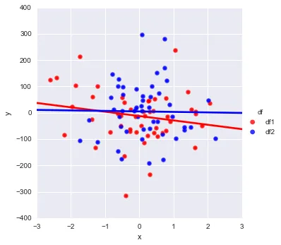
如何在同一图中绘制多个线性回归?

9

鉴于以下内容:

import numpy as np
import pandas as pd
import seaborn as sns

np.random.seed(365)
x1 = np.random.randn(50)
y1 = np.random.randn(50) * 100
x2 = np.random.randn(50)
y2 = np.random.randn(50) * 100

df1 = pd.DataFrame({'x1':x1, 'y1': y1})
df2 = pd.DataFrame({'x2':x2, 'y2': y2})

sns.lmplot('x1', 'y1', df1, fit_reg=True, ci = None)
sns.lmplot('x2', 'y2', df2, fit_reg=True, ci = None)

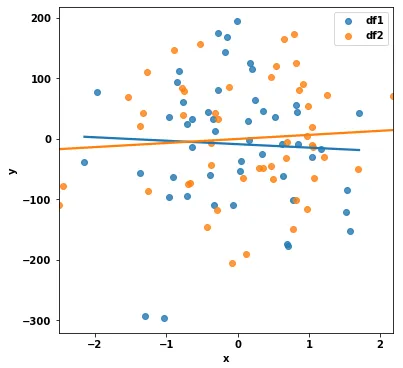
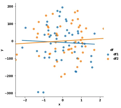
这将创建两个单独的绘图。我如何将 df2 的数据添加到同一张图表中?所有我在网上找到的 seaborn 示例似乎都集中于如何创建相邻的图形(例如,通过“hue”和“col_wrap”选项)。另外,我不想使用数据集示例,因为这在我们项目中没有自然意义。
如果需要混合使用 matplotlib/seaborn 函数来实现这一点,我会很感激有人能帮助说明。
2个回答

12
你可以使用 seabornFacetGrid 类来获得所需的结果。 你只需要用以下代码替换你的绘图调用即可:
# sns.lmplot('x1', 'y1', df1, fit_reg=True, ci = None)
# sns.lmplot('x2', 'y2', df2, fit_reg=True, ci = None)
df = pd.concat([df1.rename(columns={'x1':'x','y1':'y'})
                .join(pd.Series(['df1']*len(df1), name='df')), 
                df2.rename(columns={'x2':'x','y2':'y'})
                .join(pd.Series(['df2']*len(df2), name='df'))],
               ignore_index=True)

pal = dict(df1="red", df2="blue")
g = sns.FacetGrid(df, hue='df', palette=pal, size=5);
g.map(plt.scatter, "x", "y", s=50, alpha=.7, linewidth=.5, edgecolor="white")
g.map(sns.regplot, "x", "y", ci=None, robust=1)
g.add_legend();

这将产生以下绘图:

enter image description here

如果我理解正确的话,这就是你所需要的。

请注意,您需要注意.regplot的参数,并可能想要更改我作为示例放置的值。

  • 行末的;是为了抑制命令输出(我使用ipython笔记本电脑,在那里它是可见的)。
  • 文档.map()方法进行了一些解释。实质上,它做的就是将绘图命令与数据映射在一起。但是,它将使用“低级”绘图命令,例如regplot,而不是lmlplot,后者实际上在幕后调用regplot
  • 通常,plt.scatter会有参数:c='none'edgecolor='r',以创建非填充标记。但seaborn正在干扰此过程并将颜色强制为标记,因此我没有找到一种简单/直接的方法来解决此问题,但可以在seaborn生成绘图后操作ax元素,最好将其作为不同问题的一部分解决。

4

选项1: sns.regplot

  • 在这种情况下,最容易实现的解决方案是使用 sns.regplot,它是一个轴级函数,因为这不需要组合df1df2
import pandas as pd
import seaborn
import matplotlib.pyplot as plt

# create the figure and axes
fig, ax = plt.subplots(figsize=(6, 6))

# add the plots for each dataframe
sns.regplot(x='x1', y='y1', data=df1, fit_reg=True, ci=None, ax=ax, label='df1')
sns.regplot(x='x2', y='y2', data=df2, fit_reg=True, ci=None, ax=ax, label='df2')
ax.set(ylabel='y', xlabel='x')
ax.legend()
plt.show()

enter image description here


选项2: sns.lmplot
  • 根据 sns.FacetGrid,最好使用图形级别的函数而不是直接使用 FacetGrid
  • df1df2 合并为长格式,然后使用 sns.lmplot 并设置 hue 参数。
  • 在使用 seaborn 时,数据几乎总是需要处于长格式。
    • 通常使用 pandas.DataFrame.stackpandas.melt 将 DataFrame 从宽格式转换为长格式。
    • 因此,df1df2 必须重命名列,并添加一个额外的标识列。这使它们可以在 axis=0(默认的长格式)上进行连接,而不是在 axis=1(宽格式)上进行连接。
  • 有多种方法可以组合 DataFrames:
    1. 来自 Primeranswer 中的组合方法对于组合少量 DataFrames 是不错的。
    2. 然而,如下所示的函数对于组合许多 DataFrames 更好。
def fix_df(data: pd.DataFrame, name: str) -> pd.DataFrame:
    """rename columns and add a column"""
    # rename columns to a common name
    data.columns = ['x', 'y']
    # add an identifying value to use with hue
    data['df'] = name
    return data


# create a list of the dataframes
df_list = [df1, df2]

# update the dataframes by calling the function in a list comprehension
df_update_list = [fix_df(v, f'df{i}') for i, v in enumerate(df_list, 1)]

# combine the dataframes
df = pd.concat(df_update_list).reset_index(drop=True)

# plot the dataframe
sns.lmplot(data=df, x='x', y='y', hue='df', ci=None)

enter image description here

注意事项

  • 本答案所使用的软件包版本如下:
    • pandas v1.2.4
    • seaborn v0.11.1
    • matplotlib v3.3.4

网页内容由stack overflow 提供, 点击上面的
可以查看英文原文,
原文链接