我有一份数据,其中包括平均值和标准差:
#info mean sd
info1 20.84 4.56
info2 29.18 5.41
info3 38.90 6.22
实际上有100多行数据。如何在一个图中绘制每条线的正态分布曲线,基于以上数据?
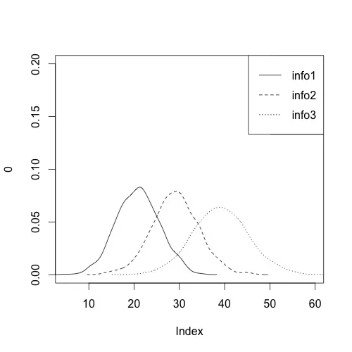
根据N的大小,您可能需要将其拆分为多个图表。但是,这是基本方法。首先,您需要根据平均值和标准差生成一些随机数据。我选择了1000个随机点,您可以根据需要进行调整。接下来,设置一个具有适当尺寸的空白图,并使用 lines 和 density 添加数据。我使用for循环因为它提供了一种指定每个数据点的线型的好方式。最后,在结尾处添加一个图例:
dat <- read.table(text = "info mean sd
info1 20.84 4.56
info2 29.18 5.41
info3 38.90 6.22
", header = TRUE)

densities <- apply(dat[, -1], 1, function(x) rnorm(n = 1000, mean = x[1], sd = x[2]))
colnames(densities) <- dat$info

plot(0, type = "n", xlim = c(min(densities), max(densities)), ylim = c(0, .2))
for (d in 1:ncol(densities)){
  lines(density(densities[, d]), lty = d)
}
legend("topright", legend=colnames(densities), lty=1:ncol(densities))
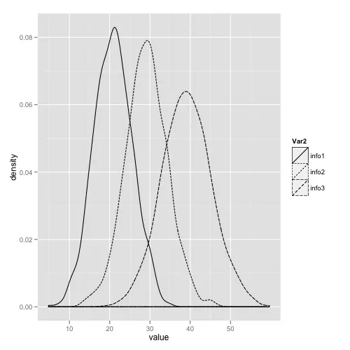
或者,使用ggplot2,它有很多好处,即它会自动为您指定合理的xlim和ylim值,并在不费力气的情况下对图例进行明智的处理。
library(reshape2)
library(ggplot2)
#Put into long format
densities.m <- melt(densities)
#Plot
ggplot(densities.m, aes(value, linetype = Var2)) + geom_density()
dnorm。 - Chasemelt()函数转换数据,就能得到var2和value。我猜确保你已经加载了reshape2和ggplot2库? - Chase又是一次错过了机会。Chase给出了非常详尽的回答。这是我的尝试:
dat <- read.table(text="info mean sd
info1 20.84 4.56
info2 29.18 5.41
info3 38.90 6.22", header=T)
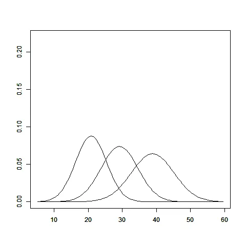
dat <- transform(dat, lower= mean-3*sd, upper= mean+3*sd)
plot(x=c(min(dat$lower)-2, max(dat$upper)+2), y=c(0, .25), ylab="",
xlim=c(min(dat$lower)-2, max(dat$upper)+2), xlab="",
axes=FALSE, xaxs = "i", type="n")
box()
FUN <- function(rownum) {
par(new=TRUE)
curve(dnorm(x,dat[rownum, 2], dat[rownum, 3]),
xlim=c(c(min(dat$lower)-2, max(dat$upper)+2)),
ylim=c(0, .22),
ylab="", xlab="")
}
lapply(seq_len(nrow(dat)), function(i) FUN(i))