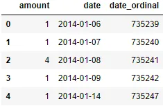
如何在 x 轴上使用日期绘制线性回归图

8
我的DataFrame对象看起来像这样
            amount
date    
2014-01-06  1
2014-01-07  1
2014-01-08  4
2014-01-09  1
2014-01-14  1

我希望能够绘制一个散点图,以时间为 x 轴,以金额为 y 轴,在数据上绘制一条线来引导观看者的眼光。如果我使用 Pandas 绘图,例如 df.plot(style="o"),这样不太对,因为没有连线。我想要类似这里(链接)给出的例子。

3个回答

26

注意:这与Ian Thompson的答案有很多共同之处,但是方法不同以至于需要单独回答。我使用问题中提供的DataFrame格式并避免更改索引。

Seaborn和其他库对于日期轴的处理可能并不如您所希望的那样好。以下是我解决此问题的方法:

首先添加一个日期序数列

Seaborn将比日期更好地处理这些内容。这是一个方便的技巧,可以在日期和不喜欢日期的库之间进行各种数学计算。

from datetime import date

df['date_ordinal'] = pd.to_datetime(df['date']).apply(lambda date: date.toordinal())

展示有序数据的数据框

在时间轴上使用有序数据制作图表

ax = seaborn.regplot(
    data=df,
    x='date_ordinal',
    y='amount',
)
# Tighten up the axes for prettiness
ax.set_xlim(df['date_ordinal'].min() - 1, df['date_ordinal'].max() + 1)
ax.set_ylim(0, df['amount'].max() + 1)

使用易读的日期替换序数X轴标签

ax.set_xlabel('date')
new_labels = [date.fromordinal(int(item)) for item in ax.get_xticks()]
ax.set_xticklabels(new_labels)

具有回归线的绘图

ta-daa!


1
太好了!我只想补充一下,因为我在脚本顶部使用了
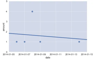
import datetime as dt,所以我不得不使用new_labels = [dt.date.fromordinal(int(item)) for item in ax.get_xticks()]我猜这个答案假设用户已经执行了from datetime import date - Tom Bush
1
是的,你需要那个日期导入;它在第一个代码块中。跳过这些步骤就自担风险吧 ;) - waterproof

3

由于Seaborn对日期的处理有些困难,我将创建一个解决方法。首先,我将把日期列设置为我的索引:

# Make dataframe
df = pd.DataFrame({'amount' : [1,
                               1,
                               4,
                               1,
                               1]},
                  index = ['2014-01-06',
                           '2014-01-07',
                           '2014-01-08',
                           '2014-01-09',
                           '2014-01-14'])

其次,将索引转换为pd.DatetimeIndex:

# Make index pd.DatetimeIndex
df.index = pd.DatetimeIndex(df.index)

用它替换原来的内容:

# Make new index
idx = pd.date_range(df.index.min(), df.index.max())

第三步,使用新索引(idx)重新索引:
# Replace original index with idx
df = df.reindex(index = idx)

这将生成一个新的数据框,对于您没有数据的日期将产生NaN值:

df edit

第四步,由于Seaborn不支持日期和回归线很好地兼容,因此我将创建一个行计数列,作为我们的x轴:

# Insert row count
df.insert(df.shape[1],
          'row_count',
          df.index.value_counts().sort_index().cumsum())

第五步,我们现在应该能够使用“行数”作为x变量,“金额”作为y变量绘制回归线:
# Plot regression using Seaborn
fig = sns.regplot(data = df, x = 'row_count', y = 'amount')

第六步,如果您希望日期显示在x轴而不是行数,则可以将x-tick标签设置为索引。
# Change x-ticks to dates
labels = [item.get_text() for item in fig.get_xticklabels()]

# Set labels for 1:10 because labels has 11 elements (0 is the left edge, 11 is the right
# edge) but our data only has 9 elements
labels[1:10] = df.index.date

# Set x-tick labels
fig.set_xticklabels(labels)

# Rotate the labels so you can read them
plt.xticks(rotation = 45)

# Change x-axis title
plt.xlabel('date')

plt.show();

plot edit 2

希望这可以帮到你!

2
  • datetime dtype 值必须被转换成类似于 ordinal 的东西。
  • 这可以通过使用 sklearn.linear_model.LinearRegression 计算模型,然后用 matplotlib.pyplot.plot 添加回归线来完成。
    • sns.lineplot(x=[x1_date, x2_date], y=[y1, y2], label='线性模型', color='洋红色') 也可以实现。
  • python 3.8.11pandas 1.3.2matplotlib 3.4.3sklearn 0.24.2 中测试通过
import yfinance as yf  # for data
from sklearn.linear_model import LinearRegression
import matplotlib.pyplot as plt

# download the data
data = yf.download('aapl', '2019-01-02', '2021-01-01')

# add an ordinal column because sklearn doesn't work with datetimes
data['ordinal'] = data.index.map(pd.Timestamp.toordinal)

# create the model
model = LinearRegression()

# extract x and y from dataframe data
x = data[['ordinal']]
y = data[['Adj Close']]

# fit the mode
model.fit(x, y)

# print the slope and intercept if desired
print('intercept:', model.intercept_[0])
print('slope:', model.coef_[0][0])

# select x1 and x2 and get the corresponding date from the index
x1 = data.ordinal.min()
x1_date = data[data.ordinal.eq(x1)].index[0]
x2 = data.ordinal.max()
x2_date = data[data.ordinal.eq(x2)].index[0]

# calculate y1, given x1
y1 = model.predict(np.array([[x1]]))[0][0]

print('y1:', y1)

# calculate y2, given x2
y2 = model.predict(np.array([[x2]]))[0][0]

print('y2:', y2)

[out]:
intercept: -90078.45713565295
slope: 0.12225139598567565
y1: 28.279040945126326
y2: 117.40030861868581

图表

ax1 = data.plot(y='Adj Close', c='k', figsize=(15, 6), grid=True, legend=False)
ax1.plot([x1_date, x2_date], [y1, y2], label='Linear Model', c='magenta')
ax1.legend()

enter image description here


网页内容由stack overflow 提供, 点击上面的
可以查看英文原文,
原文链接