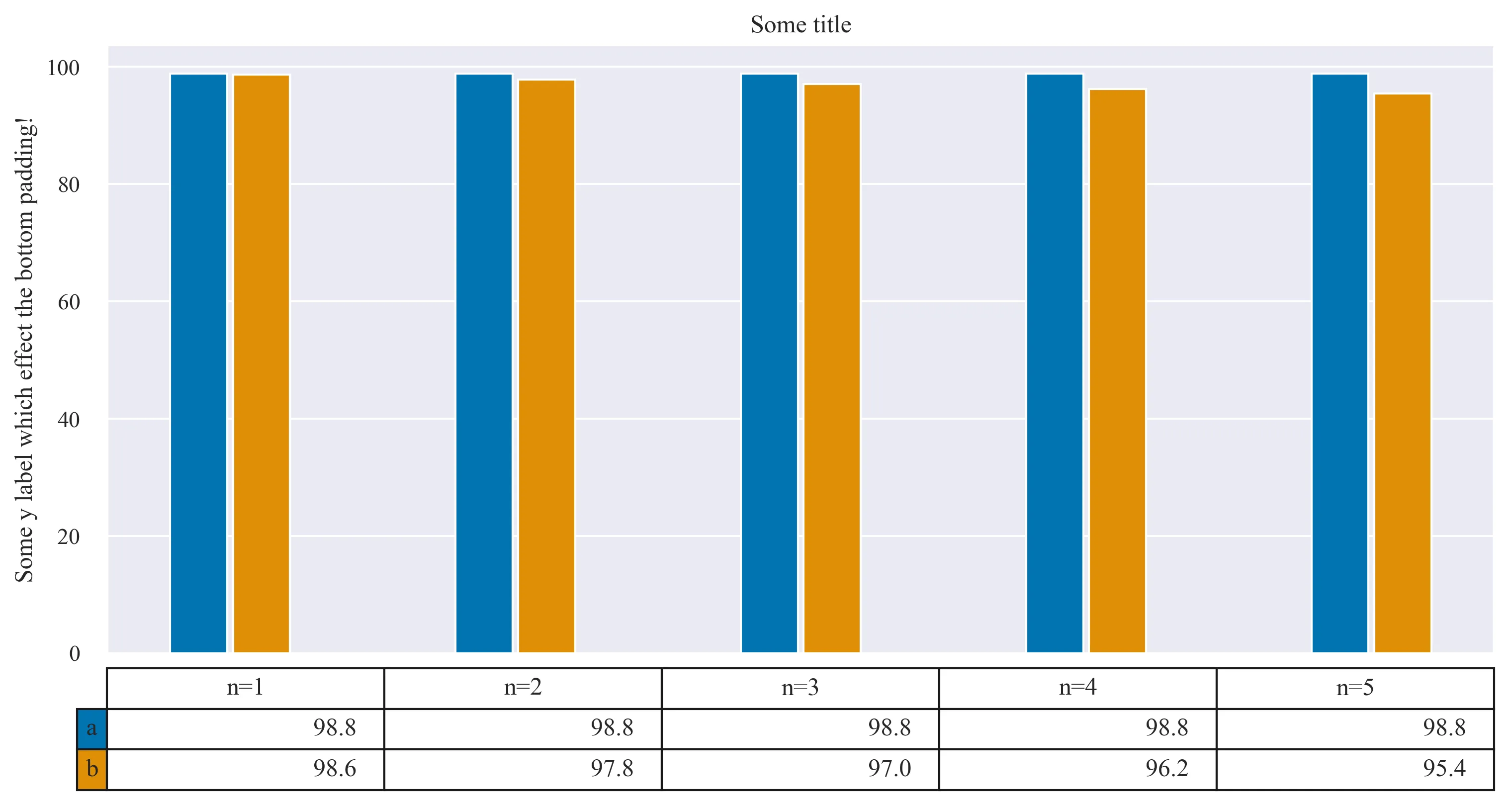
我在我的图表底部添加了一个表格,但是有一些问题需要解决:
以下是代码(Python 3):
- 右边的填充太多。
- 左边的填充太少。
- 底部没有填充。
- 单元格对于其中的文本来说太小了。
- 表格距离图表底部太近。
- 行名所属的单元格没有与条形图颜色相匹配。
以下是代码(Python 3):
import seaborn as sns
import matplotlib.pyplot as plt
import numpy as np
import matplotlib
# Set styles
plt.style.use(['seaborn-paper', 'seaborn-whitegrid'])
plt.style.use(['seaborn'])
sns.set(palette='colorblind')
matplotlib.rc("font", family="Times New Roman", size=12)

labels = ['n=1','n=2','n=3','n=4','n=5']
a = [98.8,98.8,98.8,98.8,98.8]
b = [98.6,97.8,97.0,96.2,95.4]
bar_width = 0.20
data = [a,b]
print(data)
colors = plt.cm.BuPu(np.linspace(0, 0.5, len(labels)))
columns = ('n=1', 'n=2', 'n=3', 'n=4', 'n=5')

index = np.arange(len(labels))
plt.bar(index, a, bar_width)
plt.bar(index+bar_width+.02, b, bar_width)
plt.table(cellText=data,
          rowLabels=['a', 'b'],
          rowColours=colors,
          colLabels=columns,
          loc='bottom')

plt.subplots_adjust(bottom=0.7)

plt.ylabel('Some y label which effect the bottom padding!')
plt.xticks([])
plt.title('Some title')
plt.show()
这是输出结果:
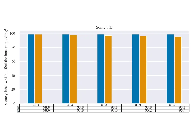
更新
现在可以正常工作了,但如果有人遇到问题:请确保您不要使用IntelliJ SciView查看绘图及其更改,因为它无法准确表示更改并引入了一些格式问题!