我有一个Pandas数据框架列表(示例):
df1 = pd.DataFrame({'Number':[-9,-8,0,1,2,3], 'A':[3,6,4,1,7,19], 'B':[2,4,4,0,7,1]})
df1.set_index('Number',inplace=True)

df2 = pd.DataFrame({'Number':[0,5,6,7,8,9], 'A':[8,7,3,5,2,15], 'B':[1,7,1,1,1,3]})
df2.set_index('Number',inplace=True)

df_list = [df1, df2] #In reality there are more than two in the list
我正在尝试使用Matplotlib绘制它们:
nrow = 2
ncol = 2
fig, axs = plt.subplots(nrow,ncol)

for i in range(nrow*ncol):
    #Convert 1D to 2D
    row = i / ncol
    col = i % ncol
    if i >= len(df_list):
        axs[row,col].axis('off')
    else:
        df_list[i]['A'].plot(kind='bar',
              ax=axs[row,col],
              ylim=(0,20),
              xlim=(-10,10),
              figsize=(20,15),
              color=('green'),
              legend=False,
              )
        df_list[i]['B'].plot(kind='bar',
              ax=axs[row,col],
              ylim=(0,20),
              xlim=(-10,10),
              figsize=(20,15),
              color=('yellow'),
              legend=False,
              )
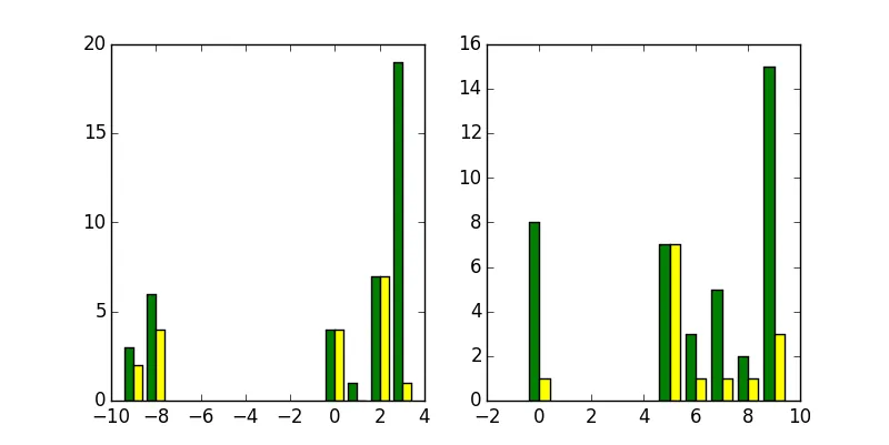
生成的图表如下所示:
 除了x轴刻度标签之外,其他都看起来很好。我期望这些标签根据其值进行间隔(例如,"-9"不应该在图的中间,"0"不应该紧贴着"5"等)。实际上,由于我的x范围大约是(-10,10),我希望在x轴上显示整个范围,并使彩色条根据它们的“数字”进行定位。我想到的一个可能的解决方案是使用Pandas填充从(-10,10)丢失的值,但我认为有更好/更明显的方法来处理这个问题。我只是一直没有能够找到那个解决方案。
更新:
感谢Ajean和JD Long在下面的回复中提供的代码,我现在正在使用这个Matplotlib代码:
df_list = [df1, df2]

nrow = 2
ncol = 2
fig, axs = plt.subplots(nrow,ncol,figsize=(20,15))

for i in range(nrow*ncol):
    #Convert 1D to 2D
    row = i / ncol
    col = i % ncol
    if i >= len(df_list):
        axs[row,col].axis('off')
    else:
        axs[row,col].bar(np.array(df_list[i].index)-0.5, df_list[i]['A'], width=1, color='green')
        axs[row,col].bar(np.array(df_list[i].index)-0.5, df_list[i]['B'], width=1, color='yellow')
        axs[row,col].set_xlim([-10,10])
        axs[row,col].set_ylim([0,20])
        axs[row,col].xaxis.set_ticks(np.arange(-10, 11, 1))
这将产生所需的结果:
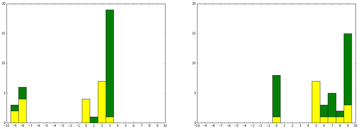
注意:每个条形图的宽度都设置为1.0,并且它们已经向左移动了-0.5,以使每个条形图位于刻度线中心。