Matplotlib: 将刻度标签移动到刻度之间

24
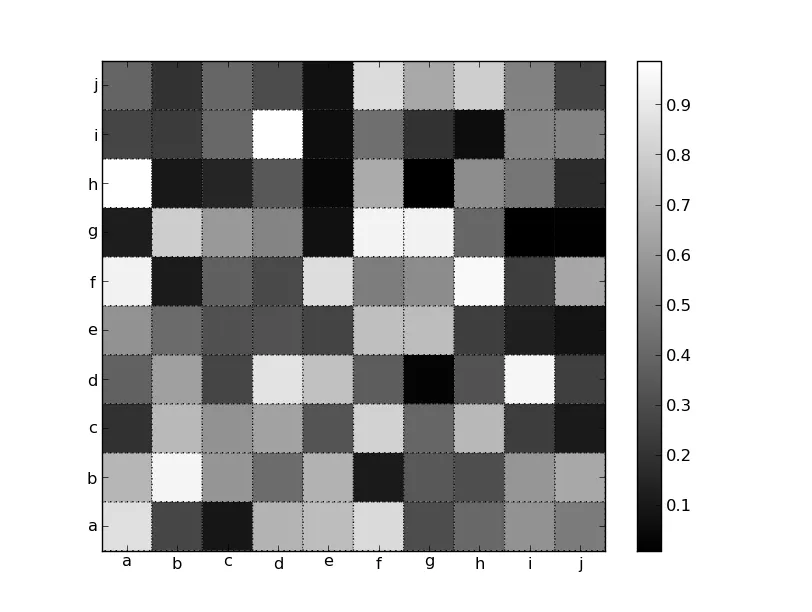
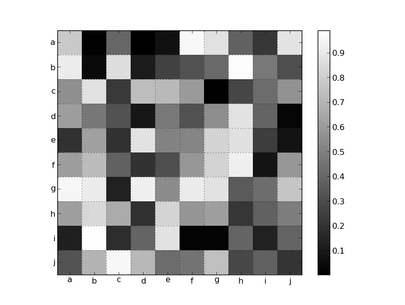
我想使用matplotlib创建混淆矩阵的可视化。以下方法的参数为类标签(字母表),分类结果作为列表的列表(conf_arr)和输出文件名。到目前为止,我对结果感到非常满意,但还有一个问题:我无法将轴刻度标签居中对齐。如果我传递下面所示的extent参数给imshow方法,则网格线与我希望对齐的位置相对应。如果我注释掉它,则网格线会错位,但标签会在我希望的位置上。我认为我需要一种方法将刻度标签移动到相关刻度和下一个刻度之间,但我不知道这是否可能以及如何做到。总之,我希望像右图那样放置刻度标签,但像左图那样具有网格/刻度。
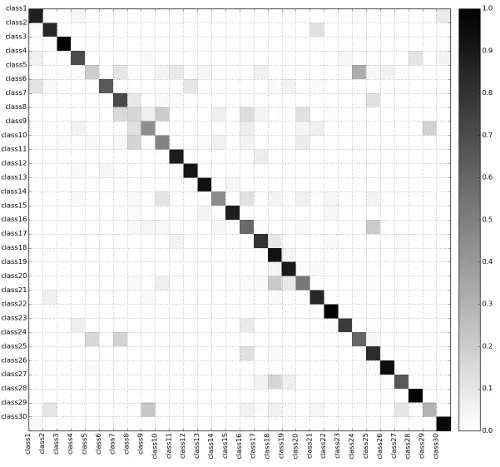
def create_confusion_matrix(alphabet, conf_arr, outputname):
    norm_conf = []
    width = len(conf_arr)
    height = len(conf_arr[0])
    for i in conf_arr:
        a = 0
        tmp_arr = []
        a = sum(i, 0)
        for j in i:
            tmp_arr.append(float(j)/float(a))
        norm_conf.append(tmp_arr)

    fig = plt.figure(figsize=(14,14))
    #fig = plt.figure()
    plt.clf()
    ax = fig.add_subplot(111)
    ax.set_aspect(1)
    ax.grid(which='major')
    res = ax.imshow(np.array(norm_conf), cmap=plt.cm.binary, 
                    interpolation='none', aspect='1', vmax=1,
                    ##Commenting out this line sets labels correctly,
                    ##but the grid is off
                    extent=[0, width, height, 0]
                    )
    divider = make_axes_locatable(ax)
    cax = divider.append_axes("right", size="5%", pad=0.2)
    cb = fig.colorbar(res, cax=cax)

    #Axes
    ax.set_xticks(range(width))
    ax.set_xticklabels(alphabet, rotation='vertical')
    ax.xaxis.labelpad = 0.5
    ax.set_yticks(range(height))
    ax.set_yticklabels(alphabet, rotation='horizontal')
    #plt.tight_layout()
    plt.savefig(outputname, format='png')
生成的图片如下所示: 在此输入图像描述

1
这个问题中的解决方案(https://dev59.com/pWQo5IYBdhLWcg3wUN3Y)是否对您有用? - BrenBarn
1
这是一个清晰明了、措辞得当的问题!(+1) 不确定为什么有人给你点了踩。 - Joe Kington
2个回答

23

你可能已经注意到,它们默认是居中的,并且你通过指定extent=[0, width, height, 0]来覆盖了默认行为。

有许多方法可以处理这个问题。其中一种方法是使用 pcolor,并设置边界颜色和线型,使其看起来像网格线(为了使其工作,实际上需要使用pcolor而不是pcolormesh)。但是,你必须更改范围才能像imshow默认情况下那样将刻度放在中心位置。

import matplotlib.pyplot as plt
import numpy as np

data = np.random.random((10,10))
labels = 'abcdefghij'

fig, ax = plt.subplots()
im = ax.pcolor(data, cmap='gray', edgecolor='black', linestyle=':', lw=1)
fig.colorbar(im)

# Shift ticks to be at 0.5, 1.5, etc
for axis in [ax.xaxis, ax.yaxis]:
    axis.set(ticks=np.arange(0.5, len(labels)), ticklabels=labels)

plt.show()

在这里输入图片描述

或者,您可以打开次网格并将其放置在像素边界上。因为您想要固定标签,所以我们将手动设置所有内容。否则,使用MultipleLocator可能更合适:

import matplotlib.pyplot as plt
import numpy as np

data = np.random.random((10,10))
labels = 'abcdefghij'

fig, ax = plt.subplots()
im = ax.imshow(data, cmap='gray', interpolation='none')
fig.colorbar(im)

# Set the major ticks at the centers and minor tick at the edges
locs = np.arange(len(labels))
for axis in [ax.xaxis, ax.yaxis]:
    axis.set_ticks(locs + 0.5, minor=True)
    axis.set(ticks=locs, ticklabels=labels)

# Turn on the grid for the minor ticks
ax.grid(True, which='minor')

plt.show()

在此输入图像描述


1
非常感谢您的努力,这完美地解决了我的问题! :) - feob

1
或者您尝试使用im = ax.matshow(data, cmap='gray')而不是imshow()?这样也应该将刻度标签放置在正确的位置。

网页内容由stack overflow 提供, 点击上面的
可以查看英文原文,
原文链接