在 x 轴上绘制时间。

3

我正在处理一个只包含日期时间对象的数据集,我已经检索了一周中的某一天并将时间重新格式化到一个单独的列中,如下所示(包括转换函数):

    datetime            day_of_week time_of_day
0   2021-06-13 12:56:16 Sunday      20:00:00
5   2021-06-13 12:56:54 Sunday      20:00:00
6   2021-06-13 12:57:27 Sunday      20:00:00
7   2021-07-16 18:55:42 Friday      20:00:00
8   2021-07-16 18:56:03 Friday      20:00:00
9   2021-06-04 18:42:06 Friday      20:00:00
10  2021-06-04 18:49:05 Friday      20:00:00
11  2021-06-04 18:58:22 Friday      20:00:00
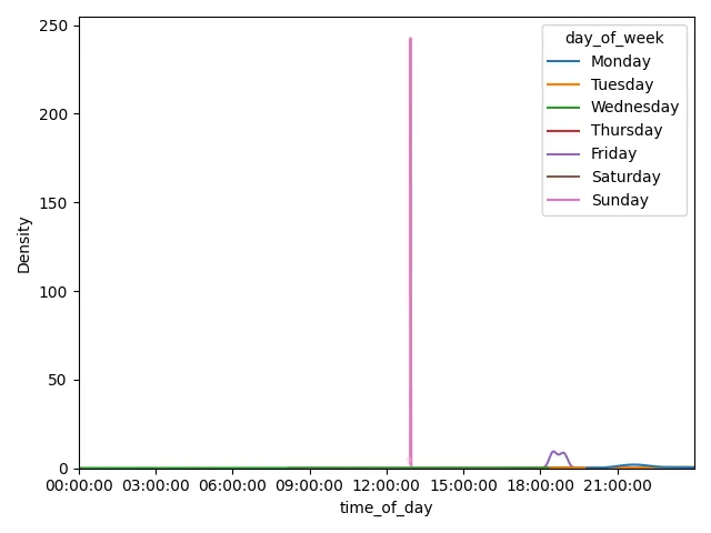
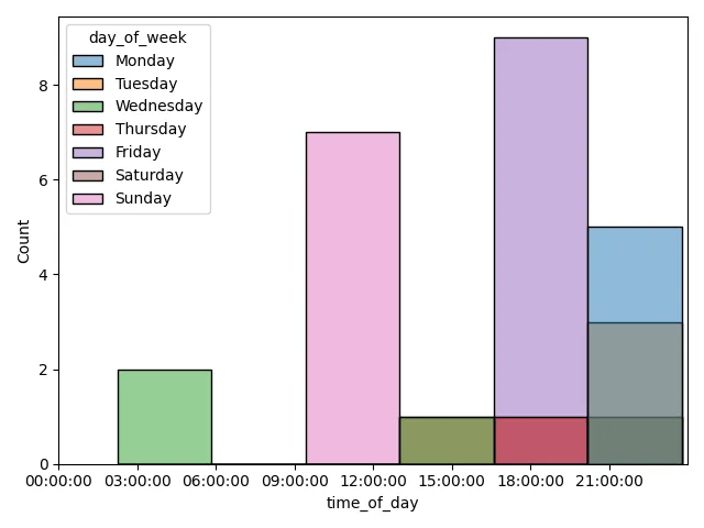
我想要做的是创建一个 kde 图,x 轴 = time_of_day(跨越 00:00:0023:59:59),y 轴 是每天每小时的 day_of_week 计数,hue = day_of_week。实际上,我将有七个不同的分布,代表每周每天的发生情况。
这是数据和我的代码示例。任何帮助都将不胜感激:
df = pd.DataFrame([
    '2021-06-13 12:56:16',
    '2021-06-13 12:56:16',
    '2021-06-13 12:56:16',
    '2021-06-13 12:56:16',
    '2021-06-13 12:56:54',
    '2021-06-13 12:56:54',
    '2021-06-13 12:57:27',
    '2021-07-16 18:55:42',
    '2021-07-16 18:56:03',
    '2021-06-04 18:42:06',
    '2021-06-04 18:49:05',
    '2021-06-04 18:58:22',
    '2021-06-08 21:31:44',
    '2021-06-09 02:14:30',
    '2021-06-09 02:20:19',
    '2021-06-12 18:05:47',
    '2021-06-15 23:46:41',
    '2021-06-15 23:47:18',
    '2021-06-16 14:19:08',
    '2021-06-17 19:08:17',
    '2021-06-17 22:37:27',
    '2021-06-21 23:31:32',
    '2021-06-23 20:32:09',
    '2021-06-24 16:04:21',
    '2020-05-22 18:29:02',
    '2020-05-22 18:29:02',
    '2020-05-22 18:29:02',
    '2020-05-22 18:29:02',
    '2020-08-31 21:38:07',
    '2020-08-31 21:38:22',
    '2020-08-31 21:38:42',
    '2020-08-31 21:39:03',
], columns=['datetime'])

def convert_date(date):
    return calendar.day_name[date.weekday()]

def convert_hour(time):
    return time[:2]+':00:00'

df['day_of_week'] = pd.to_datetime(df['datetime']).apply(convert_date)
df['time_of_day'] = df['datetime'].astype(str).apply(convert_hour)
3个回答

3

让我们试试:

  1. datetime转换为日期时间格式
  2. day_of_week codes创建一个分类列(以便正确排序)
  3. time_of_day 标准化到一天内(以便比较正确)。这使得所有事件似乎都发生在同一天,从而简化了绘图逻辑。
  4. 绘制kdeplot
  5. 将 x轴格式设置为仅显示 HH:MM:SS
import calendar

import pandas as pd
import seaborn as sns
from matplotlib import pyplot as plt, dates as mdates


# df = pd.DataFrame({...})

# Convert to datetime
df['datetime'] = pd.to_datetime(df['datetime'])
# Create Categorical Column
cat_type = pd.CategoricalDtype(list(calendar.day_name), ordered=True)
df['day_of_week'] = pd.Categorical.from_codes(
    df['datetime'].dt.day_of_week, dtype=cat_type
)
# Create Normalized Date Column
df['time_of_day'] = pd.to_datetime('2000-01-01 ' +
                                   df['datetime'].dt.time.astype(str))

# Plot
ax = sns.kdeplot(data=df, x='time_of_day', hue='day_of_week')

# X axis format
ax.set_xlim([pd.to_datetime('2000-01-01 00:00:00'),
             pd.to_datetime('2000-01-01 23:59:59')])
ax.xaxis.set_major_formatter(mdates.DateFormatter('%H:%M:%S'))

plt.tight_layout()
plt.show()

注意,这里的样本大小很小: kdeplot 如果想查看y轴上的计数,也许使用histplot会更好: histplot
ax = sns.histplot(data=df, x='time_of_day', hue='day_of_week')

histplot


非常感谢!您还知道plt.show()return等效语吗?我在函数中返回此绘图,但plt.show()给我带来了麻烦。 - big_cactus

0

我会直接使用Pandas的Timestamp。顺便说一下,你的convert_hour函数似乎有问题。它将所有数据的time_of_the_day都设为20:00:00。

import pandas as pd
import seaborn as sns
import matplotlib.pyplot as plt


sns.set_context("paper", font_scale=2)
sns.set_style('whitegrid')

df['day_of_week'] = df['datetime'].apply(lambda x: pd.Timestamp(x).day_name())
df['time_of_day'] = df['datetime'].apply(lambda x: pd.Timestamp(x).hour)

plt.figure(figsize=(8, 4))

for idx, day in enumerate(days):
    sns.kdeplot(df[df.day_of_week == day]['time_of_day'], label=day)

kdeplot

周三的KDE看起来有点奇怪,因为时间在2到20之间变化,因此在图中从-20到40有一个很长的尾巴。


0
这是一个简单的代码使用 df.plot.kde 。添加了更多数据,以便在每个 day_of_week 上有多个值可供 kde 绘制。简化代码以删除函数。
df1 = pd.DataFrame([
    '2020-09-01 16:39:03',
    '2020-09-02 16:39:03',
    '2020-09-03 16:39:03',
    '2020-09-04 16:39:03',
    '2020-09-05 16:39:03',
    '2020-09-06 16:39:03',
    '2020-09-07 16:39:03',
    '2020-09-08 16:39:03',
], columns=['datetime'])
df = pd.concat([df,df1]).reset_index(drop=True)
df['day_of_week'] = pd.to_datetime(df['datetime']).dt.day_name()
df['time_of_day'] = df['datetime'].str.split(expand=True)[1].str.split(':',expand=True)[0].astype(int)
df.pivot(columns='day_of_week').time_of_day.plot.kde()

图表: 输入图像描述

网页内容由stack overflow 提供, 点击上面的
可以查看英文原文,
原文链接