在X轴上绘制一些数字。

3
我的问题与使用matplotlib库生成的图形格式有关。
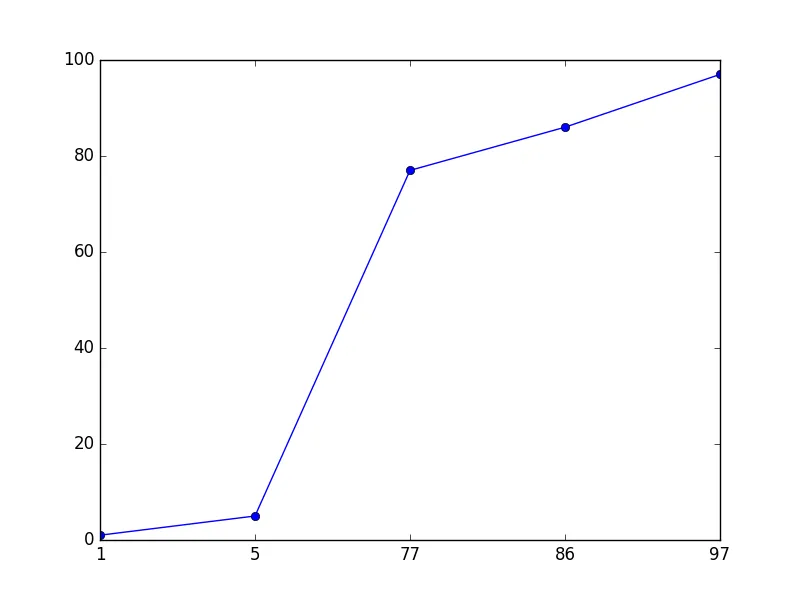
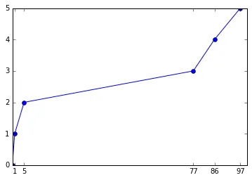
在x轴上,我有从1到100的整数,但在我的代码中,我只绘制与一些数字相关的数据(例如1,5,77,86,97)。
最后,我的代码显示了一个x轴从1到100的图形。
我该如何仅显示所需的数字(1,5,77,86,97)?
下面是我的代码:
def Plot(self,x,y, steps, nb,bool):  
    if(bool == False):

        labelfont = {
                'family' : 'sans-serif',  # (cursive, fantasy, monospace, serif)
                'color'  : 'black',       # html hex or colour name
                'weight' : 'normal',      # (normal, bold, bolder, lighter)
                'size'   : 20,            # default value:12
                }

        titlefont = {
                'family' : 'serif',
                'color'  : 'black',
                'weight' : 'bold',
                'size'   : 20,
                }

        x = np.array(x)
        y = np.array(y)
        pylab.plot(x, y,
                 'darkmagenta',                       # colour
                 linestyle='',                      # line style
                 linewidth=10,                       # line width
                 marker = '+',
                 mew=6, ms=12)

        axes = plt.gca()
        axes.grid(True)
        axes.set_xlim([1, x_max)            # x-axis bounds
        axes.set_ylim([1, nb])              # y-axis bounds

        pylab.title('Title' , fontdict=titlefont)
        pylab.xlabel('x', fontdict=labelfont)
        pylab.ylabel('y', fontdict=labelfont)

        pylab.subplots_adjust(left=0.15)        # prevents overlapping of the y label
    else:
        test_steps.insert(0,"")
        pylab.yticks(nb,  steps,rotation=0, size=10)
        pylab.margins(0.2)
        pylab.xticks(np.arange(0, x_max, 1.0),rotation=90, size=10)
        # Tweak spacing to prevent clipping of tick-labels
        pylab.subplots_adjust(bottom=0.15)
        F = pylab.gcf()
        DefaultSize = F.get_size_inches()
        if x_max < 100 and len(steps) < 100:
            Xx = 2.5
            Yy = 2.5
        elif x_max < 200 and len(steps) < 200:
            Xx = 5
            Yy = 5
        elif ix_max < 300 and len(steps) < 300:
            Xx = 8
            Yy = 8
        elif x_max < 400 and steps < 400:
            Xx = 10
            Yy = 10
        elif x_max < 500 and steps < 500:
            Xx = 12
            Yy = 12
        else:
            Xx = 15
            Yy = 15
        F.set_size_inches((DefaultSize[0]*Xx , DefaultSize[1]*Yy))
        F.savefig('Out.png', bbox_inches='tight')
        pylab.close(F)

1
请发布您的代码。 - DavidG
@DavidG:我编辑了我的帖子。 - Stack Over
3个回答

4

可以了:

import matplotlib.pyplot as plt
x = y = list(range(100))
idx = [1,5,77,86,97]
new_y = [y[i] for i in idx]
plt.plot(range(len(idx)), new_y, 'o-')
plt.xticks(range(len(idx)),idx)
plt.show()

输出

如果您只想要点,请删除-

plt.plot(range(len(idx)), new_y, 'o')
#                              ---^--- instead of 'o-'

1
很好,这简化了事情。 - M.T

2

如果您有一个matplotlib.Axes对象,可以使用set_xticks修改x轴上的刻度:

import matplotlib.pyplot as plt
plt.plot([0,1,5,77,86,97],range(6),'o-')
ax = plt.gca()
ax.set_xticks([1,5,77,86,97])

带有输出:

在此输入图像描述

编辑:假设您想要绘制等间隔的值(尽管此时您真的应该考虑类似于标签的条形图),您可以创建一个虚拟的x轴,并使用set_xticklabels重命名刻度:

import matplotlib.pyplot as plt
x = range(5)
y = range(5)
real_x = [1,5,77,86,97]
plt.plot(x,y,'o-')
ax = plt.gca()
ax.set_xticks(x)
ax.set_xticklabels(real_x)

enter image description here


您IP地址为143.198.54.68,由于运营成本限制,当前对于免费用户的使用频率限制为每个IP每72小时10次对话,如需解除限制,请点击左下角设置图标按钮(手机用户先点击左上角菜单按钮)。 - Stack Over
@StackOver 那么您想要的是,即使它们之间的差异不同,它们也应该是等距的吗?您希望上面我提供的示例图显示一条直线? - M.T
不,不是一条直线,只是点。曲线不连续。像这样:https://dev59.com/A2cs5IYBdhLWcg3waTbw - Stack Over

0
如何将x与y进行掩码处理,然后绘制它呢? 例如:
pylap.plot(x[y != 0], y,
             'darkmagenta',                       # colour
             linestyle='',                      # line style
             linewidth=10,                       # line width
             marker = '+',
             mew=6, ms=12)

或者如果 y 包含更多不等于 0 的数字,而你只想绘制上述数字,那么只需使用这些数字掩盖 x...


网页内容由stack overflow 提供, 点击上面的
可以查看英文原文,
原文链接