我想要一个类似于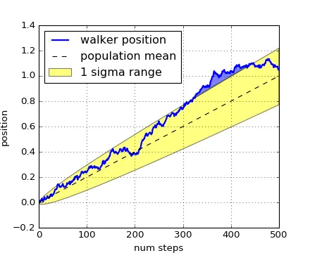 的图例。
的图例。
但是虚线和黄色区域需要像这样合并:
的图例。但是虚线和黄色区域需要像这样合并:

的图例。
legend函数,并将您想要的两行/补丁组合成一个单独的项目。# Import libraries
import numpy as np
import matplotlib.pyplot as plt
# Create some fake data
xvalue = np.linspace(1,100,100)
pop_mean = xvalue
walker_pos = pop_mean + 10*np.random.randn(100)
# Do the plot
fig, ax = plt.subplots()
# Save the output of 'plot', as we need it later
lwalker, = ax.plot(xvalue, walker_pos, 'b-')
# Save output of 'fill_between' (note there's no comma here)
lsigma = ax.fill_between(xvalue, pop_mean+10, pop_mean-10, color='yellow', alpha=0.5)
# Save the output of 'plot', as we need it later
lmean, = ax.plot(xvalue, pop_mean, 'k--')
# Create the legend, combining the yellow rectangle for the
# uncertainty and the 'mean line' as a single item
ax.legend([lwalker, (lsigma, lmean)], ["Walker position", "Mean + 1sigma range"], loc=2)
fig.savefig("legend_example.png")
plt.show()
 您可以查看图例指南来了解其中的细节,并根据需要自定义图例。