我想制作一个基因存在-缺失数据的聚类图/热力图,其中基因将被分组为不同的类别(例如趋化性、内毒素等),并相应地进行标记。在seaborn文档中,我没有找到这样的选项。我知道如何生成热力图,但我不知道如何将yticks标记为类别。这是一个示例(与我的工作无关),展示了我想要实现的效果:
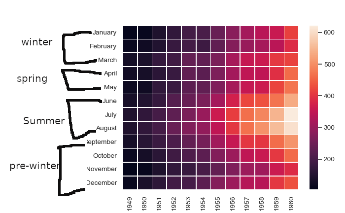
这里,yticklabels(y轴标签)的一月、二月和三月被归为“冬季”组,其他yticklabels也被类似地标记。
这里,yticklabels(y轴标签)的一月、二月和三月被归为“冬季”组,其他yticklabels也被类似地标记。
我已经在seaborn中复制了你给出的例子,并根据@Stein在这里的答案进行了调整。
import pandas as pd
import numpy as np
from matplotlib import pyplot as plt
from itertools import groupby
import datetime
import seaborn as sns

def test_table():
    months = [datetime.date(2008, i+1, 1).strftime('%B') for i in range(12)]
    seasons = ['Winter',]*3 + ['Spring',]*2 + ['Summer']*3 + ['Pre-Winter',]*4
    tuples = list(zip(months, seasons))
    index = pd.MultiIndex.from_tuples(tuples, names=['first', 'second'])
    d = {i: [np.random.randint(0,50) for _ in range(12)] for i in range(1950, 1960)}
    df = pd.DataFrame(d, index=index)
    return df

def add_line(ax, xpos, ypos):
    line = plt.Line2D([ypos, ypos+ .2], [xpos, xpos], color='black', transform=ax.transAxes)
    line.set_clip_on(False)
    ax.add_line(line)

def label_len(my_index,level):
    labels = my_index.get_level_values(level)
    return [(k, sum(1 for i in g)) for k,g in groupby(labels)]

def label_group_bar_table(ax, df):
    xpos = -.2
    scale = 1./df.index.size
    for level in range(df.index.nlevels):
        pos = df.index.size
        for label, rpos in label_len(df.index,level):
            add_line(ax, pos*scale, xpos)
            pos -= rpos
            lypos = (pos + .5 * rpos)*scale
            ax.text(xpos+.1, lypos, label, ha='center', transform=ax.transAxes)
        add_line(ax, pos*scale , xpos)
        xpos -= .2

df = test_table()

fig = plt.figure(figsize = (10, 10))
ax = fig.add_subplot(111)
sns.heatmap(df)

#Below 3 lines remove default labels
labels = ['' for item in ax.get_yticklabels()]
ax.set_yticklabels(labels)
ax.set_ylabel('')

label_group_bar_table(ax, df)
fig.subplots_adjust(bottom=.1*df.index.nlevels)
plt.show()
提供:
希望对您有所帮助。
plt.tight_layout() 可能有助于将所有标签调整到左侧。 - JohanC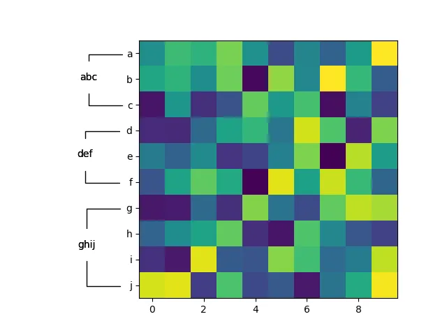
#!/usr/bin/env python
"""
Annotate a group of y-tick labels as such.
"""

import matplotlib.pyplot as plt
from matplotlib.transforms import TransformedBbox

def annotate_yranges(groups, ax=None):
    """
    Annotate a group of consecutive yticklabels with a group name.

    Arguments:
    ----------
    groups : dict
        Mapping from group label to an ordered list of group members.
    ax : matplotlib.axes object (default None)
        The axis instance to annotate.
    """
    if ax is None:
        ax = plt.gca()

    label2obj = {ticklabel.get_text() : ticklabel for ticklabel in ax.get_yticklabels()}

    for ii, (group, members) in enumerate(groups.items()):
        first = members[0]
        last = members[-1]

        bbox0 = _get_text_object_bbox(label2obj[first], ax)
        bbox1 = _get_text_object_bbox(label2obj[last], ax)

        set_yrange_label(group, bbox0.y0 + bbox0.height/2,
                         bbox1.y0 + bbox1.height/2,
                         min(bbox0.x0, bbox1.x0),
                         -2,
                         ax=ax)


def set_yrange_label(label, ymin, ymax, x, dx=-0.5, ax=None, *args, **kwargs):
    """
    Annotate a y-range.

    Arguments:
    ----------
    label : string
        The label.
    ymin, ymax : float, float
        The y-range in data coordinates.
    x : float
        The x position of the annotation arrow endpoints in data coordinates.
    dx : float (default -0.5)
        The offset from x at which the label is placed.
    ax : matplotlib.axes object (default None)
        The axis instance to annotate.
    """

    if not ax:
        ax = plt.gca()

    dy = ymax - ymin
    props = dict(connectionstyle='angle, angleA=90, angleB=180, rad=0',
                 arrowstyle='-',
                 shrinkA=10,
                 shrinkB=10,
                 lw=1)
    ax.annotate(label,
                xy=(x, ymin),
                xytext=(x + dx, ymin + dy/2),
                annotation_clip=False,
                arrowprops=props,
                *args, **kwargs,
    )
    ax.annotate(label,
                xy=(x, ymax),
                xytext=(x + dx, ymin + dy/2),
                annotation_clip=False,
                arrowprops=props,
                *args, **kwargs,
    )


def _get_text_object_bbox(text_obj, ax):
    # https://stackoverflow.com/a/35419796/2912349
    transform = ax.transData.inverted()
    # the figure needs to have been drawn once, otherwise there is no renderer?
    plt.ion(); plt.show(); plt.pause(0.001)
    bb = text_obj.get_window_extent(renderer = ax.get_figure().canvas.renderer)
    # handle canvas resizing
    return TransformedBbox(bb, transform)


if __name__ == '__main__':

    import numpy as np

    fig, ax = plt.subplots(1,1)

    # so we have some extra space for the annotations
    fig.subplots_adjust(left=0.3)

    data = np.random.rand(10,10)
    ax.imshow(data)

    ticklabels = 'abcdefghij'
    ax.set_yticks(np.arange(len(ticklabels)))
    ax.set_yticklabels(ticklabels)

    groups = {
        'abc' : ('a', 'b', 'c'),
        'def' : ('d', 'e', 'f'),
        'ghij' : ('g', 'h', 'i', 'j')
    }

    annotate_yranges(groups)

    plt.show()
@ddomingo。 - Paul Brodersen
sns.heatmap(df, yticklabels=['winter',None, None, 'spring', None, None, 'summer', None, None, 'fall',None, None])- gnahum