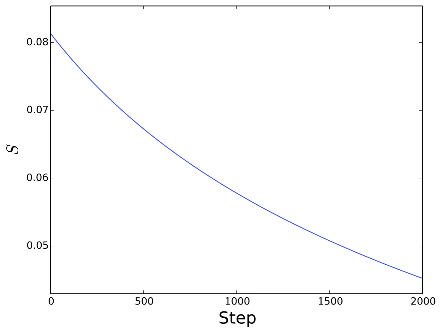
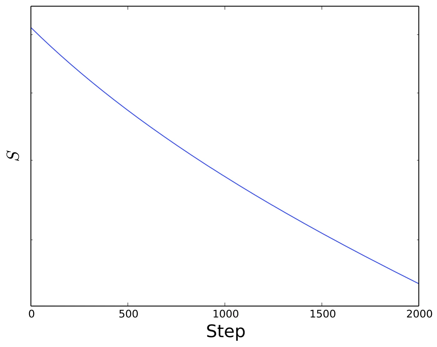
对数y轴会使刻度标签消失

4
在我的简单绘图脚本中加入plt.yscale('log')这行代码后,结果发生了变化。
import numpy as np
residuals = np.loadtxt('res_jacobi.txt', skiprows=1)

import matplotlib.pyplot as plt
fig = plt.figure()

steps = np.arange(0, len(residuals), 1)

plt.plot(steps, residuals, label='$S$')

plt.xlabel("Step",fontsize=20)
plt.ylabel("$S$",fontsize=20)
plt.ylim(0.95 * min(residuals), 1.05 * max(residuals))
plt.yscale('log')

plt.savefig('jacobi-res.pdf', bbox_inches='tight', transparent=True)

Y轴标签消失了。

enter image description hereenter image description here

我确定这个问题有一个简单的解决方法,但是搜索并没有找到结果。任何帮助将不胜感激。


看起来像是一个bug,但你可以尝试使用semilogy函数。http://matplotlib.org/api/pyplot_api.html#matplotlib.pyplot.semilogy - David Maust
3
@DavidMaust 我认为这不是一个错误,在对数刻度中,只有标记的主要刻度被标记为数量级。这绝对不是最佳行为...然而。 - DilithiumMatrix
2个回答

3
matplotlib 的正常行为是仅在对数刻度中标记主要刻度线 --- 即数量级相同的刻度,例如 {0.1, 1.0}。而你的值都在这些刻度之间。你可以采取以下措施:
  • 重新设置轴的较大范围,
    plt.gca().set_ylim(0.1, 1.0)
  • 手动标记刻度线,
    plt.gca().yaxis.set_minor_formatter(FormatStrFormatter("%.2f"))

使用plt.gca().set_yscale('semilog')会出现错误:ValueError: Unknown scale type 'semilog'plt.gca().set_yscale('log')可以执行,但仍然缺少标签。plt.gca().set_ylim(0.1, 1.0)有效,但是选择足够大的边界使y轴标签出现几乎使图形看起来恒定(是的,我知道这意味着在第一次使用时不需要使用对数刻度,但我只是遵循指示)。幸运的是,plt.gca().yaxis.set_minor_formatter(FormatStrFormatter("%.2f"))效果非常好。谢谢! - Janosh

0

semilogy 对我有用。

改变:

plt.plot(steps, residuals, label='$S$')

转换为:

plt.semilogy(steps, residuals, label='$S$')

删除 plt.yscale('log')


1
谢谢你的提示,但这对我没有任何改变。 - Janosh

网页内容由stack overflow 提供, 点击上面的
可以查看英文原文,
原文链接