在ggplot中生成成对堆积条形图(仅对某些变量使用position_dodge)

13

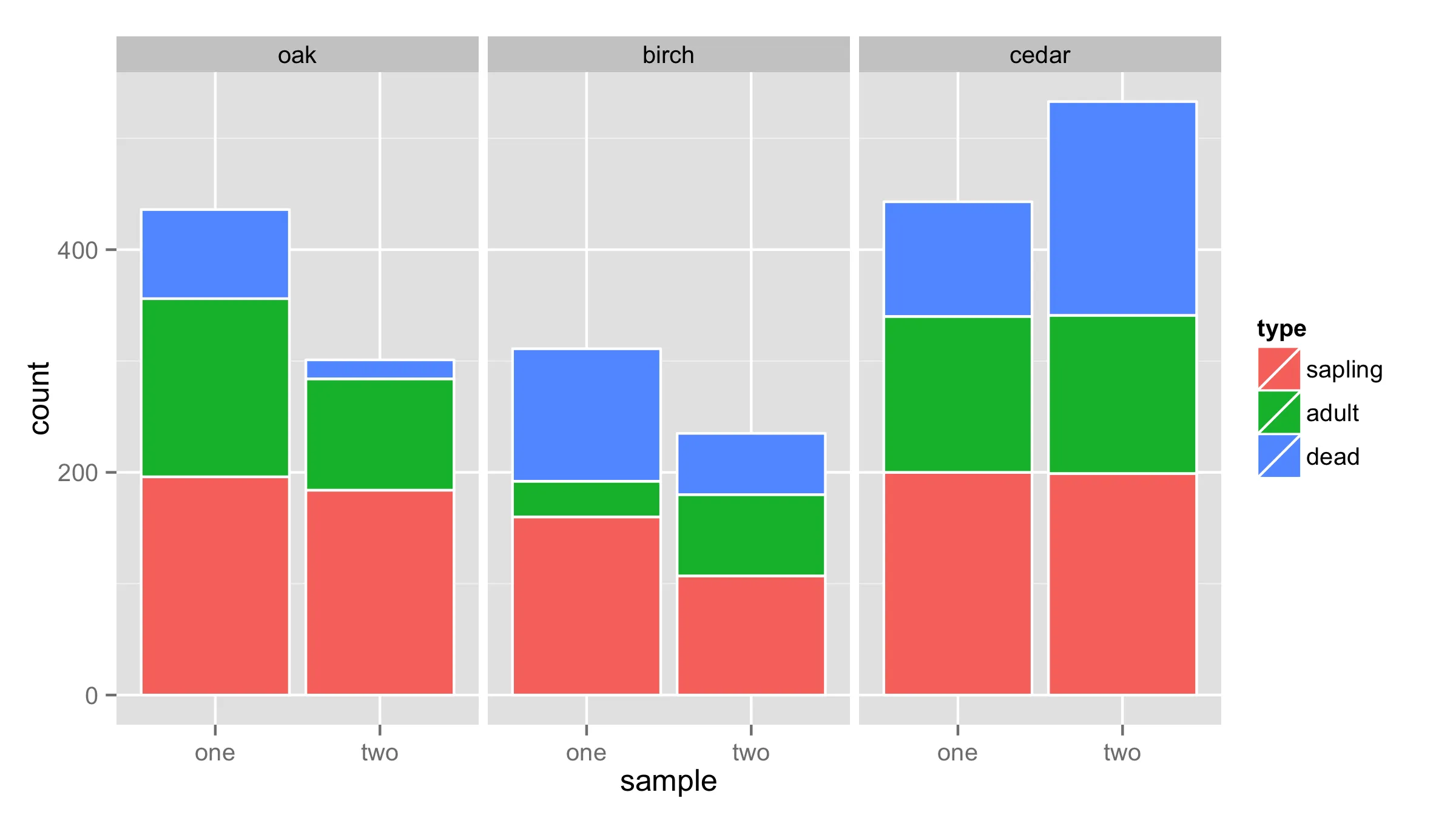
我希望使用 ggplot2 生成一组成对的堆积条形图,就像这样:

stacked bar chars example

使用以下示例数据:

df <- expand.grid(name = c("oak","birch","cedar"),
        sample = c("one","two"),
        type = c("sapling","adult","dead"))
df$count <- sample(5:200, size = nrow(df), replace = T)

我希望x轴代表树的名称,每个树种有两个柱形图:一个代表样本一,一个代表样本二。然后每个柱形图的颜色应该由类型决定。
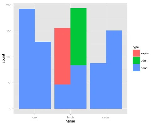
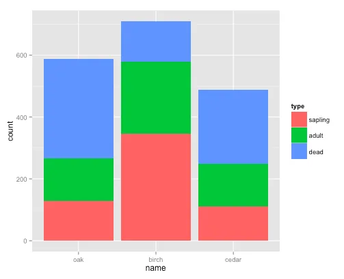
下面的代码生成了按类型分类的堆积柱状图:
ggplot(df, aes(x = name, y = count, fill = type)) + geom_bar(stat = "identity")
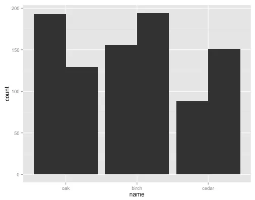
enter image description here

以下代码生成按样本分组的躲避条形图:

ggplot(df, aes(x = name, y = count, group = sample)) + geom_bar(stat = "identity", position = "dodge")

enter image description here

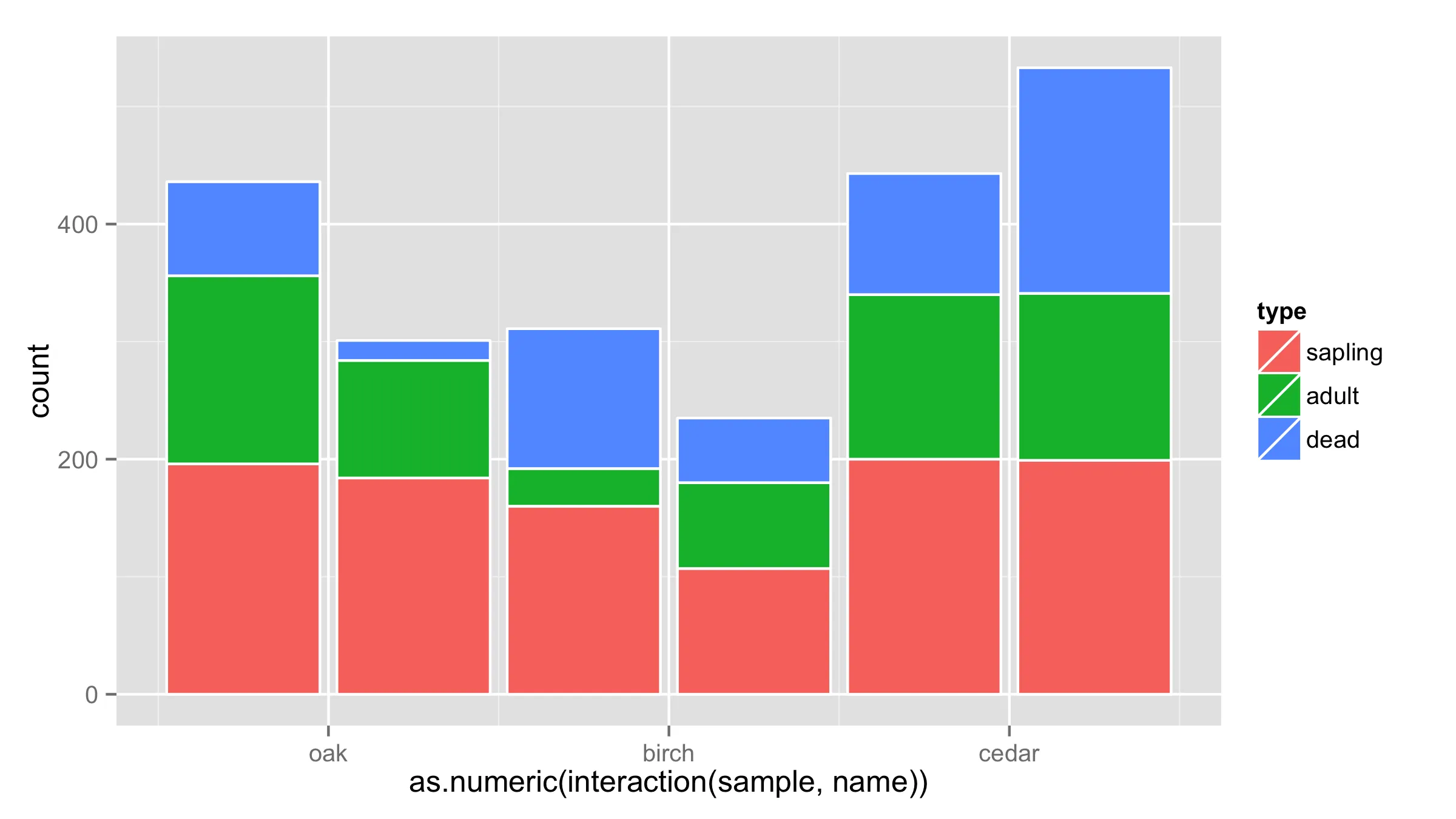
但我无法使其避开其中一个分组(样本),并将另一个分组(类型)堆叠起来:

ggplot(df, aes(x = name, y = count, fill = type, group = sample)) + geom_bar(stat = "identity", position = "dodge")

enter image description here

1个回答

21

一个解决方法是将samplename的交互放在x轴上,然后调整x轴的标签。问题是条形图之间的间距较大。

ggplot(df, aes(x = as.numeric(interaction(sample,name)), y = count, fill = type)) + 
  geom_bar(stat = "identity",color="white") +
  scale_x_continuous(breaks=c(1.5,3.5,5.5),labels=c("oak","birch","cedar"))

图片描述

另一个解决方案是使用namesample作为x值的分面。

ggplot(df,aes(x=sample,y=count,fill=type))+
  geom_bar(stat = "identity",color="white")+
  facet_wrap(~name,nrow=1)

enter image description here


1
太棒了。这非常接近。然而,我认为前面的类型(“dead”)如果这些值较小,则会隐藏其后面的堆叠条(“sapling”,“adult”)。看看最右边一列中的“cedar”。 - canary_in_the_data_mine

网页内容由stack overflow 提供, 点击上面的
可以查看英文原文,
原文链接