我知道pandas支持第二个Y轴,但是我很好奇是否有人知道如何在图表上放置第三个Y轴。目前我使用numpy+pyplot来实现这一点,但是对于大型数据集而言速度较慢。
这是为了在同一张图上绘制具有不同单位的不同测量值进行比较(例如:相对湿度/温度和电导率)。
所以我只是好奇是否有人知道是否可以在中实现这一点而不需要太多工作。
[编辑] 我怀疑是否有办法做到这一点(没有太多开销),但我希望被证明是错误的,因为这可能是matplotlib的限制。
我认为这可能有效:
import matplotlib.pyplot as plt
import numpy as np
from pandas import DataFrame
df = DataFrame(np.random.randn(5, 3), columns=['A', 'B', 'C'])

fig, ax = plt.subplots()
ax3 = ax.twinx()
rspine = ax3.spines['right']
rspine.set_position(('axes', 1.15))
ax3.set_frame_on(True)
ax3.patch.set_visible(False)
fig.subplots_adjust(right=0.7)

df.A.plot(ax=ax, style='b-')
# same ax as above since it's automatically added on the right
df.B.plot(ax=ax, style='r-', secondary_y=True)
df.C.plot(ax=ax3, style='g-')

# add legend --> take advantage of pandas providing us access
# to the line associated with the right part of the axis
ax3.legend([ax.get_lines()[0], ax.right_ax.get_lines()[0], ax3.get_lines()[0]],\
           ['A','B','C'], bbox_to_anchor=(1.5, 0.5))
输出:

一种没有使用 plt 的更简单的解决方案:
ax1 = df1.plot()

ax2 = ax1.twinx()
ax2.spines['right'].set_position(('axes', 1.0))
df2.plot(ax=ax2)

ax3 = ax1.twinx()
ax3.spines['right'].set_position(('axes', 1.1))
df3.plot(ax=ax3)

....
使用函数来实现此操作:
def plot_multi(data, cols=None, spacing=.1, **kwargs):

    from pandas.plotting._matplotlib.style import get_standard_colors

    # Get default color style from pandas - can be changed to any other color list
    if cols is None: cols = data.columns
    if len(cols) == 0: return
    colors = get_standard_colors(num_colors=len(cols))

    # First axis
    ax = data.loc[:, cols[0]].plot(label=cols[0], color=colors[0], **kwargs)
    ax.set_ylabel(ylabel=cols[0])
    lines, labels = ax.get_legend_handles_labels()

    for n in range(1, len(cols)):
        # Multiple y-axes
        ax_new = ax.twinx()
        ax_new.spines['right'].set_position(('axes', 1 + spacing * (n - 1)))
        data.loc[:, cols[n]].plot(ax=ax_new, label=cols[n], color=colors[n % len(colors)], **kwargs)
        ax_new.set_ylabel(ylabel=cols[n])

        # Proper legend position
        line, label = ax_new.get_legend_handles_labels()
        lines += line
        labels += label

    ax.legend(lines, labels, loc=0)
    return ax
例:
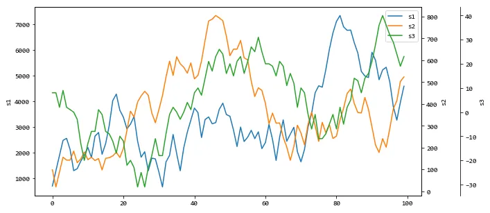
from random import randrange

data = pd.DataFrame(dict(
    s1=[randrange(-1000, 1000) for _ in range(100)],
    s2=[randrange(-100, 100) for _ in range(100)],
    s3=[randrange(-10, 10) for _ in range(100)],
))

plot_multi(data.cumsum(), figsize=(10, 5))
输出:
AttributeError: module 'pandas.plotting' has no attribute '_matplotlib'错误。 - wordsforthewisecolors = plotting._style._get_standard_colors(num_colors=len(cols)) - RGD2AttributeError: module 'pandas.plotting' has no attribute '_style'。 - somewhevedata.plot(x='x_column', y='y_column', ...)替换上面的绘图代码。顺便说一下,这样更容易阅读。 - off99555from typing import List, Union
import matplotlib.axes
import pandas as pd
def plot_multi(
data: pd.DataFrame,
x: Union[str, None] = None,
y: Union[List[str], None] = None,
spacing: float = 0.1,
**kwargs
) -> matplotlib.axes.Axes:
"""Plot multiple Y axes on the same chart with same x axis.
Args:
data: dataframe which contains x and y columns
x: column to use as x axis. If None, use index.
y: list of columns to use as Y axes. If None, all columns are used
except x column.
spacing: spacing between the plots
**kwargs: keyword arguments to pass to data.plot()
Returns:
a matplotlib.axes.Axes object returned from data.plot()
Example:
>>> plot_multi(df, figsize=(22, 10))
>>> plot_multi(df, x='time', figsize=(22, 10))
>>> plot_multi(df, y='price qty value'.split(), figsize=(22, 10))
>>> plot_multi(df, x='time', y='price qty value'.split(), figsize=(22, 10))
>>> plot_multi(df[['time price qty'.split()]], x='time', figsize=(22, 10))
See Also:
This code is mentioned in https://dev59.com/6Wgu5IYBdhLWcg3wBym1
"""
from pandas.plotting._matplotlib.style import get_standard_colors
# Get default color style from pandas - can be changed to any other color list
if y is None:
y = data.columns
# remove x_col from y_cols
if x:
y = [col for col in y if col != x]
if len(y) == 0:
return
colors = get_standard_colors(num_colors=len(y))
if "legend" not in kwargs:
kwargs["legend"] = False # prevent multiple legends
# First axis
ax = data.plot(x=x, y=y[0], color=colors[0], **kwargs)
ax.set_ylabel(ylabel=y[0])
lines, labels = ax.get_legend_handles_labels()
for i in range(1, len(y)):
# Multiple y-axes
ax_new = ax.twinx()
ax_new.spines["right"].set_position(("axes", 1 + spacing * (i - 1)))
data.plot(
ax=ax_new, x=x, y=y[i], color=colors[i % len(colors)], **kwargs
)
ax_new.set_ylabel(ylabel=y[i])
# Proper legend position
line, label = ax_new.get_legend_handles_labels()
lines += line
labels += label
ax.legend(lines, labels, loc=0)
return ax
plot_multi(df, x='time', y='price qty value'.split(), figsize=(22, 10))
ax3.legend([ax.get_lines()[0], ax2.get_lines()[0], ax3.get_lines()[0]], ['label1', 'label2', 'label3'], bbox_to_anchor=(1.15, 0.5))。 - tworecax3.set_ylabel('ylabelC3')和ax.right_ax.set_ylabel('ylabelB2')- tommy.carstensenax3.set_frame_on(True)是什么意思?请添加几行注释到代码中。谢谢!ax3.set_frame_on(True)的作用是显示matplotlib图形的框架。以下是带有注释的示例代码:import matplotlib.pyplot as plt fig, (ax1, ax2, ax3) = plt.subplots(1, 3, figsize=(10, 4)) # 在ax1上绘制一个简单的折线图 ax1.plot([1, 2, 3], [4, 5, 6]) # 在ax2上绘制一个简单的散点图 ax2.scatter([1, 2, 3], [4, 5, 6]) # 显示ax3的框架 ax3.set_frame_on(True) # 在ax3上绘制一个简单的条形图 ax3.bar([1, 2, 3], [4, 5, 6]) plt.show()- tommy.carstensen