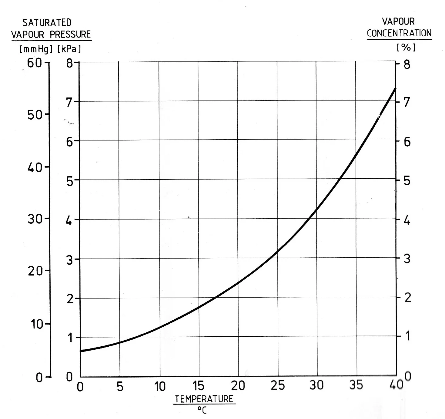
对于第一个图,我建议使用
axisartist。通过应用于指定的
y 限制的简单缩放因子,实现了左侧两个
y 轴的自动缩放。这个第一个例子基于
寄生轴 的解释。
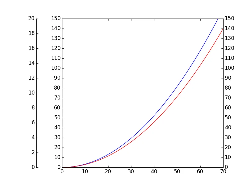
import numpy as np
from mpl_toolkits.axes_grid1 import host_subplot
import mpl_toolkits.axisartist as AA
import matplotlib.pyplot as plt
host = host_subplot(111, axes_class=AA.Axes)
plt.subplots_adjust(left=0.25)
par1 = host.twinx()
par2 = host.twinx()
offset = -60
new_fixed_axis = par2.get_grid_helper().new_fixed_axis
par2.axis["right"] = new_fixed_axis(loc="left", axes=par2, offset=(offset, 0))
par2.axis["right"].toggle(all=True)
y3_to_y1 = 1/7.5
YLIM = [0.0, 150.0,
0.0, 150.0]
x = np.linspace(0,70.0,70.0)
y1 = np.asarray([xi**2.0*0.032653 for xi in x])
y2 = np.asarray([xi**2.0*0.02857 for xi in x])
host.plot(x,y1,'b')
par1.plot(x,y2,'r')
host.set_xlim(0.0,70.0)
host.set_ylim(YLIM[0],YLIM[1])
par1.set_ylim(YLIM[2],YLIM[3])
par2.set_ylim(YLIM[2]*y3_to_y1,YLIM[3]*y3_to_y1)
host.set_yticks(np.arange(YLIM[0],YLIM[1]+0.001,10.0))
par1.set_yticks(np.arange(YLIM[2],YLIM[3]+0.001,10.0))
par2.set_yticks(np.arange(YLIM[2]*y3_to_y1,YLIM[3]*y3_to_y1+0.001, 2.0))
plt.show()
您最终将得到这个图表:
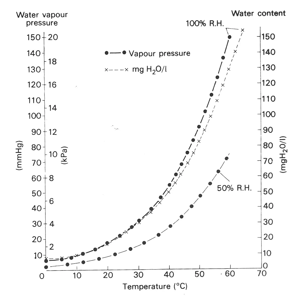
你可以尝试修改上面的示例,以获得第二个图。一个想法是将
offset减少到零。然而,使用
axisartist时,某些刻度函数
不受支持。其中之一是指定刻度线是在轴内还是轴外。
因此,对于第二个图,以下示例(基于
matplotlib:如何使用不同比例叠加图形?)是适当的。
import numpy as np
import matplotlib.pyplot as plt
fig = plt.figure()
ax1 = fig.add_subplot(111)
ax2 = ax1.twinx()
ax3 = ax1.twinx()
y3_to_y1 = 1/7.5
YLIM = [0.0, 150.0,
0.0, 150.0]
x = np.linspace(0,70.0,70.0)
y1 = np.asarray([xi**2.0*0.032653 for xi in x])
y2 = np.asarray([xi**2.0*0.02857 for xi in x])
ax1.plot(x,y1,'b')
ax2.plot(x,y2,'r')
ax1.set_xlim(0.0,70.0)
ax1.set_ylim(YLIM[0],YLIM[1])
ax2.set_ylim(YLIM[2],YLIM[3])
ax3.set_ylim(YLIM[2]*y3_to_y1,YLIM[3]*y3_to_y1)
ax3.spines['right'].set_position(('axes', 0.0))
ax1.set_yticks(np.arange(YLIM[0],YLIM[1]+0.001,10.0))
ax2.set_yticks(np.arange(YLIM[2],YLIM[3]+0.001,10.0))
ax3.set_yticks(np.arange(YLIM[2]*y3_to_y1,YLIM[3]*y3_to_y1+0.001, 2.0))
ax1.get_yaxis().set_tick_params(direction='out')
ax3.get_yaxis().set_tick_params(direction='out')
plt.show()
这导致产生这个图:
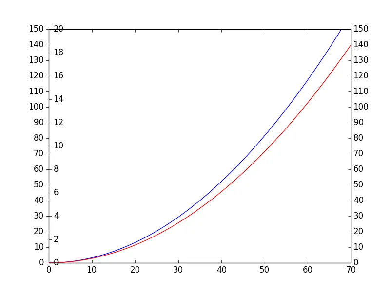
同样,set_tick_params(direction='out')在第一个示例中与axisartist不兼容。
有点违反直觉,y1和y3的刻度线都必须设置为'out'。对于y1,这是有道理的,对于y3,您必须记住它起初是右侧轴。因此,在将轴移动到左侧时,这些刻度线会显示在外面(使用默认的'in'设置)。