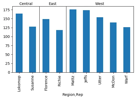
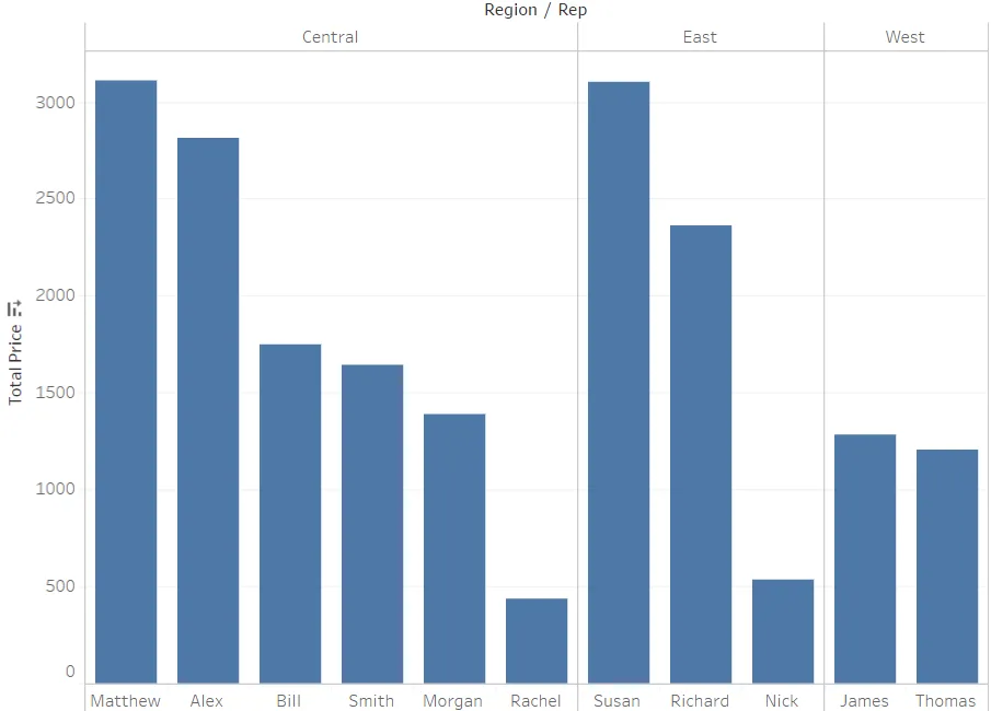
我正在使用Pandas和Matplotlib尝试复制Tableau中的这个图形:
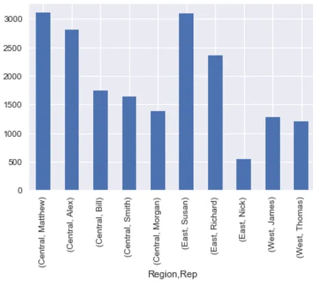
group = df.groupby(["Region","Rep"]).sum()
total_price = group["Total Price"].groupby(level=0, group_keys=False)
total_price.nlargest(5).plot(kind="bar")
这将生成以下图形:
它正确地分组了数据,但是否可能让其类似于Tableau中显示的分组方式?