我有一个像这样的pd.DataFrame:
ColumnName
1
1
2
3
1
2
3
1
2
2
我可以使用 df['ColumnName'].plot(style='o') 绘制它。
如何为列中的不同值定义不同的颜色(例如,值1为红色,2为绿色,3为橙色)?我知道这与colormap有关,但我该如何使用它?
一种解决方案是使用每个值的列构建新的DataFrame。但这些值已经排序,我想要确切的顺序只是用不同的颜色着色。
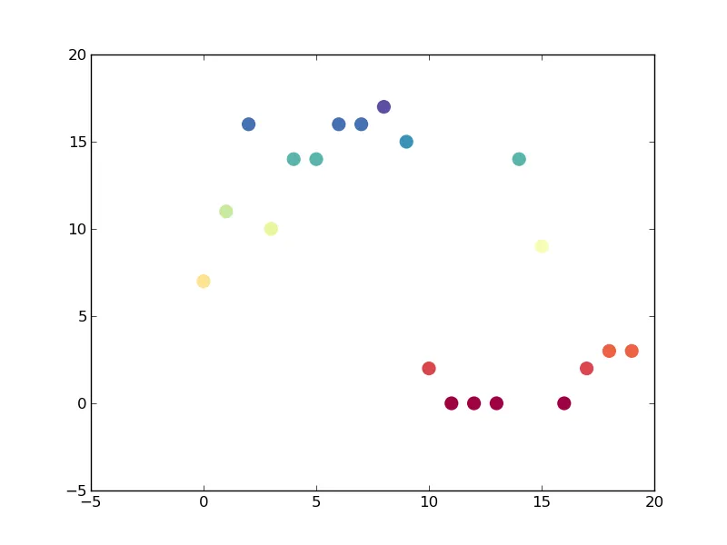
要绘制数据框的第一列,请尝试像这样:
from matplotlib import cm
import matplotlib.pyplot as plt
import numpy as np
import pandas as pd

df = pd.DataFrame(np.random.randint(20, size=20))
cmap = cm.get_cmap('Spectral') # Colour map (there are many others)

fig, ax = plt.subplots(1)
# Now here's the plot. range(len(df)) just makes the x values 1, 2, 3...
# df[0] is then the y values. c sets the colours (same as y values in this
# case). s is the marker size.
ax.scatter(range(len(df)), df[0], c=df[0], s=120, cmap=cmap, edgecolor='None')
plt.show()
导致的结果是: