Matplotlib:使用色图为表格单元格背景着色

11

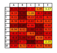
我有一个 Pandas 数据帧,希望将其作为 matplotlib 表格绘制出来。到目前为止,我已经使用以下代码成功实现了这一部分:

import numpy as np
randn = np.random.randn
from pandas import *

idx = Index(arange(1,11))
df = DataFrame(randn(10, 5), index=idx, columns=['A', 'B', 'C', 'D', 'E'])
vals = np.around(df.values,2)

fig = plt.figure(figsize=(15,8))
ax = fig.add_subplot(111, frameon=True, xticks=[], yticks=[])

the_table=plt.table(cellText=vals, rowLabels=df.index, colLabels=df.columns, 
                    colWidths = [0.03]*vals.shape[1], loc='center')

table_props = the_table.properties()
table_cells = table_props['child_artists']

clm = cm.hot(vals)

for cell in table_cells: 
    cell.set_height(0.04)
    # now i would like to set the backgroundcolor of the cell

在最后,我想根据着色图设置单元格的背景颜色 - 但是如果没有索引,我该如何在clm数组中查找它?

另一个问题:我能以某种方式向表格传递格式化字符串,以便将文本格式化为2位小数吗?

欢迎任何提示, Andy

2个回答

16
您可以使用plt.Normalize()来规范化您的数据,然后将规范化后的数据传递给Colormap对象,例如plt.cm.hot()plt.table()有一个参数cellColours,将用于相应地设置单元格的背景颜色。
因为cm.hot将黑色映射到最小值,所以在创建规范化对象时增加了值范围。
以下是代码:
from matplotlib import pyplot as plt
import numpy as np
randn = np.random.randn
from pandas import *

idx = Index(np.arange(1,11))
df = DataFrame(randn(10, 5), index=idx, columns=['A', 'B', 'C', 'D', 'E'])
vals = np.around(df.values,2)
norm = plt.Normalize(vals.min()-1, vals.max()+1)
colours = plt.cm.hot(normal(vals))

fig = plt.figure(figsize=(15,8))
ax = fig.add_subplot(111, frameon=True, xticks=[], yticks=[])

the_table=plt.table(cellText=vals, rowLabels=df.index, colLabels=df.columns, 
                    colWidths = [0.03]*vals.shape[1], loc='center', 
                    cellColours=colours)
plt.show()

enter image description here


13
“normal(vals)” 应该替换为 “norm(vals)” 吗? - user710

0

Andy的代码正常运行:

#!/usr/bin/env python
# -*- coding: utf-8 -*-

# sudo apt-get install python-pandas
# sudo apt-get install python-matplotlib
# 
# python teste.py

from matplotlib import pyplot
from matplotlib import cm

import numpy

from pandas import *

idx = Index(numpy.arange(1, 11))

df = DataFrame(
        numpy.random.randn(10, 5),
        index=idx,
        columns=['A', 'B', 'C', 'D', 'E']
    )

vals = numpy.around(df.values, 2)

normal = pyplot.normalize(vals.min()-1, vals.max()+1)

fig = pyplot.figure(figsize=(15, 8))

ax = fig.add_subplot(111, frameon=True, xticks=[], yticks=[])

the_table = pyplot.table(
                cellText=vals,
                rowLabels=df.index,
                colLabels=df.columns, 
                colWidths = [0.03]*vals.shape[1],
                loc='center', 
                cellColours=pyplot.cm.hot(normal(vals))
            )

pyplot.show()

网页内容由stack overflow 提供, 点击上面的
可以查看英文原文,
原文链接